All posts by scottishzoe

Part 4 – Research Point 1

The research point is to look at the Barthes essay Rhetoric of the Image and reflect on looking at his definitions of anchorage and relay, thinking about examples of these and considering how you could use them in your own work.

I will start by admitting that I find Barthes a complex read. This may be partly because he wrote in French and I am reading translations. It may be because his background is in philosophy and semiotics. I find I always have to have a dictionary to hand. I looked at the essay as a whole as the parts on anchorage and relay can only be understood in context.

All quotes are from the Rhetoric of the image – initially published in 1964, republished in Image Music Text in 1977 and obtained here from The Photography Reader (2019).

In the Rhetoric of the Image Barthes starts by saying that many people, especially linguists feel that images are weak communicators in comparison with language but other think that it is ‘ineffably rich’.

Barthes then looks at levels of messages in photographs. The first linguistic – and actual words such as a caption or labels within the image. These can have both denotational and connotational meanings. He then describes a clearly coded iconic message- the details of the image and what it shows (in this case the makings of soup) – the perceptual message or the denoted image.  The third level he describes as a ‘message without a code’, a literal message that we understand because of our previous knowledge – the cultural message or the connoted, symbolic image.

He notes that linking of text and image is common. Does the image duplicate information in the words or does the text add ‘fresh information’ to a picture? He sees us (in 1964) as a civilisation of writing and speech rather than of images and notes that there is a linguistic message (length variable and irrelevant) with every image – title, caption, dialogue, accompanying article.

All images are polysemous (have multiple meanings). The reader chooses. The linguistic message is one way of fixing the message, resolving the (terror of) uncertainty. The text helps to identity the scene – what is it?

Anchorage – tells you what of all the possible denotive meanings is the one that you are supposed to understand – to focus not simply my gaze but also my understanding.  It limits what you see.  It directs you to the meaning that is desired (especially in advertising). Anchorage is a control, a selective explanation (elucidation). It acts to repress (cut down) the meaning of the image to that wished by the creator or society.

 Relay (less common than anchorage) is often seen in cartoons/comics. ‘The text and image stand in a complimentary relationship’. The unity of the message becomes important rather than the individual items. He describes the information gained by the text as more ‘costly’ as it need more formal learning to acquire and the information from the image as ‘lazier’ and ‘quick’ allowing a hurried reader to avoid the necessity of verbal descriptions. He also notes that either text or image will usually be dominant.

Barthes then goes on to talk about the denoted image. He says that although a photograph, ‘by virtue of its absolutely analogue nature’ – is a message without a code – but also that everybody automatically understands more then the liberal image because of our cultural knowledge. However, a photograph is different from a drawing as any drawing chooses what to show, as opposed to a photograph which (once the frame has been decided) shows everything. The photograph records, evoking not only being-there but also having-been-there. There is always the evidence of this is how it was. It is different from any other form of image making (a mutation of a way of passing on information).

The connoted (symbolic image) is complex because there are as many possible interpretations as there are readers. The interpretation depends on prior knowledge, a ‘body of attitudes’. The language of the image consisted both utterances emitted by the creator and the utterances received from the viewer. Therefore, they may/will include surprises. The whole set of connotations from the image Barthes calls a rhetoric.

 He ends by noting that the meaning (of an image) is torn internally between culture and nature – but the whole thing combines to tell a story.

In summary:

Barthes defines anchorage as the controlling words that direct the reader to what the creator wishes him/her to see. Relay in text is something that sits alongside the image and gives additional value, is complimentary. Anchorage directs you; relay suggests possibilities.

 Examples:

  1. In the book Our Forbidden Land by Faye Godwin (Godwin, 1990) she uses a combination of both. The images are accompanied by a simple text such as ‘Stubble Burning, east Kent’ which, by itself, would allow you to look at the image and think ‘Oh. It must be winter’ or ‘That makes a lot of smoke’ – but she then accompanies the image with a passage of information about the context which makes it clear that she wants you to read it as an obnoxious and dangerous process.
  2. In The Ballad of Sexual Dependency by Nan Goldin she uses simple factual titles such as ‘Christie and Sandy on the beach, Provincetown, Mass.1976’ which’ while grounding the image in reality, this happened, I was then then – allows you to make up your own story.
  3. In Tal Uf Tal Ab by Robert Frank there is even less information, the name of the person or a place. You are left with your own interpretation.
  4. In a copy of the magazine Breathe (picked at random off the floor) -the images (while often very attractive) are clearly secondary to the anchoring text, for instance, a long article entitled ‘Food for the soul’ (Yates, 2016) which is accompanied by luscious looking strawberries, cherries and raspberries. This is very similar in use to the advertisement Barthes describes in Image of the Rhetoric, although here you are being sold a lifestyle rather than a specific product.

How might this help me?

In much of the work I do I want the reader/viewer to develop their own ideas. To Think. To feel. To imagine. But, equally, I do want to give some direction – I take images of people with disabilities. I do not want the viewer to be negative. I want them to go into their world not look from outside with contempt. I think I need to consider the relay type text, maybe a simple caption, a single word – but with an essay (possibly too formal) at some point.

I am thinking about a piece of memory work – maybe the words need to be totally separate. Single words in a grid? Minimal size captions on the alternate page?

 References:

Frank, R. (2010) Tal Uf Tal Ab. Gottingen, Germany: Steidl.

Godwin, F. (1990) Our forbidden land. London: J. Cape.

Goldin, N. et al. (1986) The ballad of sexual dependency. New York, N.Y.: Aperture Foundation.

Wells, L. (2019) The photography reader: history and theory. Abingdon, Oxon; New York, Ny: Routledge.

Yates, J. (2016) ‘Food for the soul’ In: Breathe 2016 pp.74–75.

Exercise 4.1 – Looking at Adverts

The exercise asks us to look at the Dawn Woolley articles on the WEAREOCA website and either make a blog post or reply on the site. It was difficult to track down the posts as they are now 3 years old and Dawn has left OCA – however, persistence worked.

I looked at her last post on fashion and anti-aging products. In spite of this post being old these products are still very heavily advertised today, and therefore it is still relevant. The ads still suggest we can ‘stop time’. The ads she shows and Judith Williamson talks about use ‘science’ or more often pseudoscience to catch ones attention, to make you feel that what they are saying ‘must be right’ . Woolley and Williamson describe a ‘mythic’ element to this use of science and this magic is suggested to make you look, and therefore feel younger, more attractive and therefore increase your feeling of self-worth.

I had a quick look at the Body Shop website. The cream shown in Woolley’s post is still available. It is described as:

  • Skin feels smoother, more supple, and bouncier
  • ……… visibly more youthful looking skin
  • Dermatological tested – this again implies science and safety – although without any details of what the testing involved, or who did it – presumably the Body Shop themselves
  • Non-comedogenic – I had to look this up – it means the tendency to cause blackheads – again a very ‘sciency’ term

I noted the repetitive nature of the information – and the use of ‘good sounding’ plant names (actually inaccurate – they say 3, then list 4).

I am in the age group that this is aimed at, I could certainly do with extra youthful bounce! They clearly know who they are trying to attract, and, given their sales, are successful at doing so. Has looking at the ad in detail put me off buying the product? Unfortunately, possibly not.

I took the opportunity to look at Woolley’s website where she describes her artwork as ‘a feminist critique of consumer culture’. She now works partly in still life as a blogger had assumed she was male and completely misinterpreted one of her series. I suspect that would give any female (whether feminist or not) pause for thought, and then screaming outrage, although, of course, in the past, often the only way to get your work looked at was to pretend to be male. I would have been interested to read her chapter in ‘Bodies in Flux’ – but unfortunately it is not available via the UCA library. One of her recent series – Consumed: stilled lives again looks at the impact that advertisements have on our lives, and the concerning fact that as selfies act as adverts so adverts become more reliant on human-like characteristics to be attractive/effective.

Reference list:

Drops Of YouthTM Youth Cream (s.d.) At: https://www.thebodyshop.com/en-gb/face/moisturisers/drops-of-youth-youth-cream/p/p000665 (Accessed on 11 May 2020)

Woolley, D. (2017) Looking at adverts: 17 | The Open College of the Arts. At: https://www.oca.ac.uk/weareoca/film/looking-adverts-17/ (Accessed on 11 May 2020)

Woolley, D. (s.d.) Dawn Woolley – HOME. At: http://www.dawnwoolley.com/ (Accessed on 11 May 2020)

Regular Reflections – May 1

In the ongoing times of seclusion, I am still finding it difficult to concentrate. Using the word seclusion rather than lockdown makes me think of nuns and friars rather than frustrated housewives and bored children. How did they manage? Routine was the key. Everything set around a place and time for it to happen. My son showed me a very clever meme that should become my mantra. Divide your life into spaces. Do the correct thing in the correct space. It certainly helps.

Reading and watching:

  • Creative Vision by Jeremy Webb – mainly based around film based photography with a sprinkling of other processes and digital work thrown in – not sure there is much that directly translates in what I am doing at present – but some fascinating ideas to combat boredom
  • The Photographer’s Eye by Michael Freeman. Mine is an old copy and brings back all the practical design ideas I learnt on TAOP. Probably because he wrote that course. However, it’s a good reminder of the basics.
  • Listened to a podcast with Maisie Cousins – fascinating and then bought/read (do you read or view photobooks) – her latest. Lush/fascinating/revolting all at the same time
  • Reading a lot of poetry – some inspired by photography, some hopefully will inspire it. Last West – Road songs for Dorothea Lange – is a fascinating glide though her notes mixed with modern thoughts/ideas. I read it in a single sitting.
  • Watched much of the MOMA visual gallery work on Dorothea Lange – really interesting and relevant for A4 of IAP
  • Reading old BMJ’s – catching up!

Thinking and doing:

  • Finished first go at A3
    • Put into a PowerPoint 
    • Sent off to tutor
  • Working more on A4
    • Wondering about using Polaroid type images to emphasise the nature of past and memory
  • Started on the reading for A4
  • Dug out my pastels and trying to draw again – no idea how or if this will fit into this course- but making me think more generally about image making.
  • Made an excel spreadsheet to keep track of the things I want to watch/listen to and also interesting links

Photography:

  • Still continuing with lockdown diary – using it saw a time too practice skills
    • Mainly working on macro images
    • Playing with images of sunlight, how can you see it, though trees, reflections
  • Acquired a Helios lens and playing with that – lovely soft images, focusing can be tricky though
  • Continued experimenting with calotypes

Dorothea Lange – MoMA Exhibition

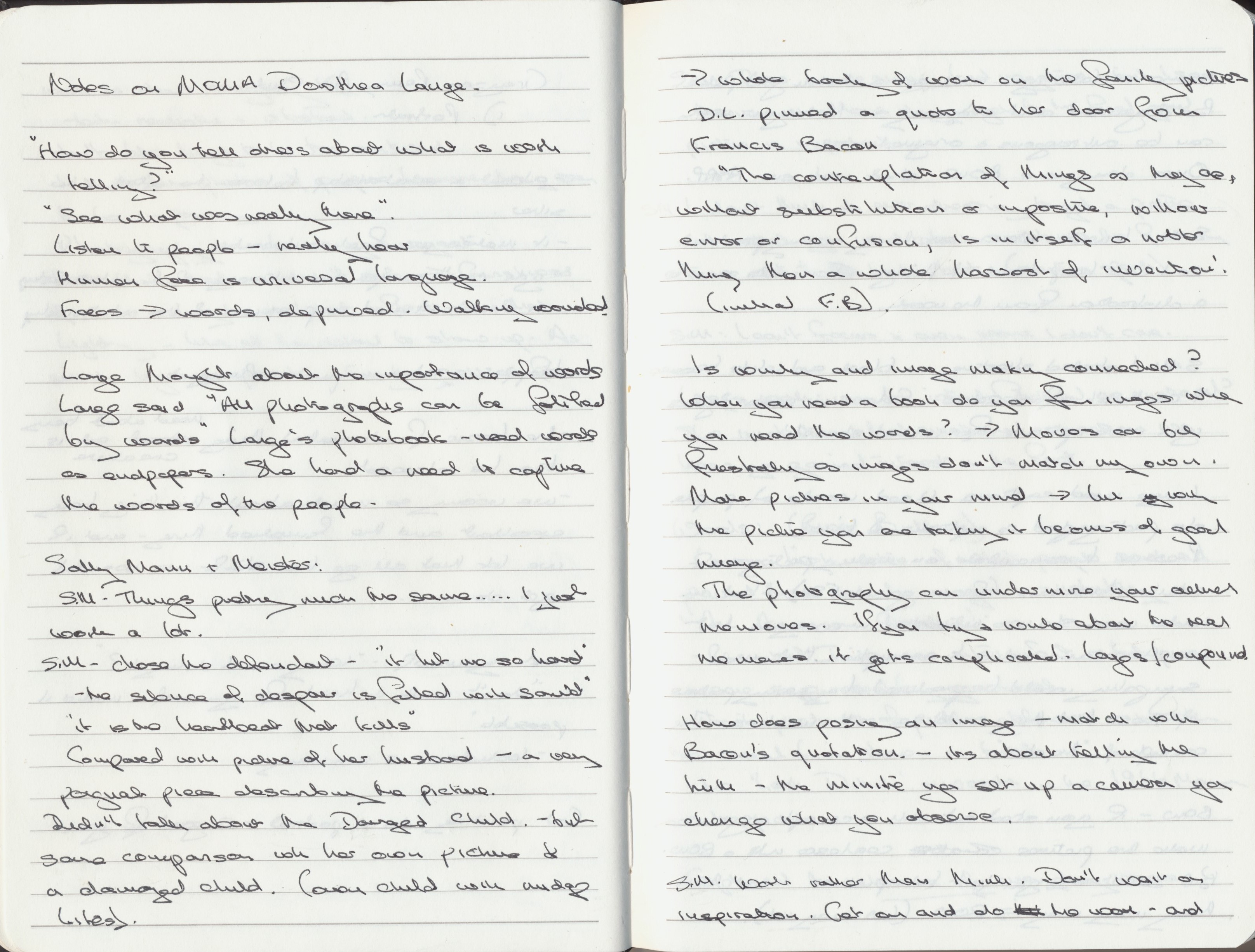
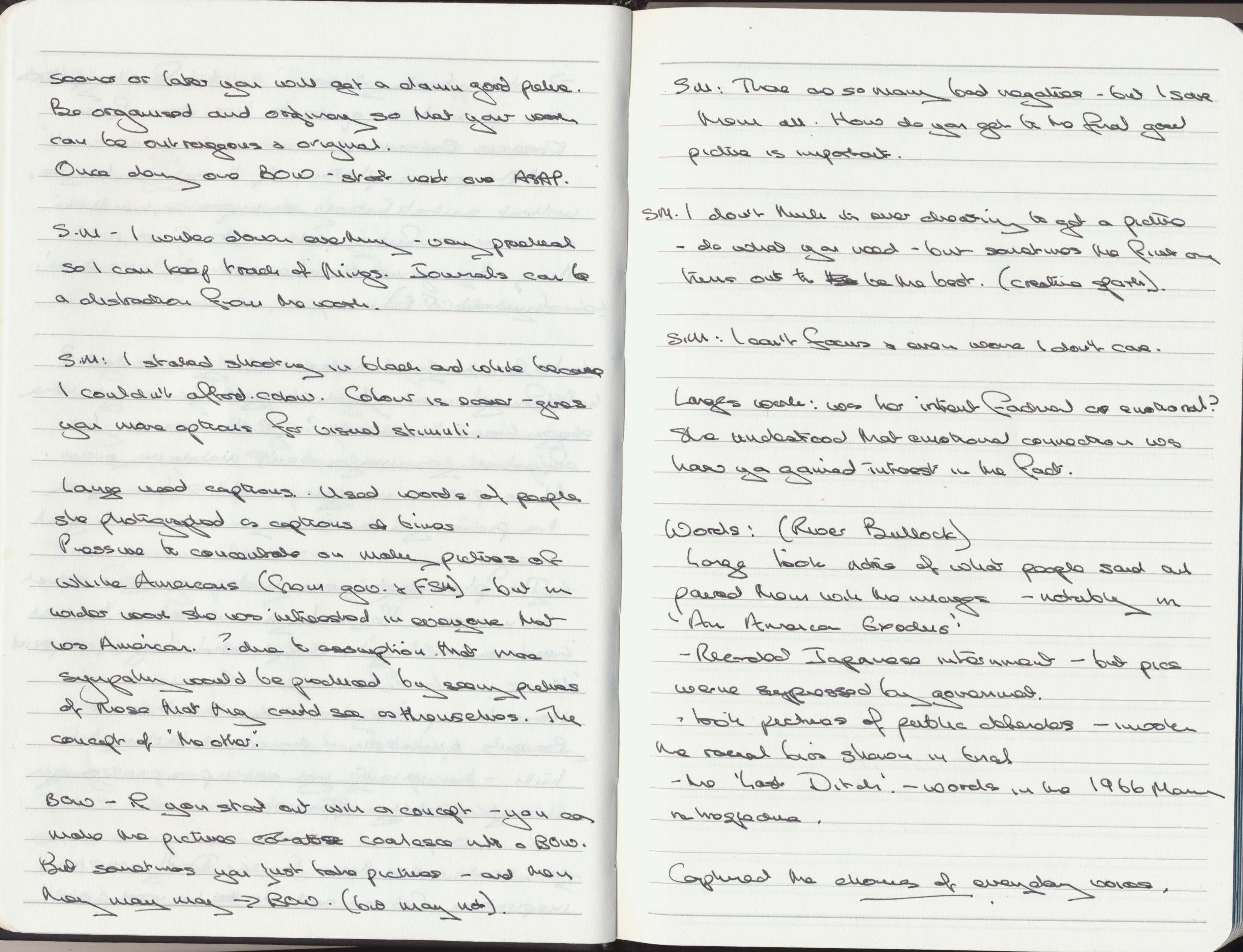
Coincidentally, or you might say serendipitously, I came across the virtual exhibition on Dorothea Lange at MOMA  (Meister, s.d.) just as I am starting Part 4, Image and Text of Identity and Place. In spite of her fame I know little of Lange’s work. There is the overriding image Migrant Mother. She worked for the Farm Security Administration.  She was American. I am now going to have to travel down a long exploratory road.

The virtual exhibition shows installation views, where you can click on the images to see some, possibly not all, of the pictures displayed. There are also a series of videos discussing her work, a fascinating live Q & A session with Sally Mann  and a work by Sam Contis Day Sleeper  that shows the way her work has developed from exploring Lange’s work ‘ a fragmented, unfamiliar world centred around the figure of the day sleeper – at once a symbol of respite and oblivion’ (Contis, 2020). The images are available on the MOMA website. (Contis, s.d.)

I took extensive notes (appended below). In summary the main things I took from the videos were:

  • See what was really there. Listen to the people and really hear
  • The human face is a universal language
  • All photographs can be fortified with words (Lange did this extensively)
  • Mann’s description of The Defender “it hit me so hard…the silence of despair is filled with sound”
  • The quote from Francis Bacon ‘The contemplation of things as they are, without substitution or imposture, without error or confusion, is in itself a nobler thing than a whole harvest of invention’ (Bacon lived 1562 – 1626).
  • Photography can undermine your actual memories of an event or a place. You remember the image not the reality. Writing about it further compounds the confusion – layers on layers
  • Work and get on with it
  • Be organised and ordinary so that your work can be outrageous and original (a slight twist/modernisation on a Flaubert quote
  • Lange was interested in everyone – not just the white Americans that the FSA wanted her to show

In the piece by River Bullock  (Bullock, s.d.) she gives two quotes from Lange:

 “I am trying here to say something about the despised, the defeated, the alienated. About death and disaster. About the wounded, the crippled, the helpless, the rootless, the dislocated. About duress and trouble. About finality. About the last ditch.”

“You see it’s evidence. It’s not pictorial illustration, it’s evidence. It’s a record of human experience. It’s linked with history. We were after the truth, not just making effective pictures. To tell the truth is in some people’s nature and it can be a habit, but you can also get in the habit of not telling the truth.”

There is a very poignant book of poetry by Tess Taylor Last West (Taylor, 2020) that has been written to coincide with the exhibition. It consists of a college of words from Lange’s own diaries, words spoken by the people she met and Taylors own words that she found while following Lange’s footsteps across California. It finishes:

                you might walk for a while

                as the road grows distant;

                might feel in the silence

                how you’re just walking –

                might feel           for a moment

                how                       it’s just earth again.

I have also taken the opportunity to look at the exhibition catalogue (Meister et al., 2020) which contains a fascinating series of essays along with the images. In the first essay Sarah Meister talks about the use of words alongside images and how important Lange thought that to be. However, despite its importance, the words could change – Migrant Mother was only the last of a series of titles and descriptions given to that image. The story of this is told in the book including copies of Lange’s thoughts on it in Popular Photography (pp.134-145). Meister notes ‘In the hazy middle ground of truth and invention are the carefully selected truths that hold the powers to persuade’ (p.21). The book also contains a series of essays in which writers, photographers and philosophers talk about their favourite image in the exhibition. They make fascinating reading – the choice of Kimberly Juanita Brown is simply titled Grayson, San Joaquin Valley, California, 1983. It shows a clapboard building and only when you look closely you realise it is a church with a dead body on the porch. A surprising choice? – But when you check her online you discover that she is a professor specialising in gender studies, slavery, and the images of the dead. Other essays talk about the history related to the images ‘a ten-year apocalypse of dust, human suffering, and folly’, ‘will history continue to repeat until the torturous cycle collapses in on itself?’ (p.65) by Wendy Red Star (a Native American multi-media artist) on Tractored Out, Childress County, Texas, June 1938.  Sally Mann’s writing about The Defendant, Almeida County Courthouse, California,1955-57 reads as a prose poem. ‘But the defendant’s heart: there is no warming sun, no warming spirits, no comfort of companionship’ (p.126).  Much of the catalogue shows pictures of the books and magazines that Lange’s work was published in. It is, therefore, possible to read the text that they were originally shown with, alongside some comments that Lange or her co-workers  made about them, for instance: “the Mormon story turned out very sour indeed” by Ansel Adams as the pictures they had chosen were severely cut down.

I am also reading the fascinating biography of Lange by Linda Gordon Dorothea Lange; A Life Beyond Limits.(Gordon, 2009). I think I may be a little Lange obsessed.

Notes:

References:

Bullock, R. (s.d.) Written by Dorothea Lange. At: https://www.moma.org/magazine/articles/245 (Accessed  08/05/2020).

Contis, S. (2020) Day Sleeper. London: Mack.

Contis, S. (s.d.) A Portfolio of Photographs from Sam Contis’s Day Sleeper | Magazine. At: https://www.moma.org/magazine/articlCes/293 (Accessed  08/05/2020).

Gordon, L. (2009) Dorothea Lange: A Llife Beyond Limits. (1st ed) London ; New York: W.W. Norton & Co.

Meister, S. (s.d.) Dorothea Lange Words & Pictures/MOMA. At: https://www.moma.org/calendar/exhibitions/5079 (Accessed  08/05/2020).

Meister, S. H. et al. (2020) Dorothea Lange: Words & Pictures. (1st ed) New York: The Museum of Modern Art.

Taylor, T. (2020) Last west. (1st ed) New York: The Museum of Modern Art.


Reflection on Assignment 3

Demonstration of Technical and Visual Skills:

  • The images are clear although the lighting is variable
  • I have shown a range of images of the club, including area shots, portraits of the members and details
  • Putting the images into a PowerPoint show was the first time I have tried this

Quality of outcome:

  • The story is told in the images
  • I would have liked to redo some of the pictures, but this was impossible in the present climate

Demonstration of creativity:

  • I have tried to be creative by using varied images and viewpoints
  • The images are all straight documentary photography, and this was important to telling the story. It is about a club and a series of events rather than about emotions and feelings.

Context:

  • The whole assignment was based on the work done in part 3
  • I have done extensive reading of story-telling picture essays – this is a rabbit hole that it is far to easy to fall down.
  • The context should be seen in relation to work such as the Summer Camp by Mark Steinmetz, although this group of people covered a wider age range.

Assignment 3 – Windows

DWARF – One Friday Night

The assignment brief was to find out about a community you do not know much about, get to know them and tell their story.

 Planning:

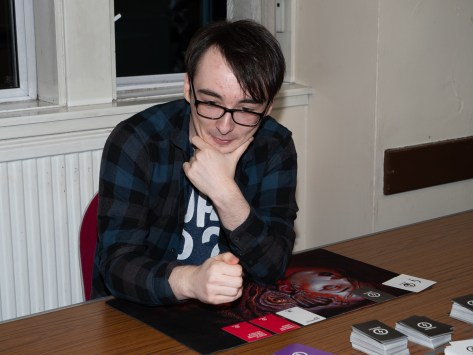
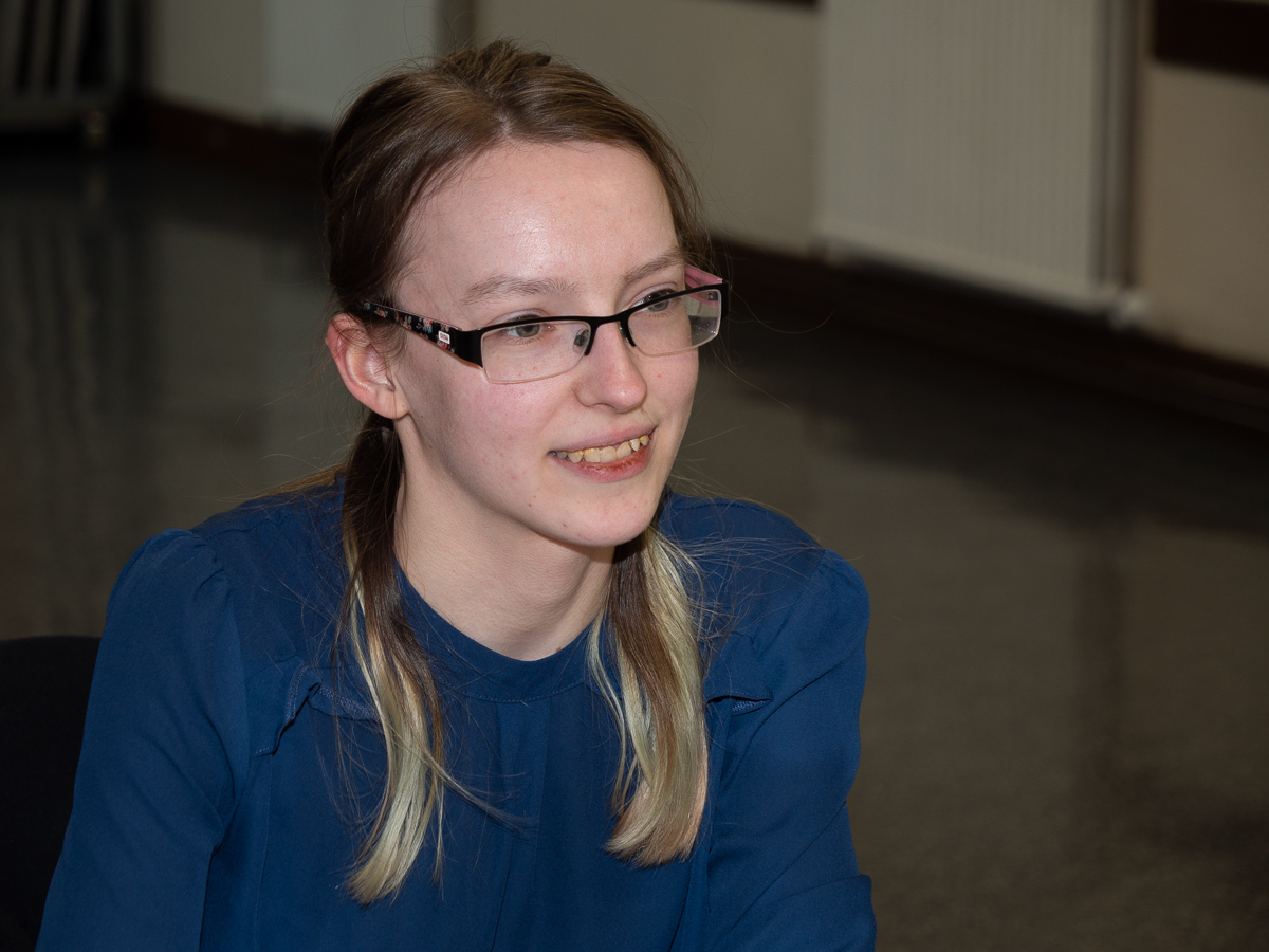
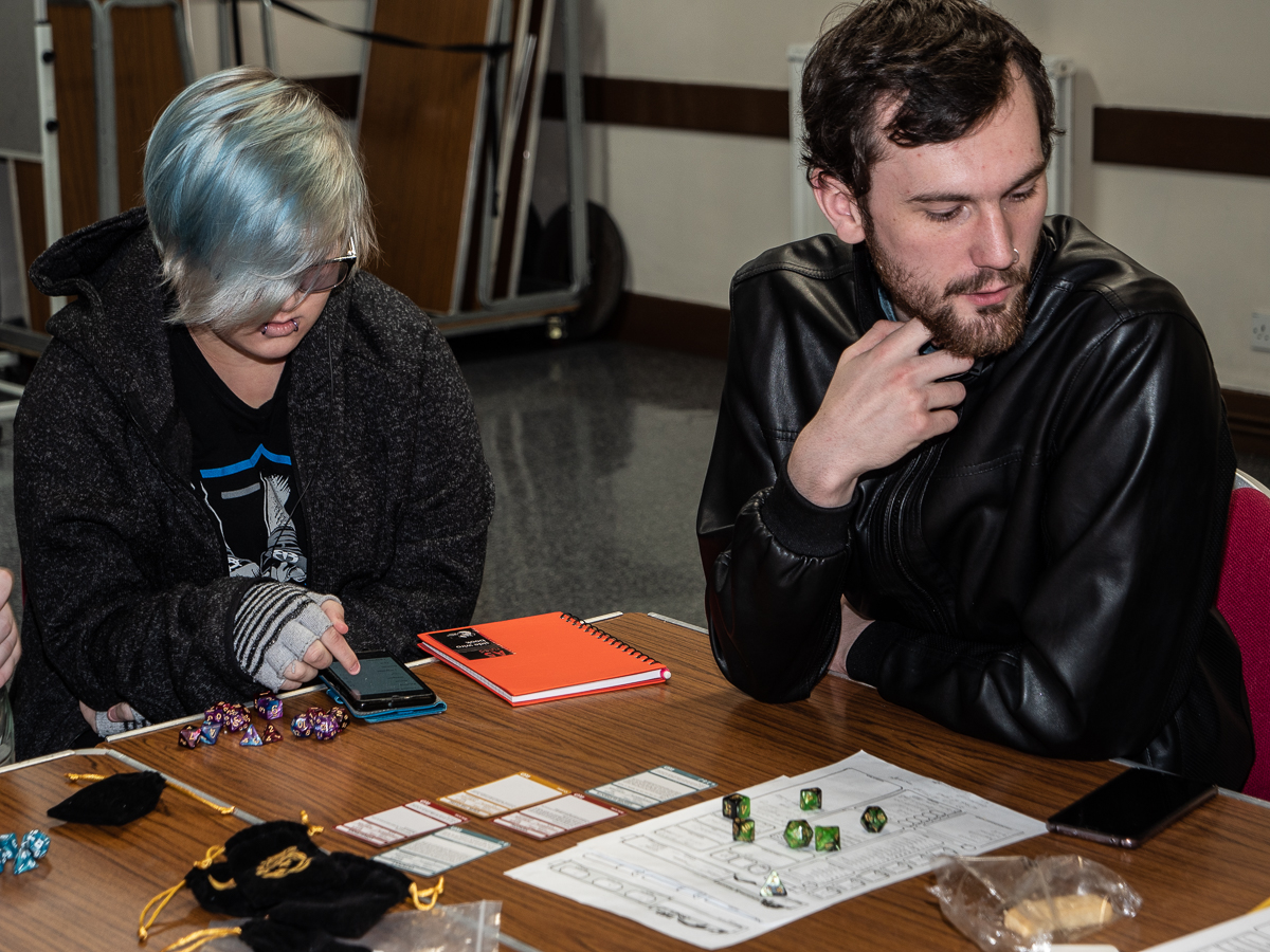
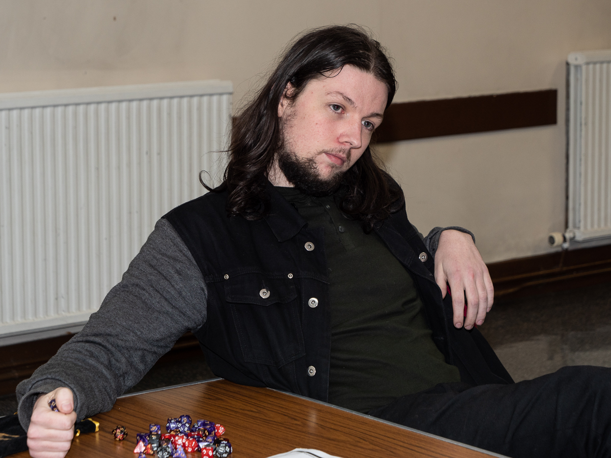
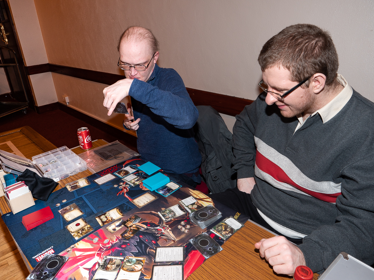
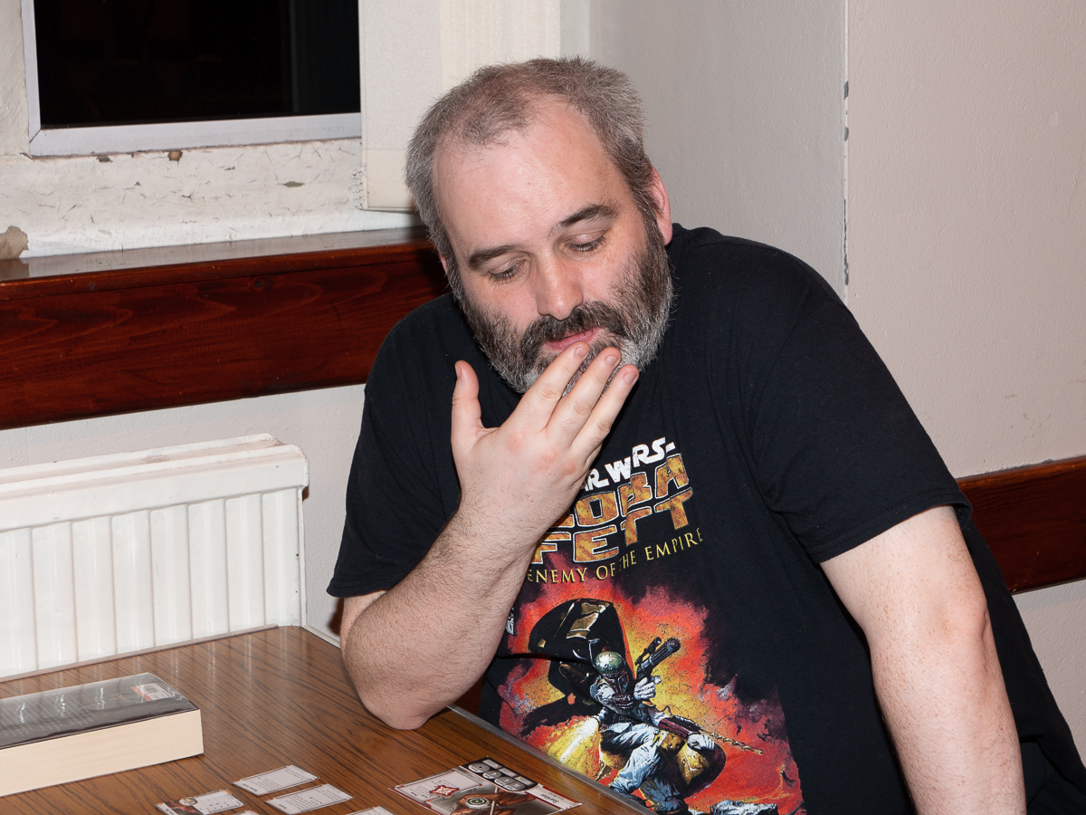
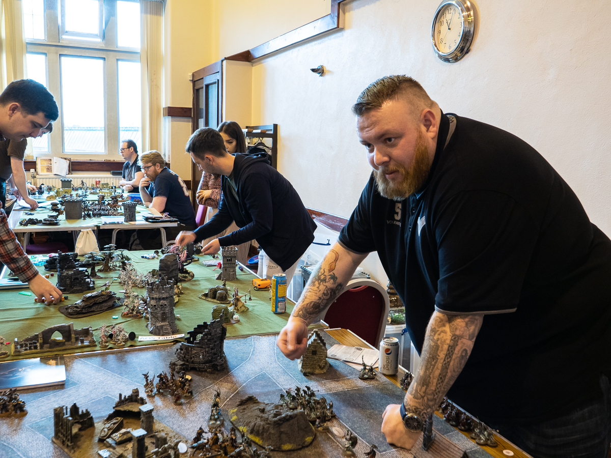
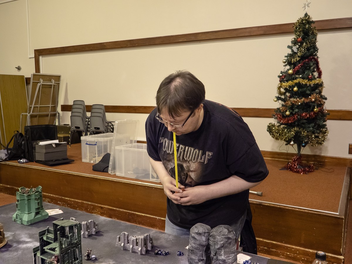
I chose to tell the story of the local gaming club – DWARF (Dunfermline Wargaming and Roleplaying Fellowship). They meet every Friday night and occasionally at weekends especially during the school holidays. The group has up to 510 members but there is a fairly constant cohort of about 50 people who attend most activities. They also run larger meetings twice a year to link with other groups across Scotland.

The club consists of three sections:

  • Wargaming
  • Role playing
  • Tabletop games

Most people are consistent members of one group, but they may also engage in other activities from time to time.

My initial thoughts and processes are shown here:  Assignment 3 – Starting point

Research:

I did a large amount of reading around the subject of telling stories and looked at several books and online series to consider how other people have put their work together. The main thing I learnt was that there are as many ways of telling stories as there are story tellers, but the most important ones are a real interest in the story you are telling, an emotional engagement and some form of internal consistency. This consistency can be in the colour (or lack of), the format or the tonal values – or simply in the underlying feeling of the piece of work.

For details of the research see: Research for Assignment 3

Process:

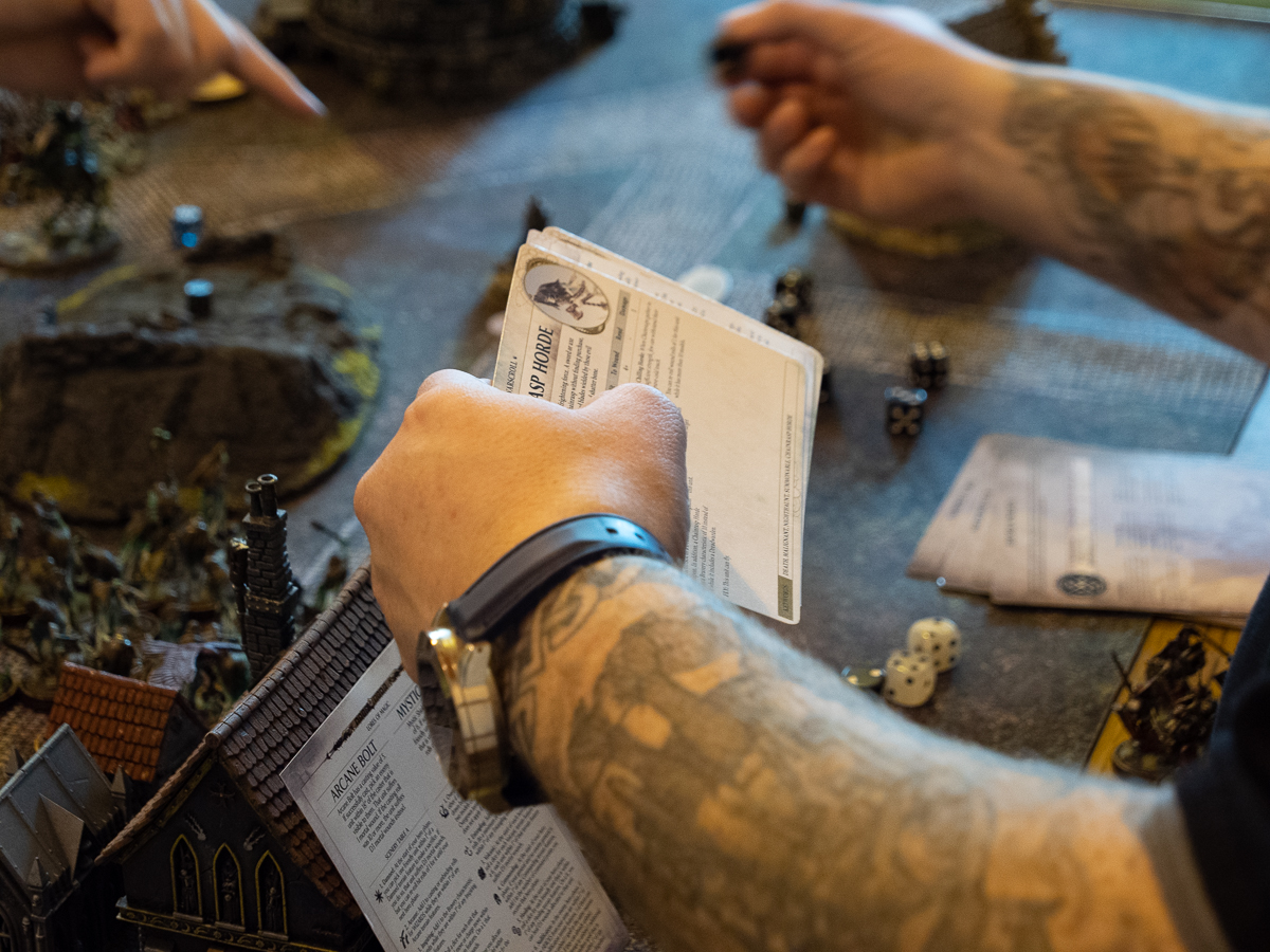
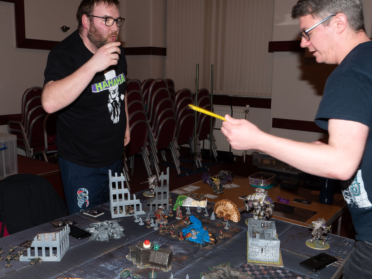
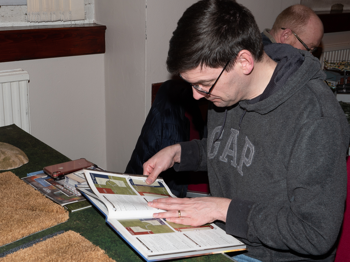
  • The club was keen to engage with me and very welcoming. I attended 6 sections and was planning to attend more but this was cut short by the corona virus. I spent time chatting with the people and learning about the various games they play. I had been in a role-playing club many years ago and two of my children also play so I had some initial insight into the activities.
  • I took images (lots) of all the activities, eventually using flash because of the difficulties with light. I had hoped to avoid it because it can be intrusive – but nobody seemed to mind.
  • I then cut these images down into sections to try and tell the story.

The details of my thinking around the story telling and choosing images can be seen here:  Assignment 3 – Choices

Final choices:

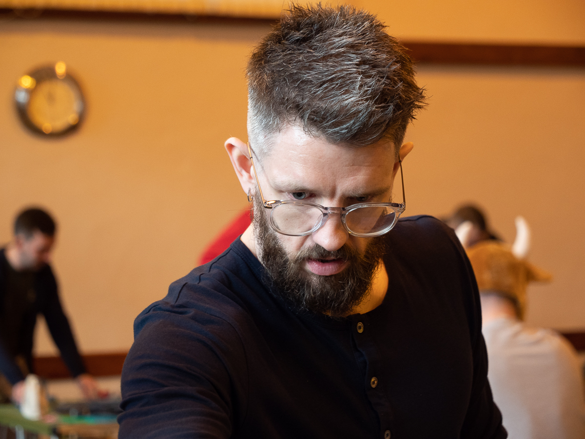
The main consideration was how best to tell the story. I had a lot of usable images – but there is a lot happening at each meeting. I considered only telling part of the story – concentrating on only one part of the activity going on, but I was reluctant to do that, partly simply because it does not give the true picture of the club, and partly because the whole membership had given me their time. I also considered focusing on the portrait images I had taken. Again, this only tells part of the story although they are a very interesting group of people and clearly enjoyed having their pictures taken.

The final images chosen tell the story of what happens on a Friday night, with some about the games, some details of the activities and some about the individual people.

Images:

Wargames (3 of 12)

Whole story (11 of 15)

Whole story (8 of 15)

Whole story (1 of 15)

Whole story (2 of 15)

Whole story (5 of 15)

Whole story (6 of 15)

Whole story (13 of 15)

Whole story (10 of 15)

Whole story (14 of 15)

Whole story (7 of 15)

Whole story (9 of 15)

Whole story (12 of 15)

Whole story (15 of 15)

Tabletop (12 of 12)

For PowerPoint see:

DWARF

With thanks to all the members of DWARF


Assignment 3 – Choices

Having spent time looking over the (very) large number of pictures taken at DWARF (Dunfermline Roleplaying and Wargaming Fellowship) and cutting out all the ones where the focus, lighting or general look was wrong I then have had to try and decide on a theme.

There are 3 main sections to DWARF:

  • The role-playing faction – who mainly play Dungeons and Dragons, but occasionally divert into card cakes such as Yu-Gi-Oh
  • The tabletop gamers who tend to play a different game each week
  • The wargamers – mainly Warhammer of various iterations although other things like Bolt Action are also played

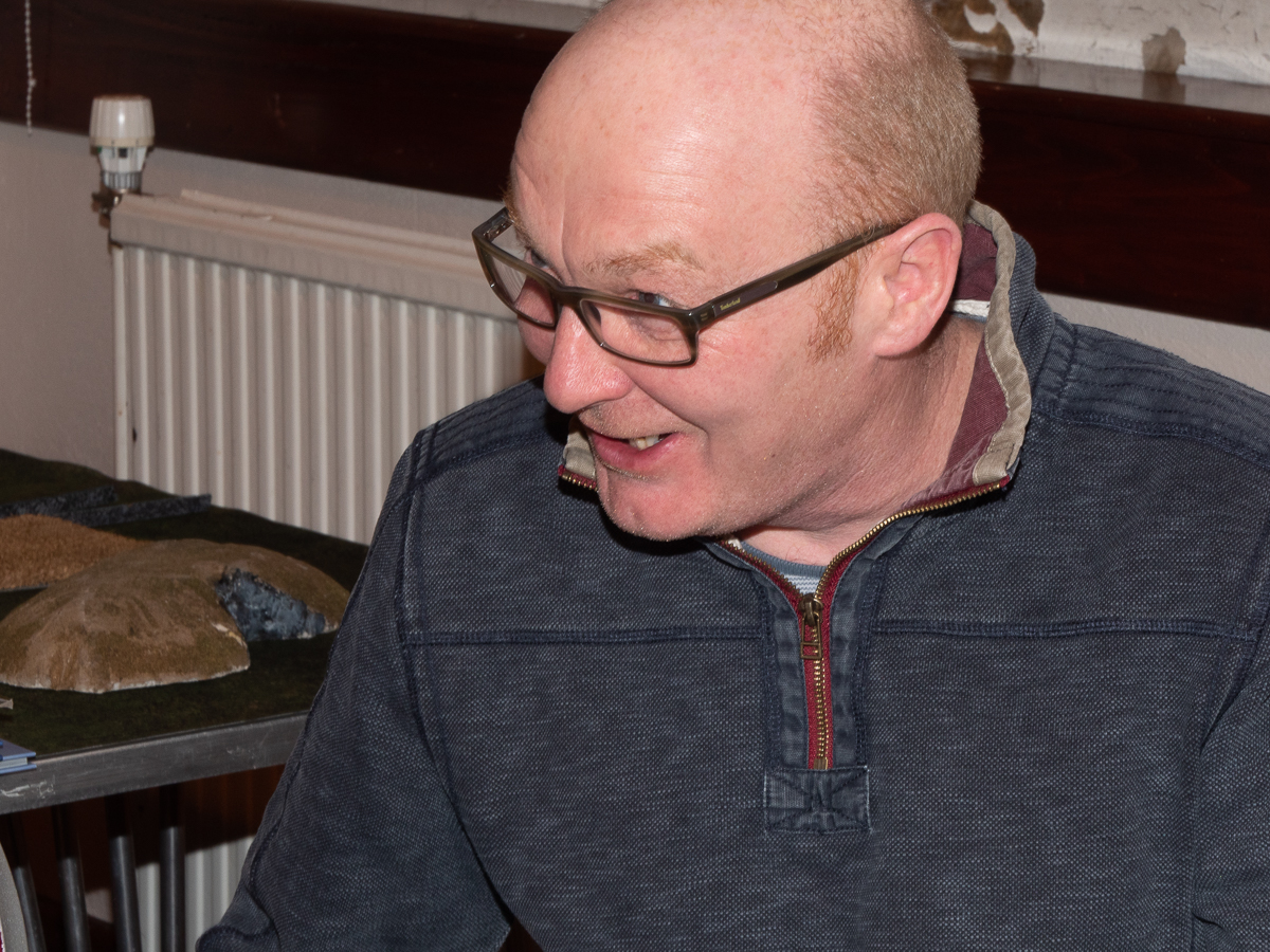
All the three groups were keen to engage with me, to have their photos taken, to ask for their photos to be put up on the group website and to suggest that I might like to join in. It was generally a very friendly group. A few people did not want to be photographed and I deliberately avoided photographing the under 16’s – although their parents were all happy for them to be involved with the project.

I then divided the images up into the 3 groups and selected the ones that told most about the activities, including some portraits. I could have used just portraits but felt that this did not say anything about the activity itself. This, eventually, gave me three groups of 12 images.  The next problem was what to show. I came up with 3 possibilities:

  • Pick one of the 3 groups and concentrate on them
  • Choose a smaller selection of each of the 3 and put them into an overall story
  • Just use the portraits – but as above this limits the overall information given

Possibilities shown here:

Role playing:

Tabletop:

Wargaming:

Whole story:

The next problem is my usual dilemma of black and white versus colour.  Most of the stories I looked at while doing research for putting a narrative together used black and white, even those that were made recently. It does have the effect of concentrating ones viewing on the faces, and, as a side benefit, would have enabled me to lose the awful colour cast given by the very peculiar lighting in the halls they use. I think if I end up doing a separate piece of work using portraits of the group that would be the way to go. However, much of the information about the activities comes from the, at times garish, colour in the games and the models. Certainly, the wargamers are extremely proud of the paint jobs and the colours act to define much of the story they are acting out. So, colour it is.

I now need to make a final choice. I would have liked to take the options to the group and ask them about how they would like to be presented to the outside world – but this is difficult at present. I will post this on the group website and see if any of them get back to me.

Mark Steinmetz

Summercamp-3
© Mark Steinmetz (with thanks) – from Summer Camp

Mark Steinmetz (born 1961) is an American photographer who spent 11 years working as a photographer in a variety of summer camps. He would take pictures and act as a photography tutor. Out of that body of work came Summer Camp (Steinmetz, 2020) which is a collection of images taken between 1986 and 1997. They were collected into book format in 2019. Steinmetz comments for the book information that ‘certain things never changed …. there isn’t much difference between them in 1990 or 1965’. Despite the pictures being taken over a considerable time they maintain a consistent look, they are all black and white and mainly low key, however, some are portrait and some landscape format. The book tells a story from arrival at the camp, though the daytime activities, to evening to night-time and then departure and saying goodbye. There are no captions – but the story is clear. In most of the images the children are not looking at the photographer, simply getting on with having fun (or not). The book is divided into sections by blank pages, a pause in the story, a shifting mood. The overall feeling is one of wistfulness, of a gentle melancholy. Steinmetz himself had been to summer camp as a child/teenager and notes ‘At summer camp you find yourself in a different, unfamiliar world and you have no choice but to adapt’ (Rosen, 2020). This experience has a undoubtedly influence the images he took and the engaging mood of the book.

Steinmetz has also published another series on American youth – The Players (Steinmetz, 2015). These images are of teenage baseball players and were taken at a similar time to those in Summer Camp. The images have a similar feel, a mixture of awkwardness and bravado, together with the intense involvement in the moment that young people often show.

His other recent book – Carnival (Steinmetz, 2019) – concentrates on the people who are involved in the country fairs, and small circuses that travelled around America. The images were taken from 1982 – 2001 and appear timeless. They capture both the workers and the people there to have fun and show the same ability to be there but not be noticed, to take images that show the life, not the people looking at you. The book tells a story, moving though the day, with people outside the fair to night-time, (to see a range of images from this book see the Guardian article referenced below).

Almost all Steinmetz’s images are back and white. An exception seems to be some of his fashion images, although, even then, the majority are monochrome. They have a timeless feel, a gently told story. Even the images of an airline terminus and a flight remain quiet – a real challenge given the amount of noise in that environment. He is a wonderful storyteller with a gift for being anonymous to those around him.

Reference list:

Carnival: capturing all the fun of the fair across the US – in pictures (2019) In: The Guardian 14 November 2019 [online] At: https://www.theguardian.com/artanddesign/gallery/2019/nov/14/carnival-capturing-all-the-fun-of-the-fair-across-the-us-in-pictures (Accessed on 22 April 2020)

Rosen, M. (2020) Vintage scenes of life at an American summer camp. At: https://www.huckmag.com/art-and-culture/photography-2/vintage-scenes-of-life-at-an-american-summer-camp/ (Accessed on 22 April 2020)

Steinmetz, M. (2015) The Players. (s.l.): Nazraeli Press.

Steinmetz, M. (2019) Carnival. (s.l.): Stanley/Barker.

Steinmetz, M. (2020) Summer Camp. (s.l.): Nazrali Press.

Research for Assignment 3

When thinking about how to present this assignment I was aware that the brief included you can create as many pictures as you like …. the set should be concise and not include repetitive or unnecessary images. This means thinking about how to reduce a large number of images into a manageable piece of work that tells a story about the group of people I have chosen to work with.

In Short’s book Context and Narrative (summarised in Context and Narrative – Maria Short) she discusses the narrative that one might read in an image and points out that while it might be linear (beginning, middle and end) it does not have to be. The story should hang together, this might be because of use of similar tonal ranges, lighting or format – but might be because of the topic and that you need to be clear about your intention. Exploring the subject over time can end with you changing what you want to say and how you say it. The story may also depend on what order the images are shown in – so do you have control over that if it is important. (Short,2018).

With his information in mind I went and looked over my collection of photobooks to see which ones told a (fairly) concise story. Many that tell a story are long (book length) and involve many more images than I want to use, although this project could easily lengthen to a full book.  However, some of the books were shorter and told a relatively clear story.

 In this I have summarised the stories I read – concentrating on the ways the books and series were presented rather than on the whole import of each book. This is no attempt to do them justice – simply to pull out some information about how and why they were produced in a particular format, and the effect that’s those choices have had.

Julia Borissova white blonde – is telling a story of a place and a time, using a combination of archival images and altered self portraits. On her website it is also shown as single images and a slideshow. The order of the images varies though the sites (book versus slideshow) as does the format. In this case the series depends on the totality of the images, their tones and the feeling they evoke rather than the order in which they are viewed.  (Borissova, 2018) See Julia Borissova – white blonde for more detail.

 Margaret Lansink – Borders of Nothingness-On the Mend – tells about the emotions that were linked with her loss of contact with her daughter and subsequent re-engagement. The book is physically small. The paper is rough and the images low key, black and white with occasional flashes of gold. Little is clear. The order is important as it moves from despair through nothingness to repair and hope. The feel of the book is also important as it is very tactile, rough, and evokes the feelings described (Lansink, 2020). See Borders of Nothingness – On the Mend for more detail.

Bettina von Zwehl – Made Up Love Song – consists of a series of portraits done of the same person over 6 months, set in the same place and with similar light. The variations are minimal, her hair and clothing show subtle changes. The images are shown against a black background opposite a simple statement of the day and time. This is a very simple presentation where you gain from the repeated images showing the gradually increasing intimacy. While a single image is effective, the story gains by the repetition (Chandler and von Zwehl, 2014). See Bettina von Zwehl for more detail.

Robin Gillanders  – A Lover’s Complaint – takes the short Fragments written by Barthes, has them translated in haiku by Henry Gough-Cooper and then interspersed these with still life images, mainly of glass and material, shown as fragments against a dense black background. The haiku are presented 12 to a page, organised alphabetically, other than a final short poem about silence and love. There is no immediate obvious connection between the haiku and the images.  The viewer/ reader needs to make their own links. However, each group of images is linked, variations on a theme. As a whole, they start minimalistically, become more complex, then fade away – following a pattern. The words and the images give equal weight to the story (Gillanders and Gough-Cooper, 2016).

Dayanita Singh – Go Away Closer – is a series of 40 images in a small book. They are all square, and all black and white, and, other than the fact that they all tell about India, those are the only linking factors. Singh says she deliberately does not try to make a narrative but puts images together intuitively. In her work she collects her images into ‘museums’ – which she them changes around for different displays, even with the same exhibition. The work is about a feeling, rather than a story Singh, 2007), See Dayanita Singh – Go Away Closer for more detail.

All these photobooks are really about emotions rather than facts.  They may be based around a story, such as the Lansink’s Borders of Nothingness – On the Mend, or actively avoid a narrative like Singh’s Go Away Closer. In spite of this they all have a clarity about the way they have been put together, an internal consistency. The tonal values are similar, the feeling derived from the images are similar. They are clearly carefully considered. In two, Go Away Closer and white blonde, the order of the images is not crucial, while it has been, inevitably, fixed within the books, it is changed in other formats (a slideshow and an exhibition). These are all fairly short books, although longer than the series I am planning, but they taught me a lot about the type of consistency required to make a book hold together, and, even more importantly, to make the reader/viewer return to it.

I then decided to look at some of my photobooks that do tell an active story, that is about groups of people and what they are doing. These all seemed to be rather longer, and often physically larger – I am not sure about the reasoning for that.

Mark Steinmetz – Summer Camp – is a collection of images taken at American summer camps between 1986 and 1997. They were collected into book format in 2019.  The book is a gentle reminiscence of a past time, although he comments there has been little change in that environment over years. The images are shown in black and white, are varying sizes and formats. However, the overall feel is remarkably consistent. There is a mixture of images that concentrate on the activities and other that concentrate on portraits of the children. See Mark Steinmetz for more detail.

J.A. Mortram –Small Town Inertia – this is a collection of images and  paired stories about people that struggle with their lives in a small town in Britain. It could be (and has been) described as poverty porn – but what makes it stand out is that Mortram lives within the community, has his own personal struggles and is clearly both sympathetic with and understanding of those he photographs, never patronising. The images are all black and white, often harshly lit with marked contrast and shadow. Some are close up portraits, some show the environment, but all concentrate on the people. The book is laid out with an almost full-page image on the right page and the corresponding information including the name and usually a short explanatory passage on the bottom of the left page. This has the effect of concentrating the eye initially on the portrait and only secondarily looking at the words (Mortram, 2017).

Nan Goldin –The Ballad of Sexual Dependency –probably the most famous of all the lifestyle stories, taken very much from an internal position. The book is a small part of the whole work which also includes film, large scale exhibition works and talks. Goldin calls it as ‘the diary I let people read’ in  the beginning essay and virtually at the end of the copy I have ‘a volume of loss, while still a ballad of love’ (Goldin, 2012). The images are harsh with often an odd colour cast. They are not all in focus and are presented with a short title, usually of who and where. Every time I look through it I notice different details. It holds the eye without any pretence at conventional beauty.

I also looked at a variety of short series online, picking them from the links that regularly pop up on my tablet, including Lenscratch, Aperture, BJP, Photographic Museum of Humanity and FOAM. This exercise could actually fill an entire book – so I have just picked out four that really caught my eye!

B. Proud Transcending Love – is the latest series by the American photographer B. (Belinda) Proud. It is about Transgender and Gender Non-conforming Couples in America, who are a mainly forgotten and mistreated group of people. The portraits she shows are of families and couples who are clearly proud to be together. The portraits are formal, in colour, deliberately chosen to represent the full spectrum of the relationships she is describing, and she says ‘This project is about the validity and fluidity of gender expression. The location for each portrait, chosen by the couple in discussion with the artist, is significant and provides the viewer with another level of understanding into the relationship’ (Smithson, 2020a). The portraits are shown with a simple title, some tell the gender/status of the people, others do not. From the website it is difficult to tell if the order is important – overall I suspect not. Each image could be first or last. The importance is in the group as a whole.

Mulugeta Ayene – Ethiopian Airlines Flight 302 Crash Site – World Press Photo Story of the Year Nominee, – this is not the same as many of the series/stories talked about above as it is a very factual piece of documentary work. However, it shows many of the points I have been thinking about. It is in colour, the images are factual but varied, from wide area shots, to details of the objects collected, to harrowing images of the people involved and those who lost friends and relatives. They are shown with dates and brief explanatory notes. Oddly, the images are not shown in date order, I think this may be to concentrate on the story – but it is then distracting to know the dates. (www.worldpressphoto.org, 2020).

Bowei Yang – Soft Thorn – is a dream or an illusion that tells the story of a gay boy/man growing up in a Christian community in China. ‘A journey of nostalgia’. It contains a mixture of staged portraits of his friends and slices of the environment, together with still life images. Some are portrait, some landscape but they are all linked by the muted tones and subdued and at times sad atmosphere that pervades the series. It gives a clear feeling of how difficult his teenage years must have been.  I will watch for more work from him – or hopefully an extension of this (Yang, 2020).

Cathy Spence – Crooked Eye – shows a very personal project about a young man, Wesley, her son, who has albinism and visual problems. It consists of a series of heartbreaking portraits which mainly show him facing away from the camera or covering his eyes with his hair. They are high key, in keeping with the subject. At some points they are almost burnt out – but this just emphasises the story. Some are blurred, reflecting on Wesley’s poor vision. Several formats are used but this does not distract from the consistency of the series. The series is highly effective at showing the difficulties of growing up with an obvious difference that few people probably understand (Smithson, 2020b).

What have I learned from all this?

  • You need to know what you want to say
  • You need to be passionate about it
  • You need to be internally consistent to hold the story together, either in colour or size or format or feeling
  • There are as many formats for storytelling as there are photographers
  • The order of the images may depend on the place they are being shown (book/exhibition/slide show online)
  • Black and white is still widely used – especially when the point of the story is about emotions – but not always
  • Precise focus and lighting are not always important (but possibly less so the more famous you are) – but this does depend on what you are showing – Goldin’s Ballad versus Ayene’s work on an air disaster.

Reference list:

Borissova, J. (2018) White blonde. (s.l.): Bessard.

Chandler, D. and Von Zwehl, B. (2014). Made up love song. London: V & A Publishing.

Gillanders, R. and Gough-Cooper, H. (2016) A Lover’s Complaint. Edinburgh, Scotland: Dingle Press.

Goldin, N. (2012) The ballad of sexual dependency. New York, N.Y.: Aperture Foundation.

Lansink, M. (2020). Borders of Nothingness – On the Mend. Belgium: Ibasho

Mortram, J. (2017) Small Town Inertia. (s.l.): Bluecoat Press.

Mulugeta Ayene SOY-DJ | World Press Photo (2020) At: https://www.worldpressphoto.org/collection/photo/2020/39610/4/Mulugeta-Ayene-SOY-DJ (Accessed on 29 April 2020)

Short, M. (2018) Context and narrative. London ; New York: Bloomsbury Visual Arts.

Singh, D. (2007). Go Away Closer. Göttingen, Germany: Steidl.

Smithson, A. (2020a) B. Proud: Transcending Love: Portraits of Transgender and Gender Non-conforming Couples. At: http://lenscratch.com/2020/04/b-proud-transcending-love/ (Accessed on 28 April 2020)

Smithson, A. (2020b) Cathy Spence: Crooked Eye. At: http://lenscratch.com/2020/04/cathy-spence/ (Accessed on 2 May 2020)

Steinmetz, M. (2019) Summer Camp. China: Nazraeli Press.

Yang, B. (20AD) SOFT THORN. At: https://phmuseum.com/Boway_Yang/story/soft-thorn-ecea0f8693 (Accessed on 2 May 2020)

Interview with Maisie Cousins

finger_web-copy-1200x1800
© Maisie Cousins from Grass, Peony, Bum

I watched the recent interview by Shoair Mavlian of Photoworks with Maisie Cousins which centered around her latest book and show Rubbish, Dipping Sauce, Grass, Peony, Bum. I have seen some of her images before and have not been altogether sure about my feelings, however, listening to her talk about them made more sense. Cousins explained how she had not enjoyed either school or university as she felt too constrained by other people choices and the need to be able to explain exactly what she was doing and why. However, her present way of working is probably a direct result of that, she left and immediately felt unconstrained.  She said, ‘I like to collect things over years and then to figure out what is going on’. She feels that putting images out as a book or a show is important as it sums the work up, allows closure and allows you to see the images at the scale she imagines them as. Many of her images are macro, then shown vastly blown up. The images in the latest book are full bleed, showing no white and very vivid. The cover is shiny gold, to echo the floor from one of her exhibitions at T.J.Boultings. Her images are often full of decay, gross, phallic and repulsive (although strangely beautiful). She uses intense lighting, and everything is in sharp focus and does minimal post-production work.

She spent some time discussing her feelings about photography. She mainly takes still-life at present. She said ‘I don’t take photos of people because it can seem you are imposing yourself on them …. Photography can be very arrogant’. She rarely uses a tripod in her personal work as she like to feel the camera as part of her, a third arm. ‘The lens becomes an extension of my body’.

Overall, this was a fascinating interview and I then spent some time looking at her images. They are lush and vibrant. Surprisingly uplifting given that many of them are of decayed objects.  I have added her book to my ‘wish list’.

In Addition:

I have now managed to acquire a copy of the book discussed above and it is just as lush as I expected it to be. Some of the images I love, others less so, probably because I have a phobia about slugs, but oddly enough not about snails, either to touch or to eat. Maybe if I put it on my wall, I can manage self-therapy! The cover is a deep and shiny gold, smooth and tactile, highly reflective – I want to somehow balance it in front of me and take my reflection in it. In the initial essay Simon Baker describes her work as ‘decadent and seductive’. It is certainly that, the cherries look so ripe I want to eat them. If it wasn’t impossible just now (lockdown), I might have found myself going to the nearest supermarket to buy a punnet, then consume them all. But then I see the ants, and somehow my appetite is gone.

IMG_6943

Serendipitously, in the same post, I received a copy of Bernard O’Donoghue’s The Seasons of Cullen Church. (O’Donoghue,2018) A quiet, calm book of poetry, wrapped in brown, that talks about the life in Ireland in the past. A meditation. Just the opposite. Or is it? It talks about death and the breaking down of life, and near the end is a short poem entitled Dublin Bay, which includes the lines

       To begin with, tight knots, dark bruises

the colour of drying, hardened blood.

So where does that flare of folded red

come from, that parachute silk

of layered satin

A perfect pairing of poems and pictures.

The interview can be watched at:

https://www.instagram.com/p/B_Mzz-rjKV2/ [Accessed 28 Apr. 2020]

See her website for more of the images:

https://www.maisiecousins.com/ [Accessed 28 Apr. 2020]

Notes:

References:

Cousins, M. (2019) Rubbish,Dipping sauce,Grass peonie bum. (s.l.): Trolley Ltd.

Cousins, M. (s.d.) grass, peonie, bum. At: https://www.maisiecousins.com/ (Accessed on 28 April 2020)

Mavlian, S. (2020) Photoworks’s Instagram profile post: “Shoair Mavlian, Director, Photoworks, in discussion with Maisie Cousins in the latest in our series of virtual book launches on the….” At: https://www.instagram.com/p/B_Mzz-rjKV2/ (Accessed on 28 April 2020)

O’Donoghue, B. (2019) Seasons of Cullen Church. Padstow: Faber & Faber, Limited.