Category Archives: Assignment 3 – Window

Assignment 3 – Redo

I have just received by tutor’s report on A3. Some was positive, some less so.

He was positive about the research and my coursework which is helpful as it suggests I am going along the correct lines here.

The main problem was with the photographic series I submitted for A3. He gave a long analysis of it. The bottom line, although phrased much more kindly, was that it was boring and bland!

‘Your images feel just like a document of a time and a place, I think that the audience want to feel something, know a little more about you. I think that you have been too restrained when producing the images. I think that there is room for more creativity and experimentation.’

‘The other aspect of working with a traditional narrative is the type of images we use in-order to create the story. Much like films, narratives will be built upon using a variety of types of shots such as the establishing shot, mid shot, close up and detail.’

‘The bottom line that I’d like you to take away is that although I feel that your critical input is strong, very relevant and it’s very important for the assessment criteria it’s distracting you from the actual production and process of your work. I get the impression that you are holding back. I think that you have the potential to produce stronger, more engaging (remember you have to gain the viewers interest) images. Let your guard down a little, work from intuition and be prepared to experiment with your images, think about more contemporary photographic approaches.’

Taking that on board, I have gone through the images I took and selected a different cut that hopefully is a little more interesting. I have also tried to arrange them more in a traditional narrative format, moving though the scene from distance to close up/detail for each set of images. Unfortunately, due to the present circumstances, it is not possible to go back and take any new images to make a more interesting set. It may well be several months before DWARF reopens.

I am very aware that I tend to go for the ‘safe’ images. In spite of having taken photographs for many years I have only just started taking pictures of people and do hold back from trying new things or experimenting with viewpoints. I find I like to please the subject – and in most cases my portraits do – but this is probably because they are safe and are what people expect of a photo of them. Unfortunately, this sort of image could be taken by anybody and shows nothing special – so I need to be more adventurous and experimental.

My tutor also gave me links to two photographers:

  • Donigan Cummings – who took his disturbing and graphic images of people in 1990 (published in 1991) and said “If you leave unsettled and afterwards don’t look at photographs the same way, the next time perhaps you won’t approach them with the same shallowness” (Reznik, 2014)
  • Boris Mikhailov – who took images of the poverty in Kharkov in 1887/98. Again, these are disturbing images that force you to think (Respini, 2011)

Neither of these artists could be considered safe, boring, or bland – I will look at them both in more detail for inspiration.

Powerpoint:

Dwarf Trial 2.pptx

References:

Respini, E. (2011) Boris Mikhailov: Case History | MoMA. At: https://www.moma.org/calendar/exhibitions/1125 (Accessed 03/06/2020).

Reznik, E. (2014) The Stage: Donigan Cumming’s Photography of the Absurd | Time.com. At: https://time.com/3807903/photos-of-the-absurd/ (Accessed 03/06/2020).

Reflection on Assignment 3

Demonstration of Technical and Visual Skills:

  • The images are clear although the lighting is variable
  • I have shown a range of images of the club, including area shots, portraits of the members and details
  • Putting the images into a PowerPoint show was the first time I have tried this

Quality of outcome:

  • The story is told in the images
  • I would have liked to redo some of the pictures, but this was impossible in the present climate

Demonstration of creativity:

  • I have tried to be creative by using varied images and viewpoints
  • The images are all straight documentary photography, and this was important to telling the story. It is about a club and a series of events rather than about emotions and feelings.

Context:

  • The whole assignment was based on the work done in part 3
  • I have done extensive reading of story-telling picture essays – this is a rabbit hole that it is far to easy to fall down.
  • The context should be seen in relation to work such as the Summer Camp by Mark Steinmetz, although this group of people covered a wider age range.

Assignment 3 – Windows

DWARF – One Friday Night

The assignment brief was to find out about a community you do not know much about, get to know them and tell their story.

 Planning:

I chose to tell the story of the local gaming club – DWARF (Dunfermline Wargaming and Roleplaying Fellowship). They meet every Friday night and occasionally at weekends especially during the school holidays. The group has up to 510 members but there is a fairly constant cohort of about 50 people who attend most activities. They also run larger meetings twice a year to link with other groups across Scotland.

The club consists of three sections:

  • Wargaming
  • Role playing
  • Tabletop games

Most people are consistent members of one group, but they may also engage in other activities from time to time.

My initial thoughts and processes are shown here:  Assignment 3 – Starting point

Research:

I did a large amount of reading around the subject of telling stories and looked at several books and online series to consider how other people have put their work together. The main thing I learnt was that there are as many ways of telling stories as there are story tellers, but the most important ones are a real interest in the story you are telling, an emotional engagement and some form of internal consistency. This consistency can be in the colour (or lack of), the format or the tonal values – or simply in the underlying feeling of the piece of work.

For details of the research see: Research for Assignment 3

Process:

  • The club was keen to engage with me and very welcoming. I attended 6 sections and was planning to attend more but this was cut short by the corona virus. I spent time chatting with the people and learning about the various games they play. I had been in a role-playing club many years ago and two of my children also play so I had some initial insight into the activities.
  • I took images (lots) of all the activities, eventually using flash because of the difficulties with light. I had hoped to avoid it because it can be intrusive – but nobody seemed to mind.
  • I then cut these images down into sections to try and tell the story.

The details of my thinking around the story telling and choosing images can be seen here:  Assignment 3 – Choices

Final choices:

The main consideration was how best to tell the story. I had a lot of usable images – but there is a lot happening at each meeting. I considered only telling part of the story – concentrating on only one part of the activity going on, but I was reluctant to do that, partly simply because it does not give the true picture of the club, and partly because the whole membership had given me their time. I also considered focusing on the portrait images I had taken. Again, this only tells part of the story although they are a very interesting group of people and clearly enjoyed having their pictures taken.

The final images chosen tell the story of what happens on a Friday night, with some about the games, some details of the activities and some about the individual people.

Images:

Wargames (3 of 12)

Whole story (11 of 15)

Whole story (8 of 15)

Whole story (1 of 15)

Whole story (2 of 15)

Whole story (5 of 15)

Whole story (6 of 15)

Whole story (13 of 15)

Whole story (10 of 15)

Whole story (14 of 15)

Whole story (7 of 15)

Whole story (9 of 15)

Whole story (12 of 15)

Whole story (15 of 15)

Tabletop (12 of 12)

For PowerPoint see:

DWARF

With thanks to all the members of DWARF


Assignment 3 – Choices

Having spent time looking over the (very) large number of pictures taken at DWARF (Dunfermline Roleplaying and Wargaming Fellowship) and cutting out all the ones where the focus, lighting or general look was wrong I then have had to try and decide on a theme.

There are 3 main sections to DWARF:

  • The role-playing faction – who mainly play Dungeons and Dragons, but occasionally divert into card cakes such as Yu-Gi-Oh
  • The tabletop gamers who tend to play a different game each week
  • The wargamers – mainly Warhammer of various iterations although other things like Bolt Action are also played

All the three groups were keen to engage with me, to have their photos taken, to ask for their photos to be put up on the group website and to suggest that I might like to join in. It was generally a very friendly group. A few people did not want to be photographed and I deliberately avoided photographing the under 16’s – although their parents were all happy for them to be involved with the project.

I then divided the images up into the 3 groups and selected the ones that told most about the activities, including some portraits. I could have used just portraits but felt that this did not say anything about the activity itself. This, eventually, gave me three groups of 12 images.  The next problem was what to show. I came up with 3 possibilities:

  • Pick one of the 3 groups and concentrate on them
  • Choose a smaller selection of each of the 3 and put them into an overall story
  • Just use the portraits – but as above this limits the overall information given

Possibilities shown here:

Role playing:

Tabletop:

Wargaming:

Whole story:

The next problem is my usual dilemma of black and white versus colour.  Most of the stories I looked at while doing research for putting a narrative together used black and white, even those that were made recently. It does have the effect of concentrating ones viewing on the faces, and, as a side benefit, would have enabled me to lose the awful colour cast given by the very peculiar lighting in the halls they use. I think if I end up doing a separate piece of work using portraits of the group that would be the way to go. However, much of the information about the activities comes from the, at times garish, colour in the games and the models. Certainly, the wargamers are extremely proud of the paint jobs and the colours act to define much of the story they are acting out. So, colour it is.

I now need to make a final choice. I would have liked to take the options to the group and ask them about how they would like to be presented to the outside world – but this is difficult at present. I will post this on the group website and see if any of them get back to me.

Research for Assignment 3

When thinking about how to present this assignment I was aware that the brief included you can create as many pictures as you like …. the set should be concise and not include repetitive or unnecessary images. This means thinking about how to reduce a large number of images into a manageable piece of work that tells a story about the group of people I have chosen to work with.

In Short’s book Context and Narrative (summarised in Context and Narrative – Maria Short) she discusses the narrative that one might read in an image and points out that while it might be linear (beginning, middle and end) it does not have to be. The story should hang together, this might be because of use of similar tonal ranges, lighting or format – but might be because of the topic and that you need to be clear about your intention. Exploring the subject over time can end with you changing what you want to say and how you say it. The story may also depend on what order the images are shown in – so do you have control over that if it is important. (Short,2018).

With his information in mind I went and looked over my collection of photobooks to see which ones told a (fairly) concise story. Many that tell a story are long (book length) and involve many more images than I want to use, although this project could easily lengthen to a full book.  However, some of the books were shorter and told a relatively clear story.

 In this I have summarised the stories I read – concentrating on the ways the books and series were presented rather than on the whole import of each book. This is no attempt to do them justice – simply to pull out some information about how and why they were produced in a particular format, and the effect that’s those choices have had.

Julia Borissova white blonde – is telling a story of a place and a time, using a combination of archival images and altered self portraits. On her website it is also shown as single images and a slideshow. The order of the images varies though the sites (book versus slideshow) as does the format. In this case the series depends on the totality of the images, their tones and the feeling they evoke rather than the order in which they are viewed.  (Borissova, 2018) See Julia Borissova – white blonde for more detail.

 Margaret Lansink – Borders of Nothingness-On the Mend – tells about the emotions that were linked with her loss of contact with her daughter and subsequent re-engagement. The book is physically small. The paper is rough and the images low key, black and white with occasional flashes of gold. Little is clear. The order is important as it moves from despair through nothingness to repair and hope. The feel of the book is also important as it is very tactile, rough, and evokes the feelings described (Lansink, 2020). See Borders of Nothingness – On the Mend for more detail.

Bettina von Zwehl – Made Up Love Song – consists of a series of portraits done of the same person over 6 months, set in the same place and with similar light. The variations are minimal, her hair and clothing show subtle changes. The images are shown against a black background opposite a simple statement of the day and time. This is a very simple presentation where you gain from the repeated images showing the gradually increasing intimacy. While a single image is effective, the story gains by the repetition (Chandler and von Zwehl, 2014). See Bettina von Zwehl for more detail.

Robin Gillanders  – A Lover’s Complaint – takes the short Fragments written by Barthes, has them translated in haiku by Henry Gough-Cooper and then interspersed these with still life images, mainly of glass and material, shown as fragments against a dense black background. The haiku are presented 12 to a page, organised alphabetically, other than a final short poem about silence and love. There is no immediate obvious connection between the haiku and the images.  The viewer/ reader needs to make their own links. However, each group of images is linked, variations on a theme. As a whole, they start minimalistically, become more complex, then fade away – following a pattern. The words and the images give equal weight to the story (Gillanders and Gough-Cooper, 2016).

Dayanita Singh – Go Away Closer – is a series of 40 images in a small book. They are all square, and all black and white, and, other than the fact that they all tell about India, those are the only linking factors. Singh says she deliberately does not try to make a narrative but puts images together intuitively. In her work she collects her images into ‘museums’ – which she them changes around for different displays, even with the same exhibition. The work is about a feeling, rather than a story Singh, 2007), See Dayanita Singh – Go Away Closer for more detail.

All these photobooks are really about emotions rather than facts.  They may be based around a story, such as the Lansink’s Borders of Nothingness – On the Mend, or actively avoid a narrative like Singh’s Go Away Closer. In spite of this they all have a clarity about the way they have been put together, an internal consistency. The tonal values are similar, the feeling derived from the images are similar. They are clearly carefully considered. In two, Go Away Closer and white blonde, the order of the images is not crucial, while it has been, inevitably, fixed within the books, it is changed in other formats (a slideshow and an exhibition). These are all fairly short books, although longer than the series I am planning, but they taught me a lot about the type of consistency required to make a book hold together, and, even more importantly, to make the reader/viewer return to it.

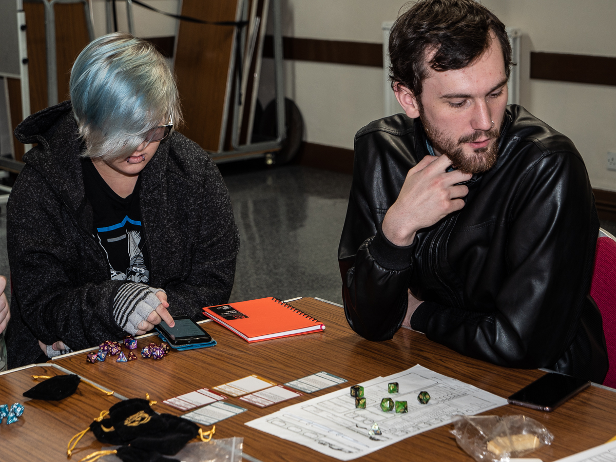
I then decided to look at some of my photobooks that do tell an active story, that is about groups of people and what they are doing. These all seemed to be rather longer, and often physically larger – I am not sure about the reasoning for that.

Mark Steinmetz – Summer Camp – is a collection of images taken at American summer camps between 1986 and 1997. They were collected into book format in 2019.  The book is a gentle reminiscence of a past time, although he comments there has been little change in that environment over years. The images are shown in black and white, are varying sizes and formats. However, the overall feel is remarkably consistent. There is a mixture of images that concentrate on the activities and other that concentrate on portraits of the children. See Mark Steinmetz for more detail.

J.A. Mortram –Small Town Inertia – this is a collection of images and  paired stories about people that struggle with their lives in a small town in Britain. It could be (and has been) described as poverty porn – but what makes it stand out is that Mortram lives within the community, has his own personal struggles and is clearly both sympathetic with and understanding of those he photographs, never patronising. The images are all black and white, often harshly lit with marked contrast and shadow. Some are close up portraits, some show the environment, but all concentrate on the people. The book is laid out with an almost full-page image on the right page and the corresponding information including the name and usually a short explanatory passage on the bottom of the left page. This has the effect of concentrating the eye initially on the portrait and only secondarily looking at the words (Mortram, 2017).

Nan Goldin –The Ballad of Sexual Dependency –probably the most famous of all the lifestyle stories, taken very much from an internal position. The book is a small part of the whole work which also includes film, large scale exhibition works and talks. Goldin calls it as ‘the diary I let people read’ in  the beginning essay and virtually at the end of the copy I have ‘a volume of loss, while still a ballad of love’ (Goldin, 2012). The images are harsh with often an odd colour cast. They are not all in focus and are presented with a short title, usually of who and where. Every time I look through it I notice different details. It holds the eye without any pretence at conventional beauty.

I also looked at a variety of short series online, picking them from the links that regularly pop up on my tablet, including Lenscratch, Aperture, BJP, Photographic Museum of Humanity and FOAM. This exercise could actually fill an entire book – so I have just picked out four that really caught my eye!

B. Proud Transcending Love – is the latest series by the American photographer B. (Belinda) Proud. It is about Transgender and Gender Non-conforming Couples in America, who are a mainly forgotten and mistreated group of people. The portraits she shows are of families and couples who are clearly proud to be together. The portraits are formal, in colour, deliberately chosen to represent the full spectrum of the relationships she is describing, and she says ‘This project is about the validity and fluidity of gender expression. The location for each portrait, chosen by the couple in discussion with the artist, is significant and provides the viewer with another level of understanding into the relationship’ (Smithson, 2020a). The portraits are shown with a simple title, some tell the gender/status of the people, others do not. From the website it is difficult to tell if the order is important – overall I suspect not. Each image could be first or last. The importance is in the group as a whole.

Mulugeta Ayene – Ethiopian Airlines Flight 302 Crash Site – World Press Photo Story of the Year Nominee, – this is not the same as many of the series/stories talked about above as it is a very factual piece of documentary work. However, it shows many of the points I have been thinking about. It is in colour, the images are factual but varied, from wide area shots, to details of the objects collected, to harrowing images of the people involved and those who lost friends and relatives. They are shown with dates and brief explanatory notes. Oddly, the images are not shown in date order, I think this may be to concentrate on the story – but it is then distracting to know the dates. (www.worldpressphoto.org, 2020).

Bowei Yang – Soft Thorn – is a dream or an illusion that tells the story of a gay boy/man growing up in a Christian community in China. ‘A journey of nostalgia’. It contains a mixture of staged portraits of his friends and slices of the environment, together with still life images. Some are portrait, some landscape but they are all linked by the muted tones and subdued and at times sad atmosphere that pervades the series. It gives a clear feeling of how difficult his teenage years must have been.  I will watch for more work from him – or hopefully an extension of this (Yang, 2020).

Cathy Spence – Crooked Eye – shows a very personal project about a young man, Wesley, her son, who has albinism and visual problems. It consists of a series of heartbreaking portraits which mainly show him facing away from the camera or covering his eyes with his hair. They are high key, in keeping with the subject. At some points they are almost burnt out – but this just emphasises the story. Some are blurred, reflecting on Wesley’s poor vision. Several formats are used but this does not distract from the consistency of the series. The series is highly effective at showing the difficulties of growing up with an obvious difference that few people probably understand (Smithson, 2020b).

What have I learned from all this?

  • You need to know what you want to say
  • You need to be passionate about it
  • You need to be internally consistent to hold the story together, either in colour or size or format or feeling
  • There are as many formats for storytelling as there are photographers
  • The order of the images may depend on the place they are being shown (book/exhibition/slide show online)
  • Black and white is still widely used – especially when the point of the story is about emotions – but not always
  • Precise focus and lighting are not always important (but possibly less so the more famous you are) – but this does depend on what you are showing – Goldin’s Ballad versus Ayene’s work on an air disaster.

Reference list:

Borissova, J. (2018) White blonde. (s.l.): Bessard.

Chandler, D. and Von Zwehl, B. (2014). Made up love song. London: V & A Publishing.

Gillanders, R. and Gough-Cooper, H. (2016) A Lover’s Complaint. Edinburgh, Scotland: Dingle Press.

Goldin, N. (2012) The ballad of sexual dependency. New York, N.Y.: Aperture Foundation.

Lansink, M. (2020). Borders of Nothingness – On the Mend. Belgium: Ibasho

Mortram, J. (2017) Small Town Inertia. (s.l.): Bluecoat Press.

Mulugeta Ayene SOY-DJ | World Press Photo (2020) At: https://www.worldpressphoto.org/collection/photo/2020/39610/4/Mulugeta-Ayene-SOY-DJ (Accessed on 29 April 2020)

Short, M. (2018) Context and narrative. London ; New York: Bloomsbury Visual Arts.

Singh, D. (2007). Go Away Closer. Göttingen, Germany: Steidl.

Smithson, A. (2020a) B. Proud: Transcending Love: Portraits of Transgender and Gender Non-conforming Couples. At: http://lenscratch.com/2020/04/b-proud-transcending-love/ (Accessed on 28 April 2020)

Smithson, A. (2020b) Cathy Spence: Crooked Eye. At: http://lenscratch.com/2020/04/cathy-spence/ (Accessed on 2 May 2020)

Steinmetz, M. (2019) Summer Camp. China: Nazraeli Press.

Yang, B. (20AD) SOFT THORN. At: https://phmuseum.com/Boway_Yang/story/soft-thorn-ecea0f8693 (Accessed on 2 May 2020)

Assignment 3 – Starting point

The assignment was to take a series of images about a group of people, either a group you were already involved in (as a mirror) or a new group (as a window) to tell a story about the group.

 I spent some time thinking about the options. I am not a very social creature and the only groups I am already involved in are to do with my previous work. Using these groups is difficult because of ethical reasons. I am in the process of working on a long term project with the local ASD community, meeting with both people with autism and their parents/carers and this was a possibility – but I am thinking of this as a much longer scale project, and I suspect I will need some of the skills learnt here to complete it.

Planning:

Looking at groups that I could join to to act as a window for I came up with several options:

  • A craft group
  • A choral society
  • A running club
  • A gaming group

I investigated all of these possibilities, but the final choice was to work with the local gaming group, DWARF (Dunfermline Wargaming and Roleplay Fellowship).  I choose this for mainly practical reasons:

  • It is local and I can easily attend
  • They meet every week so gave plenty of opportunities to go on a regular basis
  • My son already is a member – so I had ‘an in’
  • I used to roleplay many years ago, so I knew the ‘language’ and the background of what was going on

Practice:

  • I started by going along to one of the meetings, introducing myself to the committee, explaining who I was and what I was hoping to do and leaving a business card. They got back to me the following week after having discussed it and said that they would be happy for me to come provided that I posted a selection of the images I took on the club Facebook page (https://www.facebook.com/groups/DWARF.GAMING).
  • The next week I went back for an initial go at taking images. This was moderately successful as the club was having one of their regular large tournaments (Winter War) and so there was a lot of activity to experiment with.
  • I rapidly discovered that light was a problem! The main room they use is very large and has an extremely high ceiling. The lights are a peculiar colour and give an odd orange tinge to everything. They are also not very bright. I could alter the colour in Lightroom, but this was not ideal. The upstairs room has much better lighting and gave a normal colour.
  • I has originally hoped not to use flash so that I would be less intrusive within the group, but this was a clearly not going to work.
  • I went back over 5 weeks and took images each time. I had planned to continue going but the club has been cancelled because of the Covid-19 problems.

Positive things:

  • The club was very welcoming, and I rapidly became involved with the different groups there to the point that they:
    • Wanted me to join in with the activities
    • Complained if I hadn’t taken pictures of them and their group
    • People who initially had said they didn’t want their pictures taken changed their minds
  • I obtained a very large number of images; some were quite repetitive because of the lighting problems and doing it over several weeks

Problems:

  • The lighting
  • The cancellation due to Covid-19
  • I found it difficult to get images that showed what was actually going on there rather than just portraits of the people involved.
  • The people got so used to me that they completely ignored me taking images – which was a good for reality but bad for focus!
  • The number of images obtained – which I now have to try and break down.

Where I am now:

The club has several different activities which go on each week, Warhammer, Bolt Action, tabletop games (lots of different one) and role playing (mainly Dungeons and Dragons). It will be difficult to show all the activities done at the club without using a very large number of images so I am considering whether to pick out one activity and concentrate on that rather than to attempt to show the whole club. I am also thinking about how to show the images. I am considering several possibilities:

  • Single images
  • A slideshow
  • A newspaper
  • Colour versus black and white

The next stage is to think about how best to put the piece of work together and, most importantly, choose the most appropriate images, which may not be my personal favourites.