Category Archives: Research

Research point 2

Historically, still life was considered to the lowest ranked genre within art. Up to the 20th century art was often ranked according to its perceived cultural value. This ranking tended to follow the hierarchy developed by Andre Felibien (1619-1695). History (or mythological) paintings ranked highest, followed by portraiture (including self-portraits), genre (scenes showing everyday life), landscape, then still life. Still life was considered lowly because it was ‘devoid of human figures and more demonstrative of artistic skill than imagination and intellect’ (Huntsman, 2016). The images were often small and hung in private spaces rather than on grand public display. However, there have been multiple examples of famous still life paintings over the years ranging from the vanitas images of the early Dutch and Flemish artists to Frida Kahlo’s Viva la Vida, painted in the last year of her life. Still life continues to be a rich subject for exploration today.

In photography, still life images were some of the first explored, simply because they were still, and therefore relatively easy to portray with the long exposures needed. Talbot demonstrated images of vases in The Pencil of Nature and Anna Atkins cyanotypes showed a wide range of botanical specimens. More recently, Mapplethorpe, who is probably better known for his portraiture, produced a stunning series of still life photographs, mainly of flowers, but also of the traditional memento mori object of a skull.

© Estate of Robert Mapplethorpe

Still life can be used as a formal series without including other genres or mixed with portraits and landscapes to broaden the story. A recent example of this is the work by Øyvind Hjelmen (Hjelman, s.d.)who, in his recent work, Moments Reflected, shows an unexplained cone on a desk, and a lightbulb hanging from a ceiling amongst a series of hazy images of people and animals. He is (according to Laura Serani in his artists statement) telling about the past and the present, memories and dreams. Another example of this mixture of still life, portraits and landscapes is shown in Bed and Breakfast by Susan Lipper .

© øyvind hjelmen

Still life images can be made from ‘found objects’, used as they are, in their environment, such as in Making Do and Getting By by Richard Wentworth and Dingbats by Chris Wylie (Wiley, s.d.) where he takes images of close-up details seen on buildings and objects and shows them in a  formal setting against a vividly patterned frame. He says ‘ the works in this series are concerned, at least in part, with the concept of the ersatz – a descriptor of things that strive to be something other and better than they are, whose existence is defined by being like rather than simply being….Photography is like the real, but is not the real’ (Cotton, 2015).


Dingbat – © Chris Wiley

Other photographers choose to take the objects out of the environment and make elaborate ‘sculptures’ which they then photograph. Sarah Lynch with her carefully balanced objects, suspended with wire and thread and the Laura Letinsky images of left-over things and torn out, repurposed items show this. Another example is the work of Tim Brill (Brill, s.d.) whose Still Life series draws of 17th Century Dutch and Spanish masters. On his website he says, ‘The term Still Life is essentially oxymoronic and in this body of work I look to animate that stillness by removing the quotidian nature of the objects’. He uses fruit and vegetables set against a simple black background on a marginally visible dark surface. Sometimes the items are suspended, sometimes lying on shelves. The colours are intensely vibrant, almost unreal. In a further series Teddy Bear he uses a similar technique and places an old teddy bear with a variety of fruit, broken toys, a skull. He then adds a simple statement is a chalkboard style typeface such as ‘is it time?’ (with the very dilapidated teddy and the skull). He describes this series as exploring the loss of innocence. Tabea Mathern undertook a personal project to produce 52 still life images, one a week for a year. She shows them all on her website (Mathern, s.d.), they vary from collections of found objects to elaborate staged sculptures. All come with the date and an explanation, some long, some just a sentence.

Week 52
Number fifth-two. My last stilllife. A year is a bag full of weird, beautiful, scary, precious, dangerous, exhausting, empowering things, people, stories and encounters. I’m thankful for it. Happy 2015! © Tabea Mathern

It is clear from this very brief overview that still life images can be used to illustrate all parts of life, from childhood to extreme old age, from dreams to memories. A rapid Google search came up with 4,660,000,000 results and an almost equally massive number of images. Most (at a quick scan) seem to be the classic images of fruit, jugs, silverware and skulls. Many of the colours are luscious, the backgrounds often dark. If I am going to add anything of meaning to this array it needs to be personal, to represent something that I care about, and something that will add extra value to the topic. A big ask, but worth exploring.

References:

Brill, T. (s.d.) TIM BRILL. At: http://www.timbrillphoto.com/index.cfm (Accessed 16/07/2020).

Cotton, C. (ed.) (2015) Photography is magic. New York: Aperture.

Hjelman (s.d.) Oyvind Hjelmen. At: https://www.oyvindhjelmen.com/ (Accessed 16/07/2020).

Huntsman, P. (2016) Thinking about art: A thematic guide to art history. Chichester, West Sussex, UK: Wiley Blackwell.

Mathern, T. (s.d.) STILLLIFESTORIES. At: https://tabeamathern-stilllifestories.tumblr.com/?og=1 (Accessed 16/07/2020).

Wiley, C. (s.d.) Chris Wiley – Dingbats. At: http://www.chriswiley.net/index.php?id=works/dingbats (Accessed 16/07/2020).


Research for Assignment 3

When thinking about how to present this assignment I was aware that the brief included you can create as many pictures as you like …. the set should be concise and not include repetitive or unnecessary images. This means thinking about how to reduce a large number of images into a manageable piece of work that tells a story about the group of people I have chosen to work with.

In Short’s book Context and Narrative (summarised in Context and Narrative – Maria Short) she discusses the narrative that one might read in an image and points out that while it might be linear (beginning, middle and end) it does not have to be. The story should hang together, this might be because of use of similar tonal ranges, lighting or format – but might be because of the topic and that you need to be clear about your intention. Exploring the subject over time can end with you changing what you want to say and how you say it. The story may also depend on what order the images are shown in – so do you have control over that if it is important. (Short,2018).

With his information in mind I went and looked over my collection of photobooks to see which ones told a (fairly) concise story. Many that tell a story are long (book length) and involve many more images than I want to use, although this project could easily lengthen to a full book.  However, some of the books were shorter and told a relatively clear story.

 In this I have summarised the stories I read – concentrating on the ways the books and series were presented rather than on the whole import of each book. This is no attempt to do them justice – simply to pull out some information about how and why they were produced in a particular format, and the effect that’s those choices have had.

Julia Borissova white blonde – is telling a story of a place and a time, using a combination of archival images and altered self portraits. On her website it is also shown as single images and a slideshow. The order of the images varies though the sites (book versus slideshow) as does the format. In this case the series depends on the totality of the images, their tones and the feeling they evoke rather than the order in which they are viewed.  (Borissova, 2018) See Julia Borissova – white blonde for more detail.

 Margaret Lansink – Borders of Nothingness-On the Mend – tells about the emotions that were linked with her loss of contact with her daughter and subsequent re-engagement. The book is physically small. The paper is rough and the images low key, black and white with occasional flashes of gold. Little is clear. The order is important as it moves from despair through nothingness to repair and hope. The feel of the book is also important as it is very tactile, rough, and evokes the feelings described (Lansink, 2020). See Borders of Nothingness – On the Mend for more detail.

Bettina von Zwehl – Made Up Love Song – consists of a series of portraits done of the same person over 6 months, set in the same place and with similar light. The variations are minimal, her hair and clothing show subtle changes. The images are shown against a black background opposite a simple statement of the day and time. This is a very simple presentation where you gain from the repeated images showing the gradually increasing intimacy. While a single image is effective, the story gains by the repetition (Chandler and von Zwehl, 2014). See Bettina von Zwehl for more detail.

Robin Gillanders  – A Lover’s Complaint – takes the short Fragments written by Barthes, has them translated in haiku by Henry Gough-Cooper and then interspersed these with still life images, mainly of glass and material, shown as fragments against a dense black background. The haiku are presented 12 to a page, organised alphabetically, other than a final short poem about silence and love. There is no immediate obvious connection between the haiku and the images.  The viewer/ reader needs to make their own links. However, each group of images is linked, variations on a theme. As a whole, they start minimalistically, become more complex, then fade away – following a pattern. The words and the images give equal weight to the story (Gillanders and Gough-Cooper, 2016).

Dayanita Singh – Go Away Closer – is a series of 40 images in a small book. They are all square, and all black and white, and, other than the fact that they all tell about India, those are the only linking factors. Singh says she deliberately does not try to make a narrative but puts images together intuitively. In her work she collects her images into ‘museums’ – which she them changes around for different displays, even with the same exhibition. The work is about a feeling, rather than a story Singh, 2007), See Dayanita Singh – Go Away Closer for more detail.

All these photobooks are really about emotions rather than facts.  They may be based around a story, such as the Lansink’s Borders of Nothingness – On the Mend, or actively avoid a narrative like Singh’s Go Away Closer. In spite of this they all have a clarity about the way they have been put together, an internal consistency. The tonal values are similar, the feeling derived from the images are similar. They are clearly carefully considered. In two, Go Away Closer and white blonde, the order of the images is not crucial, while it has been, inevitably, fixed within the books, it is changed in other formats (a slideshow and an exhibition). These are all fairly short books, although longer than the series I am planning, but they taught me a lot about the type of consistency required to make a book hold together, and, even more importantly, to make the reader/viewer return to it.

I then decided to look at some of my photobooks that do tell an active story, that is about groups of people and what they are doing. These all seemed to be rather longer, and often physically larger – I am not sure about the reasoning for that.

Mark Steinmetz – Summer Camp – is a collection of images taken at American summer camps between 1986 and 1997. They were collected into book format in 2019.  The book is a gentle reminiscence of a past time, although he comments there has been little change in that environment over years. The images are shown in black and white, are varying sizes and formats. However, the overall feel is remarkably consistent. There is a mixture of images that concentrate on the activities and other that concentrate on portraits of the children. See Mark Steinmetz for more detail.

J.A. Mortram –Small Town Inertia – this is a collection of images and  paired stories about people that struggle with their lives in a small town in Britain. It could be (and has been) described as poverty porn – but what makes it stand out is that Mortram lives within the community, has his own personal struggles and is clearly both sympathetic with and understanding of those he photographs, never patronising. The images are all black and white, often harshly lit with marked contrast and shadow. Some are close up portraits, some show the environment, but all concentrate on the people. The book is laid out with an almost full-page image on the right page and the corresponding information including the name and usually a short explanatory passage on the bottom of the left page. This has the effect of concentrating the eye initially on the portrait and only secondarily looking at the words (Mortram, 2017).

Nan Goldin –The Ballad of Sexual Dependency –probably the most famous of all the lifestyle stories, taken very much from an internal position. The book is a small part of the whole work which also includes film, large scale exhibition works and talks. Goldin calls it as ‘the diary I let people read’ in  the beginning essay and virtually at the end of the copy I have ‘a volume of loss, while still a ballad of love’ (Goldin, 2012). The images are harsh with often an odd colour cast. They are not all in focus and are presented with a short title, usually of who and where. Every time I look through it I notice different details. It holds the eye without any pretence at conventional beauty.

I also looked at a variety of short series online, picking them from the links that regularly pop up on my tablet, including Lenscratch, Aperture, BJP, Photographic Museum of Humanity and FOAM. This exercise could actually fill an entire book – so I have just picked out four that really caught my eye!

B. Proud Transcending Love – is the latest series by the American photographer B. (Belinda) Proud. It is about Transgender and Gender Non-conforming Couples in America, who are a mainly forgotten and mistreated group of people. The portraits she shows are of families and couples who are clearly proud to be together. The portraits are formal, in colour, deliberately chosen to represent the full spectrum of the relationships she is describing, and she says ‘This project is about the validity and fluidity of gender expression. The location for each portrait, chosen by the couple in discussion with the artist, is significant and provides the viewer with another level of understanding into the relationship’ (Smithson, 2020a). The portraits are shown with a simple title, some tell the gender/status of the people, others do not. From the website it is difficult to tell if the order is important – overall I suspect not. Each image could be first or last. The importance is in the group as a whole.

Mulugeta Ayene – Ethiopian Airlines Flight 302 Crash Site – World Press Photo Story of the Year Nominee, – this is not the same as many of the series/stories talked about above as it is a very factual piece of documentary work. However, it shows many of the points I have been thinking about. It is in colour, the images are factual but varied, from wide area shots, to details of the objects collected, to harrowing images of the people involved and those who lost friends and relatives. They are shown with dates and brief explanatory notes. Oddly, the images are not shown in date order, I think this may be to concentrate on the story – but it is then distracting to know the dates. (www.worldpressphoto.org, 2020).

Bowei Yang – Soft Thorn – is a dream or an illusion that tells the story of a gay boy/man growing up in a Christian community in China. ‘A journey of nostalgia’. It contains a mixture of staged portraits of his friends and slices of the environment, together with still life images. Some are portrait, some landscape but they are all linked by the muted tones and subdued and at times sad atmosphere that pervades the series. It gives a clear feeling of how difficult his teenage years must have been.  I will watch for more work from him – or hopefully an extension of this (Yang, 2020).

Cathy Spence – Crooked Eye – shows a very personal project about a young man, Wesley, her son, who has albinism and visual problems. It consists of a series of heartbreaking portraits which mainly show him facing away from the camera or covering his eyes with his hair. They are high key, in keeping with the subject. At some points they are almost burnt out – but this just emphasises the story. Some are blurred, reflecting on Wesley’s poor vision. Several formats are used but this does not distract from the consistency of the series. The series is highly effective at showing the difficulties of growing up with an obvious difference that few people probably understand (Smithson, 2020b).

What have I learned from all this?

  • You need to know what you want to say
  • You need to be passionate about it
  • You need to be internally consistent to hold the story together, either in colour or size or format or feeling
  • There are as many formats for storytelling as there are photographers
  • The order of the images may depend on the place they are being shown (book/exhibition/slide show online)
  • Black and white is still widely used – especially when the point of the story is about emotions – but not always
  • Precise focus and lighting are not always important (but possibly less so the more famous you are) – but this does depend on what you are showing – Goldin’s Ballad versus Ayene’s work on an air disaster.

Reference list:

Borissova, J. (2018) White blonde. (s.l.): Bessard.

Chandler, D. and Von Zwehl, B. (2014). Made up love song. London: V & A Publishing.

Gillanders, R. and Gough-Cooper, H. (2016) A Lover’s Complaint. Edinburgh, Scotland: Dingle Press.

Goldin, N. (2012) The ballad of sexual dependency. New York, N.Y.: Aperture Foundation.

Lansink, M. (2020). Borders of Nothingness – On the Mend. Belgium: Ibasho

Mortram, J. (2017) Small Town Inertia. (s.l.): Bluecoat Press.

Mulugeta Ayene SOY-DJ | World Press Photo (2020) At: https://www.worldpressphoto.org/collection/photo/2020/39610/4/Mulugeta-Ayene-SOY-DJ (Accessed on 29 April 2020)

Short, M. (2018) Context and narrative. London ; New York: Bloomsbury Visual Arts.

Singh, D. (2007). Go Away Closer. Göttingen, Germany: Steidl.

Smithson, A. (2020a) B. Proud: Transcending Love: Portraits of Transgender and Gender Non-conforming Couples. At: http://lenscratch.com/2020/04/b-proud-transcending-love/ (Accessed on 28 April 2020)

Smithson, A. (2020b) Cathy Spence: Crooked Eye. At: http://lenscratch.com/2020/04/cathy-spence/ (Accessed on 2 May 2020)

Steinmetz, M. (2019) Summer Camp. China: Nazraeli Press.

Yang, B. (20AD) SOFT THORN. At: https://phmuseum.com/Boway_Yang/story/soft-thorn-ecea0f8693 (Accessed on 2 May 2020)

Julia Borissova – white blonde


© Julia Borissova – white blonde

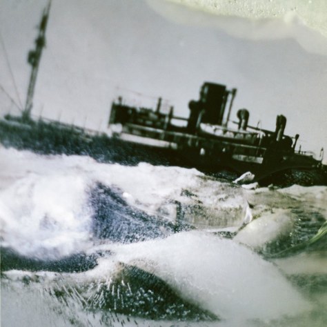
Julia Borissova in White Blonde (Borissova, 2018) is telling a story about Antarctica – she says, ‘though my series I aimed to convey a feeling of he hostile and unfamiliar environment of the South Pole, creating images where the geographic reality give way to the space of dream’. She has used a combination of archival photographs, found objects and self images to explore personal and collective history. The book is short, consisting of just over 20 images. Some are full bleed, some across 2 pages and other overlap each other. They are given consistency by their tonal range, whites, pale blues, greys, beiges and black. The only bright colour (red) is in the additional print sent with the book which shows crimson folded hearts with a portrait of a woman – I assumed it was a self-portrait however now know it is actually part of Borissova’s series Lullaby for a Bride. Most of the images are blurred or overlaid with what looks like ice. In reality Borissova did actually freeze the images to get this effect, ‘to be part of the landscape to express a sense of awareness of time’ (Arena, s.d.). Borissova calls her self-portraits ‘icebergs’. The overall feeling is of age, confusion, and exhaustion in a strange landscape. It is not clear whether or not Borissova has visited Antarctica, although I do not think so.

Her images are available in the book white blonde, on her website as single images and as a slideshow. Interestingly, the order of the images is different between the book and the slideshow, they are often cropped differently (all the images in the slideshow are square and this was the original format) and not all images occur in both. The book and the slideshow are complimentary, not equal but additive.

The book requires careful examination. On my first viewing I found if difficult to follow. Some of the images are beautiful, others are confusing, some are clear, some are abstract. On multiple views I found myself sucked into the cold and the ice. They are a meditation rather than a clear story and are worth reviewing time and again.

With thanks to Julia Borissova for additional information and pointing me towards the review on Landscape Stories.

© Julia Borissova – white blonde

References:

Arena, G. (s.d.) Landscape Stories | Julia Borissova – Nautilus // Let Me Fall Again // White Blonde. At: http://magazine.landscapestories.net/en/books/book-reviews/julia-borissova (Accessed  20/05/2020).

Borissova, J. (2018). White blonde. S.L.: Bessard.

Borissova, J. (n.d.). White Blonde. [online] http://www.juliaborissova.ru. Available at: http://www.juliaborissova.ru/Julia_Borissova_PhotoSite/Projects/Pages/White_Blonde.html [Accessed 17 Apr. 2020].

Context and Narrative – Maria Short

Context and Narrative by Maria Short looks at how  the planned purpose of an image can alter how you take it and how your visual language needs to vary depending on the circumstance.

The photograph:

  • How you show the ‘truth’ depends on the intended purpose of the image
  • A photo can go beyond a simple recording and take on a different personal meaning
  • Need to consider the context, social commentary, photojournalism, the personal experiences of the photographer
  • What is the ’truth’ in a constructed image? Can it be ‘deeper’?
  • You need to be both engaged with the subject and detached to allow for objectivity
  • Need to read the brief carefully and plan what you are doing if there is limited time
  • For a self-directed brief it may take of in unexpected directions
  • The context within which the photo will be seen is crucial, remember the culture may be different
  • Consider how the images relate to each other
  • There may be a need to make repeated visits to a place to learn the nuances before even starting to take pictures

Subject:

  • Need to be passionate about something and committed
  • What do you want to show? Why does it need saying? Why a photo?
  • Need for as full as possible understanding of your subject – leads to insight
  • What camera format will work best? How do you avoid being over intrusive?
  • Need for both humanity and vision, shows the things that are inevitably absent (smell, noise, quietness)
  • Look to create empathy – see Stuart Griffiths – Homeless Ex-Service

Audience:

  • The photographer should seek an audience which will accept his vision (Brodovitch) – How?
  • Think about what the image is intended to show, how you want the viewer to feel
  • Need for truthful communication – authenticity
  • Be aware of the attitude of potential viewers, and their understanding of the subject
  • Context and how do you tell it?
  • Shape, size and ordering of images inform a series
  • The photo is a subjective impression of what the photographer sees – not someone else’s vision

Narrative:

  • A beginning, a middle and an end – sometimes
  • Can be linear – but does not have to be
  • Is it a typology? A photo essay? Or what
  • Is the sequence crucial – or could the images work as standalone frames?
  • Look for coherence – visual continuity with lighting and tonal range, consider the format
  • Is the story sequential – or several snippets that link together?
  • Do you have control of the order the images are seen in?
  • Do all the images need to be the same size? What about pairs, or triptychs?
  • Need to be clear about the intention for the project
  • A single image can also be a narrative – it might be taken as a ‘one-off’ or actually originally have been part of a series
  • The more the photographer is absorbed in the moment (and the more they understand the process) the more likely an image is to tell a story – the unconscious takes over
  • Kim Sweet – the average subject, need to experiment and explore the idea

Signs and Symbols:

  • Saussure – sign is a signifier (form) and the signified (concept it represents)
  • Pierce – representamen (form) + interpretant (sense made of it) + an object to which the sign reference
  • Barthes – studium + punctum
  • Signs can trigger memories, can explain an image
  • Symbol represents something, an icon resembles it
  • Indexicality – a photo is a trace (therefore notions of truth)
  • Signs and symbols included in images need to be considered – may or may not be planned
  • They will influence how a viewer reads the image
  • What you understand from your own image is crucial – if you don’t understand it how can others
  • Signs and symbols can control the pace of a narrative

Text:

  • Might be a simple informative caption, or might be an essay, or a book! Think what is needed
  • Think about context of viewing
  • Draw on literature as part of the research either using as quotes or getting ideas
  • Use as a multidimensional addition to work
  • Does the image need the text to make sense?
  • What about the use of text within the images, as part of the photo?
  • Use of handwriting (very different from print)
  • Use of a diary format

Reference:

Short, M. (2018). Context and Narrative. London; New York: Bloomsbury Visual Arts.

David Hevey – The Disabled Century

David Hevey is a producer, photographer and storyteller. He is also the director for The National Disability Arts Collection and Archive. He has written books and made films. Among the films is a 3-part series ‘The Disabled Century’ that was made for the BBC in 2012. It can be watched in full on his website. This film concentrates on physical disability, cerebral palsy, dwarfism, hearing impairment although there is also some mention of mental health problems including bipolar disorder and PTSD. The 3 episodes can be seen here:

Viewing

Episode 1 – pre 1945

  • Shocking images on film of people with ‘shell shock’ (PTSD) from WWI – images that would rarely be taken now, associated with talk by ex ambulance driver about his memories
  • Images from the time on film interspersed with stills and films of people now and their memories
  • “That’s what happens with war -Nobody wants them”
  • Talks about people ‘locked away’ under 1931 Mental Defective Act – intercutting film of the past with the present day – telling what happened and how he felt
  • Deaf and dumb also sent away, segregation ‘considered caring’
  • Operations to ‘fix’ Dwarfism – to stretch people – effectively torture
  • Tended to have a poor prognosis given especially about life extent (often far from accurate).
  • Disabled workers employed in WWII – often to first work they were given

Photography – mixture of grainy film as lots of harrowing images, mainly of groups or from a distance  which emphasised the differences and the oddities and new close-ups which showed the humanity, often focusing on only parts of the faces, hands or body, often overlayered with film shots of what was happening at the time. Still unsparing – but somehow more human. Is that because you are hearing the story in the people’s own voices?

Episode 2 – 1945 – 1969

  • Disabled veterans were heroes, society owed much, developed plastic surgery to treat burns
  • NHS included support for disabled people – created a system of state-run homes/hospitals
  • Many disabled had no choice about whether or not hey would go to an institution, spent years there, lonely and bored
  • Treated as though ‘we were nothing’
  • Thalidomide – syringomyelia – led to issues about compensation and should you be made to wear artificial limbs
  • Investigations for medical curiosity ‘I felt that I was property …. A bit like a lab animal’
  • Started to see the treatment of disability as an injustice

Pictures of the past interlaced with personal stories and reminisces. Traumatic stories of punishment and treatment. Wards cramped. Beds on top of each other. very aware of the possibility of death (both own and others). People talking are very eloquent – makes a mockery of the assumption of uselessness. Pictures still the extreme contrast of close-up now and distance images from the past. Shows a stunning image of a thalidomide lady surrounded by artificial legs, telling her story.

Episode 3 – 1970 – the present

  • Talking about the grim reality of mental health wards in the 70’s
  • Not allowed to think or make choices
  • But leaving could be a shock after a life in an institution, leaving home, leaving friends
  • Care in the community was lacking in resources
  • Need for self acceptance and knowledge of who you were, important to meet other people
  • 1995 disability discrimination act – but no enforcement
  • “Here I am, you have to deal with me”
  • “We are proud of ourselves”
  • But, in reality, few jobs, much poverty and much to little support.

Ongoing contrast between old images and films shots, grainy, often in B/W, again distance shots versus close-up, sharp focus, colour of modern storytellers. Often overlaid, old on new, multiple sounds tracks implying the confusion of what happened to many people. Dark and light, flashing lights and images. Real life stories on fantastical (horrific) images that are hard to believe. Parts of faces, parts of bodies – implying need to look closely, to concentrate.

Conclusion:

The overall series is hard to watch, makes for a grim story of disability in the past, and, unfortunately, also in the present. The series was made nearly a decade ago – but little has changed. Most people continue to ignore the disabled, the resources are limited and there is little public understanding.

Reference list:

Hevey, D. (s.d.) Viewing. At: http://davidhevey.com/viewing/ (Accessed on 10 April 2020)

Diane Arbus

Diane Arbus (1923-1971) was an American photographer who, according to Wikipedia (!) ‘worked to normalise marginalised groups and highlight the importance of proper representation of all people’. (Wikipedia contributors, 2019). Her work has become controversial simply because of that. She called the people she photographed her ‘singular people’ and they were often different, disabled (both physically and mentally) or had other things that set them aside from high society: nudists, transvestites, Jews. Her images are often stark, usually graphic and highly revealing. I have looked at her work before in Self Evidence – Woodman, Arbus and Mapplethorpe (after seeing an exhibition) and  Reading Images (in response to a research question).

Over years I have worked with people with a range of disabilities similar to those Arbus photographed and find her images both disturbing and tender. How I interpret them depends on my mood. On one day I think “How could she” and on another I think “that is perfect”. In the book ‘diane arbus’ (Arbus and Arbus, 1990) she is quoted as saying, “You see someone on the street and essentially what you notice about them is the flaw”  and “there are certain evasions, certain nicenesses that I think you have to get out of” and “Freaks was a thing I photographed a lot. It was one of the first things I photographed and it had a terrific kind of excitement for me…. they made me feel a mixture of shame and awe…. they’ve already passed their test in life. They’re aristocrats” and “I work from awkwardness, by that I mean I don’t like to arrange things. If I stand in front of something instead of arranging it, I arrange myself”. On looking though the images in that book the odd thing that struck me was that the happiest, and most honest, smiles were in the images of the people with learning disabilities.

csm_Lempertz-1041-106-Photography-Diane-Arbus-Untitled-2-_f803013e78

Her images are black and white (although colour film was available), square format (a Rollei) and usually low key. Often the most important part of the image is dark. Most of the portraits are taken full face on, with the subject looking straight at her – has she actually arranged them? Or is this just how people expect to be photographed?

She gave the marginalised people a voice, whether or not it was a voice that they would have chosen is an interesting question, but a least she engaged with them rather than ignoring them.

References:

Arbus, D. and Arbus, D. (1990). Diane Arbus. London: Bloomsbury.

Wikipedia Contributors (2019). Diane Arbus. [online] Wikipedia. Available at: https://en.wikipedia.org/wiki/Diane_Arbus [Accessed 25 Mar. 2019].

Newspaper trial

At our last OCA Scottish Group meeting our tutor Wendy set us the challenge of making a newspaper to showcase our work.

I used The Newspaper Club, which is based in Glasgow. They have a template which you can use, and as it was my first time, I used it. That had pros and cons. It was simple to use (once I had worked out that you could only upload images that were set to the correct size and pixel count – all of mine needed considerable adjustment to fit this).  However, it was very limiting. I would have liked to either add some full bleed images, or some that went across the midline, especially on the centre page, and, although you can do this – shown in both the demonstration newspaper they send out and on their website, it is not possible to do so using the template. To do so you need to make up your own PDF and send it in.

I chose to use colour images to see how they would work out. Because I used colour, I went for the higher quality whiter paper. I used some very small amounts of text. The paper was printed and delivered very quickly. The colours, as had been suggested in the information on site were, less vibrant than ideal, especially the blues and purples.

Overall, I was pleased by the outcome as initial trial. I think I used too many images. It would have been better with even less words (or maybe none).  The layout definitely could have been more interesting if I had designed it to run across the centre or have larger images.

Whole pdf:

https://documentcloud.adobe.com/link/track?uri=urn%3Aaaid%3Ascds%3AUS%3A6abb3ef1-ccd3-426c-be20-6574e0be1972

Two other people brought their newspapers. Both had chosen to use black and white, one on each type of paper. I felt the black and white images were more successful, and actually preferred the more tactile feel of the lower quality standard paper.

An interesting experiment, and definitely one worth taking further.

Future plans:

  • Learn to use some form of design software. The obvious options are
    • Indesign – very expensive
    • Scribus – free, but less tutorials available
  • Make another newspaper – with black and white images

August Sander – A short review

August Sander’s documentary project ‘People of the 20th Century’ was an attempt to sketch society in Germany at that time. He produced portfolios of ‘typical’ people organised by social categories (he also did the same with landscapes).

Sander (1876 – 1964) was born in Herdorf of working-class parents. He initially worked on a waste mining tip and did photography in his spare time. He moved to Linz in Austria, travelled and worked in a photographic studio. He had a very active cultural life – he was now consorting with a range of people from the professional classes and other artists. From as early as 1906, when he held an exhibition, he was already photoing people in their own domestic settings as well as in a studio. He returned to Germany 1920, initially living in Cologne and moving permanently to the countryside during the WWII air raids.

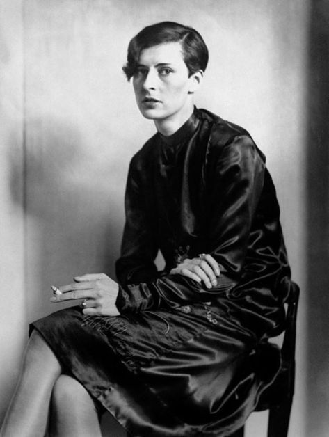
5006a0e8aa611327b5bb2f6e7857da36--august-sander-secretary
Secretary at West German Radio, Cologne – August Sander

Sander used a large format camera and planned his images very carefully, trying to reflect real life. He collected the images with a goal ‘to provide a true psychology of our time and of our people’ (Sander, 1925). His plan was to produce a massive work, containing somewhere between 500 and 600 pictures called Menschen des 20 Jahrhunderts (People of the 20th Century) that was divided into 7 sections. He was looking at taking images of human ‘types’ that were true to nature, he did not want to distort reality but was happy to ensure that an interesting image was made and was undoubtably influenced by the painters of his age including the Surrealists. He was interested in understanding the theory of photography and its use as a way of communication. The concept of ‘types’ and the underpinning use of physiognomy (the pseudo-science that suggested that you could tell much, or all, about a person by the shape of their head and face) has a complicated ethical stance, and has been linked with the eugenics policy of Weimar Germany and the Nationals Socialists.  Interestingly, very few of Sander’s portraits show a typically Aryan type.

Painter [Heinrich Hoerle] 1928,  by August Sander
Painter [Heinrich Hoerle] 1928, by August Sander – one of the Persecuted

His life was impacted on by political situation, friends were imprisoned, some died in concentration camps, his own son, Erich, was imprisoned and died before his release. It is difficult to know what Sander’s position politically was. Before the war he was strongly engaged with the artists, (especially the group known as the Cologne Progressives who were associated with Marxist views), other intellectuals and the ‘left’ culture. His relationship with the Cologne Progressives, his multiple photographs of them and of their work is discussed in detail by Dorothy Rowe (Rowe, 2013). His son had very clear political views and was imprisoned for them. Sander himself took a series of photographs of the Jews and included them within a group called ‘The Persecuted ‘. It is undoubtedly true that what he could publish during the time of the National socialist rule was limited and may well not have reflected his inner thoughts.  Certainly, later he planned to include images of both the persecuted and political prisoners in his portfolio.  His political ideals and morals are discussed at length in an article by Rose-Carol Washton Long (Long, 2013) who argues that although Sander did not openly write about his political beliefs, his friendships, photographs of prisoners and the persecuted and the arrangement of images within his portfolio suggests that he had much more sympathy with the left wing than is commonly thought true. There is an interesting article on this section of his portfolio at:

From August Sander, Stirring Portraits of Nazis and Jews

Sander’s book Face of Our Time was criticised by the German National Socialist government as it did not show the ideals they ascribed to, and the printing blockers were destroyed and as many copies as could be traced also destroyed. This has now been re-issued by Schirmer Art Books with a translation of the foreword by Alfred Döblin (Sander and Döblin, 2003). Döblin remarks that Sander follows the tenants of the Realists, that is, ‘the great universals are effective and real’ and therefore he has, by means of his photographs and the way he has arranged them, formed a sociological history of his time. The types that are photographed now (1920-30’s) are, with the exception of farmers, different from those that could have been photographed 100 years ago and presumably, if the argument for ‘types’ holds true, are different from those that could be photographed now. He ends by saying ‘Entire stories could be told about many of these photographs, they are asking for it, they are raw material for writers, material that is more stimulating and more productive than many a newspaper report’ (Sander and Döblin, 2003).

The Rhine loop near Boppard
The Rhine loop near Boppard – August Sander

Although he is mostly remembered for his portraits, he took pictures of places, landscapes and nature with equal precision. He was interested in showing life as a whole and how it fitted together. He took images of uncluttered nature and of the human encroachment on it. A bridge is as valid as a forest as a quarry.  He didn’t just take the pretty images, the picturesque as many earlier photographers did. ‘Life as it’ is could be taken as his motto. He also was interested in the fine details of things; hands, texture of skin, parts of plants. He documented his time in its entirety, concentrating on local images of people and places to stand for the ‘types’ he felt important.

August-Sander_FHCB_5-728x570
Hands – August Sander

As well as taking images he painted, drew, wrote about photography and gave lectures (some of these on the radio). His lecture Photography as a Universal Language is available in a translation by Anne Halley (Halley1978) in Seeing, Observing and Thinking (Sander et al, 2009). It is a fascinating insight into his thoughts, starting from the development of language and social reasoning. He says ‘pictorial language….is the most suggestive medium for advertising or coming to an understanding or achieving an end, because the image provides faster orientation than written language…….via photography we are capable of conveying fact, our thoughts and our ideas to all the peoples of the world: add a date to it, and we’re capable of capturing world history’.  He describes it as ‘a global language’, understandable by the masses. There is a clear western, European, intellectual bias here in his thoughts as he makes a number of unfounded assumptions about the universality of understanding of images, and also that the ‘masses’ ware less likely to understand written explanations. However, these biases are understandable in the context of his time and background. He is also clearly aware that photographs can lie, ‘besides its significance as proof of truth, photography also has at it’s disposal the most dangerous potential for deception’.  Sander then talks at length about the innate ability of people to understand what people are like on first impressions, from how they look, from their ‘physiognomy’ (at which he thinks females are better at than males).  He thinks that the face tells you what kind of work a person does (the theory behind his dividing people into ‘types’). He includes an assumption that this also applies to a person’s political beliefs. He feels this only holds true if you do not attempt to confound the images by dressing people up or putting them in clothes from another era. He concludes ‘By means of seeing, observing and thinking, and with the aid of a camera and a date, we can capture world history and influence all of humanity by means of photography as a global language’.

While Sander’s political views are unclear, they were grounded in the complex and changing political situation of the time. His ideas about ‘types’ of people were also associated with the current thoughts in Germany and are of dubious relevance today. He did, however, take a vast number of fascinating images and his thoughts about ‘seeing, observing and thinking’ are as valid today as they were in his lifetime.


Reference list and sources:

Halley, A. (1978). Photography as a Universal Language. Massachusetts Review, Winter 1978, pp.663–679.

Long, R.-C.W. (2013). August Sander’s Portraits of Persecuted Jews – Tate Papers | Tate. [online] Tate. Available at: https://www.tate.org.uk/research/publications/tate-papers/19/august-sanders-portraits-of-persecuted-jews [Accessed 13 Jul. 2019].

Photography as a Universal language, (1931). Westdeutscher Rundfunk. 12 Apr.

Rowe, D.C. (2013). August Sander and the Artists: Locating the Subjects of New Objectivity – Tate Papers | Tate. [online] Tate. Available at: https://www.tate.org.uk/research/publications/tate-papers/19/august-sander-and-the-artists-locating-the-subjects-of-new-objectivity.

Sander, A. (1925). Letter from Sander to Erich Stenger.

Sander, A., Conrath-Scholl, G., Sk Stiftung Kultur. Photographische Sammlung and Fondation Henri Cartier-Bresson (2009). August Sander : Seeing, Observing and Thinking : Photographs. Munich: Schirmer/Mosel ; Cologne.

Sander, A. and Döblin, A. (2003). August Sander: Face of our time : Sixty Portraits of Twentieth-Century Germans. München: Schirmer/Mosel.

Sander, A., Sander, E. and Nunez, G.B. (2018). August Sander – Persecuted/Persecutors : people of the 20th century. Gottingen: Steidl.


Theories of Identity

Theoretical Underpinning of identity:

A person’s identity is made up of a series of layers that come from a combination of genes, early nurture and experience as an adult.

Humans are a species that has more capability for conscious thought (as far as we are aware) than any other species on outer planet.  Susan Black says, ‘Humans belong to the group of conscious beings that are carbon-based, solar system dependent, limited in knowledge, prone to error and mortal’ (Black, 2018). As part of our make-up we have an identity, which is part physical, part psychological and part social. Erickson, a behavioural psychologist working in the 1050’s  (quoted in Black, 2018) defined identity as ‘either (a) a social category, defined by membership rules and (alleged) characteristic attributes or expected behaviors, or (b) socially distinguishing features that a person takes a special pride in or views as unchangeable but socially consequential (or (a) and (b) at once).’  That is, he is saying that identity is a social construct dependent on the groups you belong to and the things you are interested in. Black, however, argues that the physical identity of a person is equally important and asks, ‘How much alteration can a biological entity sustain while remaining recognisable as the same individual and maintaining its traceable identity?’ (Black, 2019).

Maintaining your identity is important and is emphasised in the multiple stories from around the world of lost, stolen or fake identities both couched as history and as fiction, often in folklore. This means names (as a crucial part of our identity) are central and finding out that our name is ‘fake’ may be very traumatic. Our name and heritage are our base, our bedrock and it should not be made of sand! The importance of our perceived heritage can make a profound impact on who we are.

Genetic:

Our initial identity comes from our genes. Our genetic code is very similar to that of  chimpanzees and the other great apes who are tribal species where the strongest aim to be the leader of the tribe and may be very aggressive in obtaining that goal but when they get there they will often protect the weaker members, while still remaining aggressive to outsiders.

Environmental:

Behaviour is believed to be caused by environment. As humans we absorb the stories that flow around our culture to make sense of who we are and what we want to be. In Europe this follows on from the Ancient Greek tradition of individuality featuring a strong person who aims to be a moral leader. This probably developed from the need to be an entrepreneur, because of the limited pastures and need for each small group of people to be self sufficient. Aristotle shows that individuality was key. There was also frequent engagement with foreigners and different beliefs systems and values that allowed further for the development of individuality (provided you were rich and strong enough). This is thought of as the ‘independent construal – the inherent separateness of distinct persons. (Markus and Kitayama, 1991)

This was very different from ancient China with its wide pastoral areas and need for large projects and grand schemes. Group harmony was paramount rather than individuality. Harmony came from people who knew their place in life and stuck to it. Confucius was a major exponent of this. Identity is part of a group! This concept continues to hold in much of the  Eastern world even today and may lead a very different views of  of who you are and how you should interact with others with a need to consider multiple perspectives and seeing things in a wider context rather than as single objects and a simple right or wrong in the Western world. This as described as the ‘interdependent construal – the fundamental connectedness of human beings to each other’ (Markus and Kitayama, 1991).

There are similar variances in other cultures even on a relatively small scale. Southern USA males are often said to be more belligerent than northern ones, northern Chinese people who live in small communities are said to be more individualistic than southern ones who rely on large communities to work the large paddy fields.

These theories of the development of identity are very broad based and obviously do not explain individual variation but may well underpin some of it.

Sociological:

A person’s identity consists of an internal interpreter which makes up stories to explain why things happen and the underlying emotions and drives. In the modern world, especially in the west, there is an assumption that you can (and should) be a hero. A star of your own story. Be perfect. There is a (wrong) assumption that everybody thinks like you do. This has led to a massive ‘wellness’ industry. It is true that meaningful core projects (work, hobbies, religion – it varies from person to person) do act to improve our well being and are essential to our sense of self identity. However, the self (your identity) is formed from series of overlapping layers that often seeks validation from others. Your ‘self’ changes depending on where you are, your role and on how other people are treating you.

The onset of personal computers and the internet was a game changer. You are visible and have to be the best at everything, perfect or others see that you are not! The problem is that we end up judging others very harshly. No time or space for the underdog. We lose sight of the fact that we a a social species and depend on others and also that what we do impacts on a lot of people. Individual responsibility is a myth. This has led to the development of a new pattern of identity especially in the younger generations. The selfie people, where the ambition is to be known!  Social media plays on that, and also on a the (very basic) need for tribal approval.

Summary:

How much of our personality is due to genetics? How much nurture? Behaviour is a combination of situation and genes.  People are not all the same. Identity is a core part of your person and is undoubtedly partly secondary to your background. Showing a person’s identity therefore becomes complex. A simple snapshot can only show a fragment, but will a million images tell anything more?

References

Black, S. (2018). All That Remains. [Place of publication not identified]: BLACK SWAN.

Markus, H. and Kitayama, S. (1991). Culture and the self: Implications for cognition, emotion, and motivation. Psychological Review, 98(2), pp.224-253.

Storr, W. (2017). Selfie. London: Picador.


Grayson Perry – Picturing Identities

Grayson Perry (born 1960) is an English multimedia artist who, among his large oeuvre, specialises in making portraits. His portraits are not, however, simple representations of a face or a body.  He spends considerable time with the person, or group of people that he intends to portray, getting to know them, talking to their friends and colleagues, joining in with their activities and, probably most importantly, thinking before making an image, which might be a piece of pottery, a tapestry or a painting.

Perry is known for his eclectic persona. He is a transvestite (and proud of it) and a television personality. He comments on the contemporary arts scene, and on what he sees as British prejudices. He has made several television programs about making art and portraiture, two of which All Man and Who We are as particularly fascinating. Unfortunately, episode 1 do Who We Are does not seem to be available for download on any source available in the UK, but episodes 2 and 3 are well worth watching.

Who We Are 2 looks at how you can show families in portraits.  He looks at 3 families

  • A religious group who act as an extended family and live together. Here he notes that ritual makes up an important part of their lives, together with the need to be accepting of others and also give things up to act as a single unit. He comments that ‘other people act as a mirror, a reflecting surface’ and that allows you to understand yourself and him to understand the group
    • He made a reliquary casket showing the caring aspect of the family, based on the older form of religious icons

      grayson-perry-who-are-you-the-jesus-army-money-box
      © Grayson Perry
  • A complex family unit of 2 white gay men raising a mixed-race child. This brought up issues about how you define yourself, both about race and the LGBTQ+ axis, together with the fact that society tends to put people ‘in pockets’ and to tell their story you need to tale the back out again. Identity is formed of multiple layers, a feeling rather than a conscious knowledge, and these need to be explored to make an image
    • He made a pottery jar showing the surrounding and caring aspect of a family

      15cb617eb016836b55f9641ebe86ae40
      © Grayson Perry
  • A couple of older people one of whom has Alzheimer’s disease. Here he looked at how the loss of memory affected identity. Taking away the layers, especially when you loose professional accomplishments. Identity then starts to rely on the memories of others – but the carer can also then loose (or change) their own identity, becoming a shadow. Your identity can also be part of being a couple – so if this is lost it changes – Alzheimer’s is described as “ a random bombing raid on the whole of the mind”.
    • He made a funeral urn for memories, composed of multiple photo shattered and cut apart, then recomposed.

https://youtu.be/PJ835U-wr7c

Who We Are 3 looks at tribes, groups of people whose identity is bound up in their culture.

  • Belfast people – where portraits that reflect the past violence are still everywhere. Symbols tell a story, might be tattoos, might be clothes. Possibly an ‘old-fashioned view of what Britishness is, and very different from the view in other parts of Britain. Thinking about how identical I’d affected by where you live, especially by where you were born.
    • He made a flag that was in many ways a caricature, wondering if humour could help the situation, but a risk of it being offensive

      1413377476.5842_117_o
      © Grayson Perry
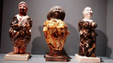
  • Obese women – looking at how your identity is fashioned by what other people think of you. How your body can make you an outsider, a negative impact similar to the effect the one that other minority groups get from the world. Being in a group allows acceptance and may improve confidence with a positive effect on mental health.
    • He made a series of statues, playing on the theme of the Willendorf Venus. Objects of beauty.

      p.txt
      © Grayson Perry
  • Deaf people who have their own culture based on a visual not spoken language and which can be very different. Not hearing is often seen as a disability but should be considered a difference. There can be a conflict between cultures especially if you are born into one but live within another. How does that impact on your identity? It becomes an internal (and external) negotiation.
    • He made a very visual and colourful silk screen printing based on a set of hearing aid covers

https://youtu.be/i6WWeneq6Z0

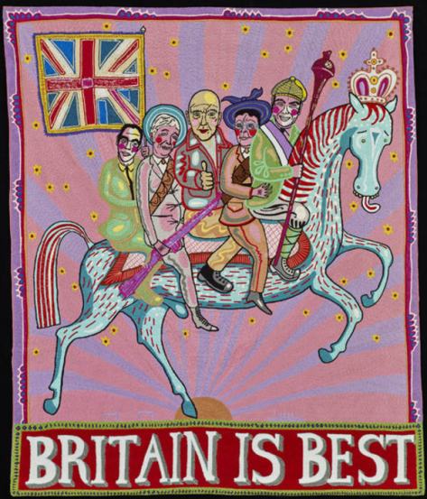
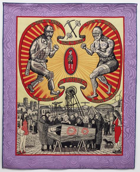
All Man 1 looked at the identity men give themselves.  He looked closely at the culture of extreme ‘macho’ men including cage fighters. The surface personality may be very brutal but underneath the person may be very gentle. The fighter described “being broken inside” and “its all we have left’ coming from a run-down, working class area with little opportunities for work remaining.  The risk of suicide is high. Men are not encouraged to recognise their feelings. He made a banner that echoed the banners that are still paraded in the villages and towns and also a very ‘frilly’, gentle pot, a very feminine object to commemorate the life (and death) of a man who couldn’t cope and who had killed himself. A masculine banner and a feminine pot. Cloth and pottery. Hard and soft. Both working together to tell the story.

PerryG-DoaWH
© Grayson Perry

https://youtu.be/qvrC0i4pXak

Summary:

Both series showed the depth of investigation required to produce a meaningful piece of artwork that told a story of the person or group of people and their lives. Emotion is needed, both from the person and the artist. A connection of some sort needs to be formed. To make a good portrait you need to be part detective, part psychologist.  You need to look at what the person shows to the world, and also what is underneath it, consider their lives and the lives of other around them and the culture they live in now together with the one they were born into. Not a simple task.