Brief: Choose a day that you can be out and about. Be conscious of how images and texts are presented to you in real life. Think about some specific examples.
This was possibly a more limited and limiting experience than it was meant to be. Because of Covid there was only a small number of places that I could wander to, and much of the information was about this!
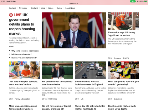
I start the day with the usual unwelcome pop-up to my tablet What Covid news have you missed overnight – I have put it in bold because that is how it hits you, nothing else is apparently important. A similar message comes several times because I keep forgetting to turn of news alerts from several different sources. My early morning reading is similarly contaminated. The pictures show either disasters or warnings with the occasional feel good story thrown in. On the particular day I went for a walk there was:
- ‘PM quizzed over unexplained care home deaths’ – with an image of the PM in Westminster leaning forward looking (to my eye anyway) very aggressive.
- Chancellor says UK facing a significant recession – set against an image (presumably stock) of a builder in a worksite. I am not sure how these link together – possibly look how great we were?
So, I went for a walk, this was limited but I was still surprised to see how much text was about in the environment. I suspect I usually simply ignore it. They could be divided into several categories
- Instructions such as Please keep this gate CLOSED AT ALL TIMES. NO SMOKING ON SCHOOL GROUNDS – accompanied by the no smoking sign and the council logo. The typeface is bold. It is very clear that this is an absolute instruction, no choice given. Sometimes this was coded as a request ‘PLEASE BE A RESPONSIBLE DOG OWNER’ – together with an attractive picture of one of the local peacocks.
- Information – I walked though the park and there were a number of signs telling you what you could expect to see, with the layout of the area and particularly interesting thing to look out for, together with other signs telling you the history of the area, what happened in WWII, the links to Andrew Carnegie and Malcolm Canmore (an early King of Scotland).
- Simple signs – HEAVY DUTY PLASTIC WASTE ONLY on a skip.
- Warning signs – PC T.V. IN OPERATION – this one was linked with a slightly humorous drawing of a guard in a room making up signs to tell you not to feed the peacocks.
- Memorial – names on park benches, sometimes with a short phrase such as Forever Loved.
- Titles – I passed one for a pub/club that is called Life, careful examination the sign has people doing gymnastics on the letters. I assume the implication is that when you attend their club you will feel uplifted and fit – or maybe it is that you will be swinging from the ceiling?
- Advertising – IT’S THE NATIONS FAVOURITE over a bacon roll, WRESTLING SHOWDOWN – on a tatty poster on a window. Neither of these attracted me at all – however I can imagine that they would attract plenty of other people. The colours are bright, the pictures eye catching. Also the simpler We are still open (M&S).
- Mysterious – on the way home my eye was caught by the sheer number of steel access plate inlaid into the road – all of which had varying combinations of words, numbers and names.
Much of the text used was capital letters with very strong contrasts with the background. The more it was seen to be a command the ‘SHOUTIER’ the text. There were few pictures as such, several were accompanied by symbols such as ‘no smoking’. In practice most of the text (+images/signs) I saw gave little room for personal interpretation. They were informative and often directive. In most of them it is clear that the creator wanted to give you information or instructions. Their choice – not yours.


The only ones that gave me any room for a personal interpretation were
- The sign on the cash machines – Free Cash Withdrawals – and I suspect this is just my sense of humour, not a deliberate ploy by the bank.
- The sign for the British Heart Foundation – a typical heart shape (connoting love), with a trace of an ECG (connoting death)on a bright red (blood red) background – when I think about it is a very clever logo – just enough to make you aware and think “Oh. Maybe I am at risk too. Maybe I should donate”.
- The memorial signs on the park benches which always make me want to imagine the lives of the people commemorated. Who were they? What were they like? Do their family visit the benches and sit there and remember.


