Tag Archives: Laura Letinsky

Exercise 5.3

While we have been on lockdown there have only been a very limited number of walks I have been able to take. I have walked around my house. Lately I have walked down town to do some shopping. I have gone on some walks around our local park. The journey I have done most frequently and taken most pleasure in has been to walk to the end of our street, cross the road, and walk along the path though the fields. It makes a circle of about 2 miles. I have walked this on sunny days and under heavy, threatening clouds. From early spring to mid summer. I often carry a camera or my phone. I take random pictures but have not previously been organised about this.

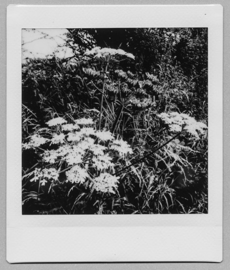
I decided that I would try an experiment. I took my Instax Square and allowed myself 10 prints. A whole cartridge. I admit that I did take rather more images as it needed some experimenting. Previously I have only used the Instax for images of people and the lens is wide angle, very suitable for close ups of people – but you get rather more than expected on a distance shot. There is no focus control or choice of f-stop or shutter speed. Point, shoot and hope.

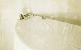
The idea came from the images of Paul Gaffney in Perigee  (Gaffney, 2017) who first went walking with his Polaroid to explore the area before going back under moonlight – but ended up using them as part of the project. I have also recently looked at the work of Laura Letinsky who also used a Polaroid camera for planning images, and then, when they were old and distorted (and somehow strangely beautiful) published them in Time’s Assignation and Other Polaroids (Letinsky and Herschdorfer, 2017).

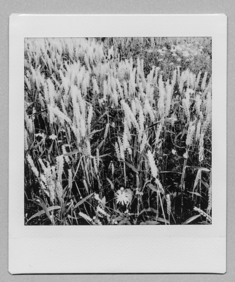
 The Instax allows for either automatic printing, just as taken, and on the spot, which could work out very expensive, or for manual printing at a later date. If you chose manual printing you have the choice of several filters, one of which is monochrome. I decided to print a set of 10 monochrome images that took me on a walk around the circle, starting with the signpost and ending up with the telegraph post at the end of the path. En route I saw sky and clouds, barley and wheat, thistles (very Scottish) and Rosebay Willowherb, paths and trees. It was difficult to reduce the selection to 10.

For showing on here I am scanning the original prints. I could take the images from the SD card and put to  Lightroom and use from there but I would be tempted to fiddle, and it would loose the effect of the white surround that mimics the old Polaroids, which I like and wanted for this series. The scanned images show the idea of the series but they are not as crisp and do not have the sheer tactile pleasure of looking at the images in the original prints. It is interesting using only the 10 images that you get from one cassette, making the choice and no going back.

Images:

Scan_20200728 (5)Scan_20200728 (19)Scan_20200728 (16)Scan_20200728 (13)Scan_20200728 (12)Scan_20200728 (10)Scan_20200728 (3)Scan_20200728 (8)Scan_20200728 (18)Scan_20200728 (6)

I have just attended a zoom ‘Write where you are’ and used this path as a subject. This is what I wrote:

The path is at the end of my street. In winter it is bleak. The trees are bare, the fields are empty. The sky is heavy, but you can see for miles. Spring comes late here. Yellow flowers along the edges. The earth breaks into shoots. What has the farmer planted this year? Summer changes again. The path is surrounded by tall grasses, by cow parsley and rosebay willowherb. The colour has changed to white and pink. The fields grow barley and wheat. Barley for whisky, wheat for bread. The two essentials.  Last year it was oilseed rape, heavy yellow smells. Soon autumn comes. The fields will turn green to gold. The cycle turns. Sometimes there are poppies but not this year. I will walk again tomorrow and look for the deer, listen to the birds. Be free.

The words tell the other half of the story about theplace.

References:

Gaffney, P. (2017) Perigee. Ireland: Self-published.

Letinsky, L. and Herschdorfer, N. (2017) Time’s assignation. Santa Fe: Radius Books.

Research point 2

Historically, still life was considered to the lowest ranked genre within art. Up to the 20th century art was often ranked according to its perceived cultural value. This ranking tended to follow the hierarchy developed by Andre Felibien (1619-1695). History (or mythological) paintings ranked highest, followed by portraiture (including self-portraits), genre (scenes showing everyday life), landscape, then still life. Still life was considered lowly because it was ‘devoid of human figures and more demonstrative of artistic skill than imagination and intellect’ (Huntsman, 2016). The images were often small and hung in private spaces rather than on grand public display. However, there have been multiple examples of famous still life paintings over the years ranging from the vanitas images of the early Dutch and Flemish artists to Frida Kahlo’s Viva la Vida, painted in the last year of her life. Still life continues to be a rich subject for exploration today.

In photography, still life images were some of the first explored, simply because they were still, and therefore relatively easy to portray with the long exposures needed. Talbot demonstrated images of vases in The Pencil of Nature and Anna Atkins cyanotypes showed a wide range of botanical specimens. More recently, Mapplethorpe, who is probably better known for his portraiture, produced a stunning series of still life photographs, mainly of flowers, but also of the traditional memento mori object of a skull.

© Estate of Robert Mapplethorpe

Still life can be used as a formal series without including other genres or mixed with portraits and landscapes to broaden the story. A recent example of this is the work by Øyvind Hjelmen (Hjelman, s.d.)who, in his recent work, Moments Reflected, shows an unexplained cone on a desk, and a lightbulb hanging from a ceiling amongst a series of hazy images of people and animals. He is (according to Laura Serani in his artists statement) telling about the past and the present, memories and dreams. Another example of this mixture of still life, portraits and landscapes is shown in Bed and Breakfast by Susan Lipper .

© øyvind hjelmen

Still life images can be made from ‘found objects’, used as they are, in their environment, such as in Making Do and Getting By by Richard Wentworth and Dingbats by Chris Wylie (Wiley, s.d.) where he takes images of close-up details seen on buildings and objects and shows them in a  formal setting against a vividly patterned frame. He says ‘ the works in this series are concerned, at least in part, with the concept of the ersatz – a descriptor of things that strive to be something other and better than they are, whose existence is defined by being like rather than simply being….Photography is like the real, but is not the real’ (Cotton, 2015).


Dingbat – © Chris Wiley

Other photographers choose to take the objects out of the environment and make elaborate ‘sculptures’ which they then photograph. Sarah Lynch with her carefully balanced objects, suspended with wire and thread and the Laura Letinsky images of left-over things and torn out, repurposed items show this. Another example is the work of Tim Brill (Brill, s.d.) whose Still Life series draws of 17th Century Dutch and Spanish masters. On his website he says, ‘The term Still Life is essentially oxymoronic and in this body of work I look to animate that stillness by removing the quotidian nature of the objects’. He uses fruit and vegetables set against a simple black background on a marginally visible dark surface. Sometimes the items are suspended, sometimes lying on shelves. The colours are intensely vibrant, almost unreal. In a further series Teddy Bear he uses a similar technique and places an old teddy bear with a variety of fruit, broken toys, a skull. He then adds a simple statement is a chalkboard style typeface such as ‘is it time?’ (with the very dilapidated teddy and the skull). He describes this series as exploring the loss of innocence. Tabea Mathern undertook a personal project to produce 52 still life images, one a week for a year. She shows them all on her website (Mathern, s.d.), they vary from collections of found objects to elaborate staged sculptures. All come with the date and an explanation, some long, some just a sentence.

Week 52
Number fifth-two. My last stilllife. A year is a bag full of weird, beautiful, scary, precious, dangerous, exhausting, empowering things, people, stories and encounters. I’m thankful for it. Happy 2015! © Tabea Mathern

It is clear from this very brief overview that still life images can be used to illustrate all parts of life, from childhood to extreme old age, from dreams to memories. A rapid Google search came up with 4,660,000,000 results and an almost equally massive number of images. Most (at a quick scan) seem to be the classic images of fruit, jugs, silverware and skulls. Many of the colours are luscious, the backgrounds often dark. If I am going to add anything of meaning to this array it needs to be personal, to represent something that I care about, and something that will add extra value to the topic. A big ask, but worth exploring.

References:

Brill, T. (s.d.) TIM BRILL. At: http://www.timbrillphoto.com/index.cfm (Accessed 16/07/2020).

Cotton, C. (ed.) (2015) Photography is magic. New York: Aperture.

Hjelman (s.d.) Oyvind Hjelmen. At: https://www.oyvindhjelmen.com/ (Accessed 16/07/2020).

Huntsman, P. (2016) Thinking about art: A thematic guide to art history. Chichester, West Sussex, UK: Wiley Blackwell.

Mathern, T. (s.d.) STILLLIFESTORIES. At: https://tabeamathern-stilllifestories.tumblr.com/?og=1 (Accessed 16/07/2020).

Wiley, C. (s.d.) Chris Wiley – Dingbats. At: http://www.chriswiley.net/index.php?id=works/dingbats (Accessed 16/07/2020).


Laura Letinsky

Laura Letinsky is a Canadian artist and photographer, who lives and works in Chicago. She is best known for her still life images, mainly using soft pastels colours. Initially she mainly used objects, fruit, china, tables, and napkins but more recently has added in photographs, magazine clippings and similar objects to her oeuvre. The pictures often show the end of things, the leftovers, the crumbs on the table. The images are surprisingly beautiful for all that they show the debris of life. In her interview with Brian Sholis (Sholis, 2013) (quoted in the OCA manual) she talks about her interest in still life as a genre that enables her to explore ‘the tension between the small and minute and larger social structures’. She describes how she uses images ‘already in the world’, including her own. She notes that ‘images are promiscuous……. they don’t care what we do with them’ and that ‘photography can help access the feelings that are intrinsic to being human’. In another interview she says, ‘Instead of inviting the viewer to partake in the traditional still life, I was interested in what remains. What gets left over, what you can’t get rid of, or what you try to hold onto’ and references Barthes’s comments about photography being always after the fact (Herrara, 2017).

In Ill Form and Void  (Letinsky and Tillman, 2014) it is often difficult to be sure whether she has photographed real items, or pictures of real items or a mixture. The delicate colours of the images are set against white, cloths nd paper. Much is torn and broken. The colours are smudged. They talk about the small things, the left-over things, the left behind items. It is similar to the series Albeit – however in this case the colours are harsher and the use of torn pictures more obvious. One shows a bird on a branch with an ivory handed knife, the kind of knife I grew up with, and that are still in my mother’s drawers.

web01_Albeit02_2010-1024x744
from Albeit – © Laura Letinsky

Time’s Assignation and Other Polaroids 1997 -2007 (Letinsky and Herschdorfer, 2017) is a series of Polaroids of still life’s. The surfaces are damaged, the colour is washed out. They are blotched and blurred. Some are barely visible. They are beautiful, show the small unimportant things in life. The images were made on Polaroid Type 55 film, now partly decomposed as part of her working process – but have become images in their own right, time worn.

from Time’s Assignation: The Polaroids, © Laura Letinsky

I had only seen the occasional image by her previously but, having looked at it extensively I find myself wanting to acquire it, to hang it on my wall, to be able to stare at it when I am tired. To luxuriate in the colours. To bring back the past.

See more of her images on her website:

https://lauraletinsky.com/

References:

Herrara, B. K. (2017) Laura Letinsky on The Great Discontent (TGD). At: https://thegreatdiscontent.com/interview/laura-letinsky (Accessed 14/07/2020).

Letinsky, L. and Herschdorfer, N. (2017) Time’s assignation. Santa Fe : Radius Books.

Letinsky, L. and Tillman, L. (2014) Laura Letinsky: Ill form & void full. Santa Fe: Radius Books.

Sholis, B. (2013) Interview with Laura Letinsky. At: https://aperture.org/blog/interview-with-laura-letinsky/ (Accessed 14/07/2020).