The objective is to explore the themes in Part 2 and develop them further, exchanging portraits taken on location with ones taken within the studio or inside developing a series of 5 images, either of one person or of a linked series.
In my earlier exercises for part 2 all the work was done outside, with the exception of a few trialled images inside our local abbey. They were also done in daylight and without a flash.
Research:
As part of the background work for part 2 I have looked at several photographers and how they went about their portrait work. This included looking at images that were taken while people were not aware of what you were doing (see Project 1 – The Unaware 1 and Project 1 – The unaware – 2) and other, more formal images. These have been described in Project 2 – The aware and Project 2 – The Aware – 2 The ones I found most interesting were the images of Alice by Siân Davey, (Davey, 2015) which tell a very clear story, the images by Paul Graham of his mother, taken inside in very subdued lighting and the images by Clare Strand in Gone Away (Drew et.al, 2009) where she uses a painted back cloth to relate the images of people to Victorian photography and to contrast idealism with distress.
I thought about several options for extending the work:
- Make an outside studio with backdrops
- Try more images within the abbey
- Take some images within someone’s house
- Set up a ‘studio’ within my own house using backdrops
Outside in a made up studio:
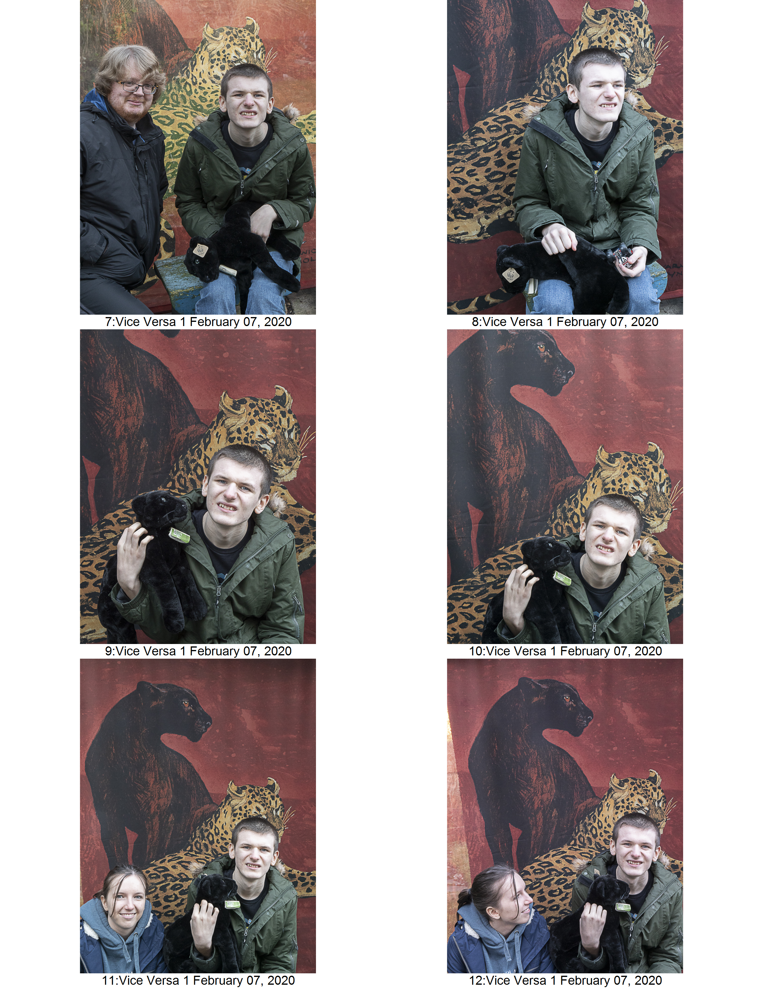
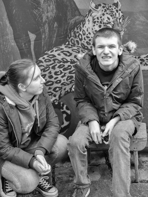
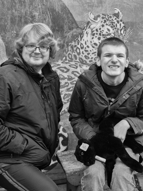
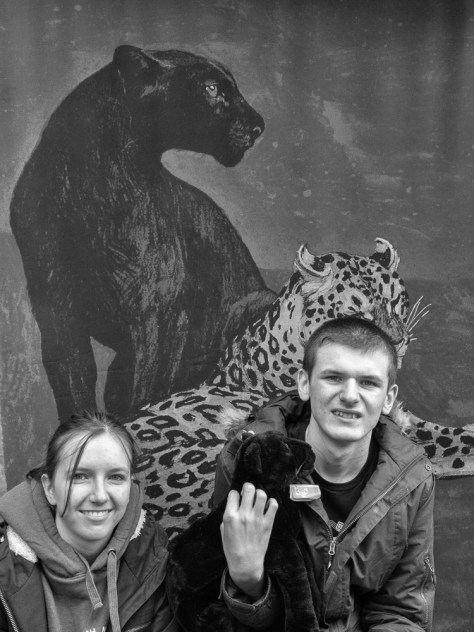
I decided to enlist the help of an autistic young man I know, his sister and my son who he is friendly with. Sam is fascinated with animals, especially the family of big cats so I decided to set his images against a backdrop showing two big cats which I hung in my garden. This was fraught with problems:
- We had difficulty arranging a photo shoot because
- Sam was unwell and we had to delay it on several occasions
- The weather was not obliging (Scotland in winter)
- When we did get together Sam insisted on pulling a series of silly faces. In the end I just went with that as it was a way of getting his cooperation
- I had trouble getting focus on Sam and the other 2 people and tended to focus on the backdrop – I think this was because Sam moved a lot.
- It was not very good light, but I could not use additional flash as it would have upset Sam
Planning:
- I organised time with Sam’s mother to give her a chance to explain what was happening to Sam
- We did a preliminary visit to my house and garden to allow him to be comfortable
- I had a trial run of taking pictures against the backdrop to find the best position to put it up in the garden
Outcome:
- I eventually obtained 40 images, using 2 different backdrops. One backdrop of a tree on a brightly coloured background was not successful as I managed to get the tree growing out of Sam’s head. I should have positioned him more carefully.
- Out of these 24 were in focus and showed Sam engaged with the game (how it was explained to him).
- 11 were landscape and 13 were portrait. The portrait images were more successful as they showed Sam engaged with the other people and also with 2 toys (a car and a toy cat).
Images:
12 preferred images

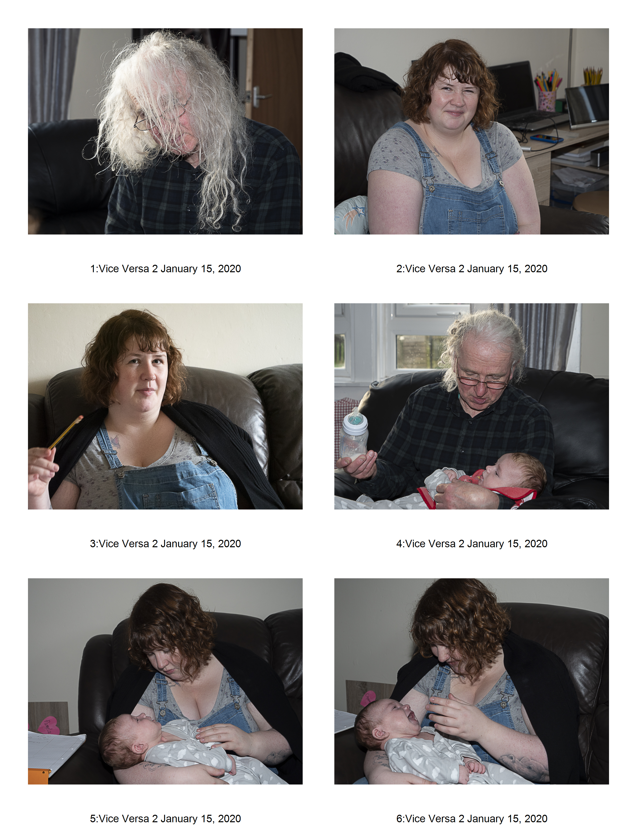
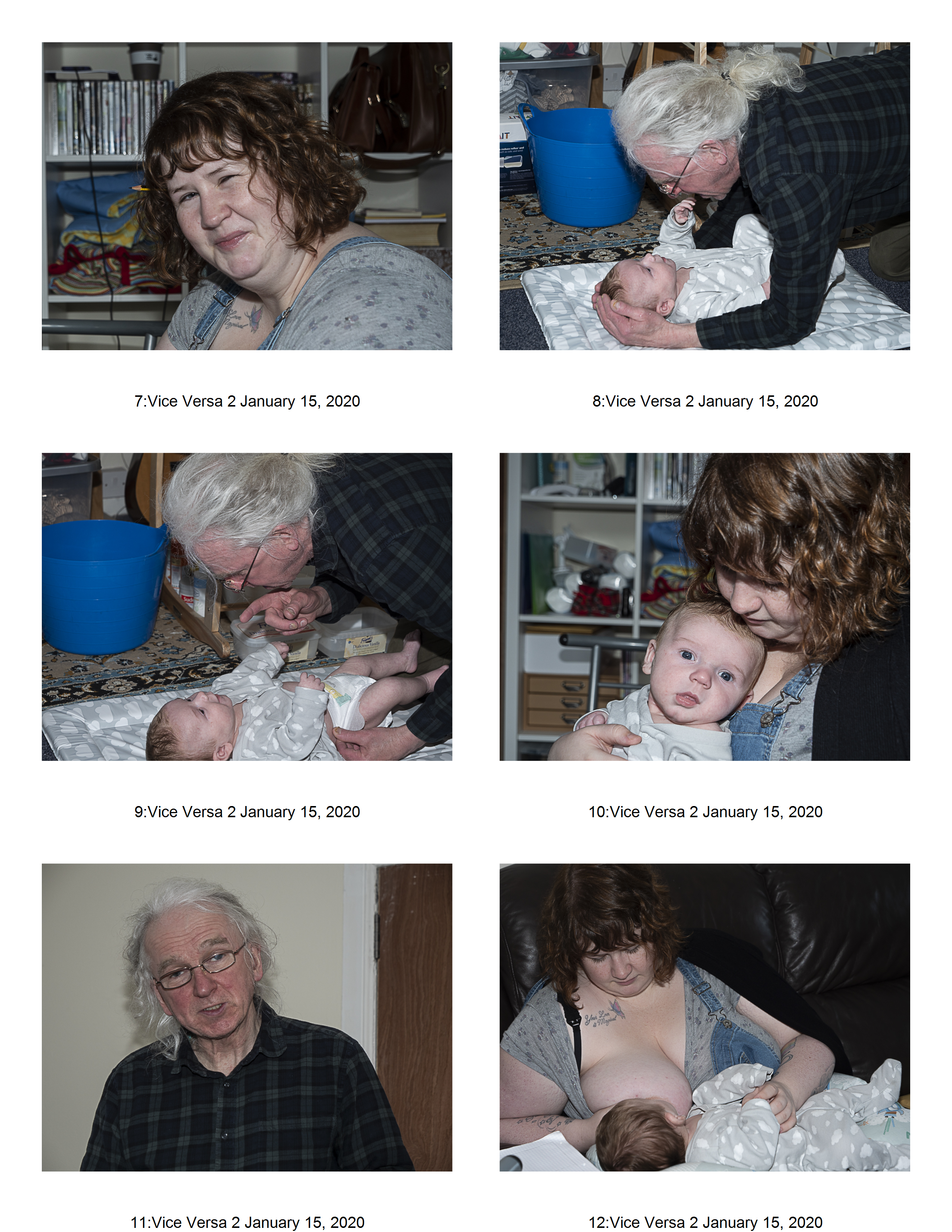
Inside a house (leaving the house as it is):
For this series I took pictures of an autistic couple and their new baby in their house. It was the first time I had met Rich, and while keen to engage he was very shy about having photographs taken, however he did eventually relax. These images were taken with flash as the light inside their house was not adequate by itself. They were very keen to tell me that everything a ‘neurotypical’ person could do they could also do if they wanted to. They were very proud of their baby and that they could look after him well. Janey was especially proud of the fact she was breast feeding.
Planning:
- I contacted several autistic people and their families though a local autism network. This is part of a larger project that I am working on
- We arranged to meet in a neutral place (a local cafe)
- I explained who I was and what I was aiming at to Janey and gave her the opportunity to choose to engage or not
Outcome:
- I obtained about 70 images of the family – which was far too many
- As is typical of autistic people eye contact was an issue, and so in many of the pictures they were either looking away or partially hiding their faces
- 30 images showed them either in typical positions or interacted with the baby
- All were landscape – possibly because of the flash unit
Images:
12 preferred images
Final Choices:
Having thought about both pieces of work I decided to use the outdoor ‘studio’ images. This was partly because I thought they fulfilled the brief better, in that they were taken with an artificial background and, while using some of the portrait skills I had experimented with earlier, they were clearly different in the way they were set-up. However, I am not convinced about the painted background, which, although it references Sam’s interests, could be considered too intrusive. I have since made my own backdrop from a painted sheet and plan to take more images of Sam against this to compare them.
Colour or black and white?
I then had to decide on the final 5 images and also whether colour or black and white gave a clearer view of who Sam is.


To decide about the issues of black and white versus colour I had to think about what I was planning to show. Colour is more ‘contemporary’ in feel. Black and white could be considered a more traditional take on portraiture. Most of the photographic portrait series I have looked at on people with ASD and other mental health issues have been in colour – Polly Braden in Great Interactions (Braden, 2016) and Louis Quail in Big Brother (Quail, 2018) are examples of this.. Equally there is the work by Clare Strand on Gone Away (Strand, n.d.) where the portraits are taken against a backdrop which are in black and white as are many of her other images. I suspect (although I have not been able to find out) that the images were taken using black and white film. My digital camera takes the information in colour even if I set it to black and white. Black and white is what I see – until I download the images at which point I get the colour image. So, to get a black and white image I have to convert it – this does seem somewhat counter-intuitive – but is what happens.
Having looked at the series both in colour and black and white I then asked for opinions from the OCA group (the Critiques site, the Facebook pages and the IAP email group). The general opinion was for colour – more contemporary, why use black and white? too flat a light and one interesting comment ‘colour rather than black & white, moves them away from being a documentary-style observed-type/ teenage wildlife captured on safari sort of thing…”. I also asked for the opinion of Sam’s mother, she is not a photographer, but I was curious about what she preferred. She immediately said colour. Sam himself was also more interested in the colour images.
Eventually I settled on the colour images:
- They do give a more contemporary feel
- They echo the age of the person more appropriately
- Sam looks much older than he actually is in the black and white images (however I process them)
- Although this was a ‘formal’ attempt at a series it turned into a game with Sam – and this is better reflected in the colour images.
Learning Points:
- Thinking is useful but actually doing is more useful
- Have a back-up plan
- Have a second back-up as well!
- The weather is not your friend
- Ask for help and ideas from other people if you are stuck
References:
Braden, P. (2016). Great interactions : life with learning disabilities and autism. Stockport, England: Dewi Lewis Publishing.
Davey, S. (2015). Looking for Alice. Great Britain: Trolley Ltd.
Drew, R., Chandler, D., Eskildsen, U., Jeffrey, I., Mullen, C. and Strand, C. (2009). Clare Strand : a Photoworks Monograph. Brighton: Photoworks ; Göttingen, Germany.
Graham, P. (2019). Mother. S.L.: Mack.
Quail, L. (2018). Big brother. Stockport: Dewi Lewis Publishing.
Strand, C. (n.d.). Clare Strand ~ Photographer ~ works. [online] http://www.clarestrand.co.uk. Available at: https://www.clarestrand.co.uk/works/?id=100 [Accessed 26 Feb. 2020].

I think a lot of what you’ve done (particularly in the Sam pictures) is to do with establishing the right balance between observed and not-observed (carrying on despite the ‘silly faces’; not using flash) trying to reach something that felt less aware to the viewer. And colour rather than black & white, moves them away from being a documentary-style observed-type/ teenage wildlife captured on safari sort of thing…
Also – total bonus – the work you’ve done with the autism network (and the second – rejected for now? – set of pictures) gives you a head start for (the particularly tricky) Assignment 3 and it’s inside/outside-y-ness achieved over time.
LikeLike
Thanks Simon, probably will use the colour for all the reasons you said, the other images and ASD network is part of a very long project (BOW) type but may use some of the images in possibly A4. A3 is well under way with a group of gamers!
LikeLike
Hi Zoe,
I did an earlier version of this course so not familiar with the brief but I love the series with the couple and the baby. You say 70 is too many but I would bet that Polly Braden took many more than that for her ‘Great Interactions’ series. I also think that the photographs you have selected shows the level of trust you have gained with this family.
You have decided to go with the photos of Sam despite all the obstacles. This made me think of a train journey I photographed for landscape when the first problem was that my planned train was cancelled and everything went downhill from there. Well done you for sticking with it. I have read all the comments on the thread as well as Simon’s above and if it was me, I would go for the black and white, the reason being that I find the background in the colour images quite distracting. That said, my tutor asked me in an earlier course why I had chosen to extract colour, so if you do go for black and white you need a good reason.
I love the idea of pursuing this for a body of work at level 3!
LikeLike
Thank you Anne, I really dithered between colour and black and white, like you I thought there were less distractions, but I couldn’t think of a good enough formal reason!
LikeLike