His written version of the Reith lectures – fascinating and funny! Gives an overview of what he thinks about the contemporary art scene
Thinking about art – Penny Huntsman
A general book on the history of art (not just photography) – secondary to my decision to generally learn more about art history so that I can put the photography scene into context
People of the 21st century – Hans Eijkelboom – his work on people and their similarities (and differences) see notes Hans Eijkelboom
Photography:
Still no further forward with pictures for A2 – think I an going to have to completely change subject
Started on images of people with ASD and their families. Met up with a couple (and baby) and did some work with them
This has led to some thoughts as to what I might want to take forward
People with their favourite image (to an image of their favourite artist)
People mimicking the person they would most like to be, or someone who inspires them
Hangouts/zoom:
Tutor led zoom on ‘How to keep ones work on track’ – fascinating and much needed at present
I joined the OCA photography reader group yesterday for a discussion about Rancière’s essay. Prior to the discussion I had read the essay and looked up various references that he made. I admit that I ended up confused and lacking in any real understanding of what point(s) he was making. Some of the confusion might have been because of the translation from the French, but much was probably because I simply don’t have the background knowledge.
Points thought about prior to discussion:
Need to read Benjamin – I think the point is that Benjamin felt that the mechanical nature of photography allowed for interpretation of signs and information by allowing people to see them as art via their senses. ?Sensible = uses of senses (vision, hearing etc) rather than ‘common-sense’
Invasion of large format images into galleries especially those of portraits of indifferent (?meaning not famous or rare) people are ‘mysterious’ – similar to much earlier portraiture eg Dijkstra’s teenager on the beach = Botticelli’s Venus, re-links an image as a representation and also art.
Barthes (need to read Camera Lucida) – studium (information) and punctum (affective/emotional) redefining as the transfer of one absolute (the photographed object) to a separate absolute (the viewer).
Lewis Hine’s photograph of disabled children – Barthes talks about the small details as being the punctum eg the bandaged finger – but he uses a coincidence of the French language to (same word for doll and bandage) to make the point, also Danton collar – a figure in French history. If you don’t speak French or know the history (as I do not) neither of these would have struck you. The words are only valid within a certain knowledge base. For me the punctum is the expression (or rather lack of expression) on the girl’s face. Was she forced to stand there? Did she even know what was happening? Why did Hind take this image? His images of working children show people who are clearly aware – and may even have been bribed?
The image of ‘the handcuffed man’ (Lewis Payne) – in itself tells you little, you need the backstory – then the questions start. Same about Avedon’s former slave. I think the point Rancière is making is that without information the photograph is meaningless. What the viewer takes depends on that (and where, how and when it is seen).
The photograph tells you nothing about the internal thoughts of the person who is being photographed.
Photography without people – shows absence? of what – containers filled with their own absence – I would have liked to be able to ask the photographers what they were thinking about – was it a metaphysical question or an aesthetic one? Rancière says both – the presence of the forms and the mystery of the merchandise.
Walker Evans farm kitchen – lots of possibilities discussed about why he took that particular image, and who was responsible for the art – the photographer or the farmer who built it (assuming that it wasn’t a ‘set-up’).
Taking about Flaubert and Madame Bovary – assumption of knowledge of this literature – probably more common in a French speaker – but – does make the point that photography is not alone, and that assumptions we make when interpreting images are impacted on by our other learning, reading, watching cinema etc, and also that the photographer’s mindset will have been similarly influenced – life is not a vacuum.
Fried – again I need to read further – talks about how the absorption of a person in what is happening separates them from the spectator (and the rest of the world)
‘The photo does not say whether is is art or not … it tells us neither what the person who laid the planks and the cutlery in this manner had in mind nor what the photographer wanted to do’ (Rancière, 2009) and Kant’s idea that an aesthetic idea prompts much thought but no determinate thought …. can be adequate – quoted by Rancière – from Kant, Critique of Judgement, 1987.
Additional thoughts garnered from the discussion:
When Rancière talks about indifference he is meaning that the object you are photographing is indifferent and it is up to the viewer to give a meaning (which may be different the the one assigned by the photographer
Any photograph can have multiple meanings, art, documentary etc
When identifying something as documentary you need to define the ‘truth’ – long discussion about whether set-ups are valid, remembering documentary originally meant to tell a story about something
Photography is special (different) as you take an image of something that is non-art and make it into art – the indexicality of photography – there is always a thing/where/when – rather than in a painting when the painter starts from a blank.
In films the realism is critically dependent on the soundtrack
All the concepts around image/construction/validity depend on where the image is going to be used and who will see it
The group were very helpful about pointing me towards further information sources
In With My Family (1978) he posed as the father with a mother and their children in their living room. The rooms are busy and reminiscent of the June Street images of Parr and Meadows, although of course, the twist here is that the ‘father’ is not the real father (and possibly the families are rather higher in the social scale). However they look totally relaxed and could easily be mistaken for a ‘real’ family. I wonder who took the images as there is no sign of a cable release– was it an assistant, or could it, in a further twist, have been the actual father. More recently, Trish Morrissey (discussed in Masquerades) has done a similar set of images for her series Front (2005) where she became the ‘mother’ in photographs of families on the beach. In these images she took it further as she borrowed items of clothing from the actual mother before posing. On her website she says, ‘Ideas around the mythological creature the ‘shape shifter’ and the cuckoo are evoked.’ (Morressey, 2017). Both of the series raise the question about the reality of images, and what is truth. Does it matter that the apparently happy family group is a constructed one? What does that say about the identity of families? How can an outsider know? One assumes that groups of people on the beach or in the house are related if they are shown in a family album – but they may not be. The further on in time from the image the less certain one becomes. I have images in my family archives of similar (although less professionally posed groups) where no one now alive is sure who all the people are.
Eijkelboom has carried on working with identity. His more recent work People of the 21st Century, collected into a series of Photo Notes shows people he has photographed on the street. He then collages groups of people who are wearing very similar outfits. Does this show loss of the individual? But everyone is subtly different, their personal slant on what is the current fashion. Although this is in some ways a retake of Sander’s People of the 20th Century there is no overt attempt to categorise the people by their place in life or their class, although assumptions might be made by the grouping and the clothes. In An interview Eijkelboom says, “That’s a very strange development in society. That wasn’t the intention at the start of the project, but in the end you could say the book is about a fight, a war within society: more and more, big companies have their grip on people, in producing the clothes and so on. But in the book you see the possibilities to give it your own personal touch. When you now go to the Kalverstraat in Amsterdam, everybody has their own individual message on their T-shirt. But on the other hand, they all look the same, because they are all people with a message on their T-shirt. You can already see a little bit of change, making the power of the big companies weaker, I think.” (Petridis, 2014).
Started Train your Gaze fascinating information and would like to find time to work on the exercises
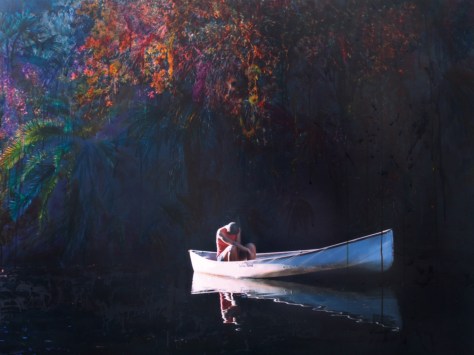
Carpe Fucking Diem by Elina Brotherus, a tale of sorrow, loneliness and despair, bookended by sections of life. Favourite image – the blossoms, white against grey, (? cherries). How can you reveal yourself to others so nakedly? No words, none needed.
Exhibitions:
BP portrait of the year at the Scottish National portrait gallery.
A documentary about what makes a portrait – worth seeing, talks about the guilt a painter feels for exposing the sitter to the public, and how the sitter feels for being exposed, how the judging was done – it doesn’t have to be crystal clear, its often the things you can’t figure out, how people feel when they have been shortlisted, the intensity of painting
Seen this most years but this will be the last time up here because been withdrawn from the calendar because of links with the oil industry
Favourite image – 3rd prize – Quo Vadis? By Massimiliano Pironti. Oil on aluminium. Magic picture that looks so real you want to stroke it. He says vanitas like effect of open window and hot water bottle referencing passing of time.
2nd favourite – Girl without a pearl earring – Bas Nijenhuis – apparently someone the artist met in the street and asked to paint.
Fascinating collection of early photographs, some I have seen before such as some of the Adamson and Hill, Thomas Annan pictures of Glasgow and Roger Fenton but also some I hadn’t seen before such as some Julia Margaret Cameron ones and a whole wall of postcards giving an interesting view on what was considered photo worthy
Interesting contrast between his images and the Annan ones taken almost a century earlier, both showing children from the slums, the later ones only slightly cleaner than the earlier and several others in between such as Bert Hardy.
Scottish OCA Group meeting:
Started by seeing the Oscar Marzaroli exhibition as above, excellent exhibition, beautifully hung, images stand out against new colour of walls (calendar obtained)
Discussed at length the problems with focus, the need for a plan, a beginning, middle and end, possibly even using a GANT chart! Actually do things, even if not directly relevant to get your mind working.
Think about using a photographers Playbook type approach to make you do work you are uncomfortable with and stretch you.
Get feedback – who from? not just friends and family but outsiders
Could we do a group art show?
For the future – think about how you would die a proposal, time-limited and budgeted. How do you value your time?
Consider
Dora Marr exhibition
Jonathon Owens pictures
The Extended Mind at the Talbot-Rice gallery
Discussed the zines we experimented with
Need to consider use of flash within portrait photography, especially if inside.
Photography:
Flowers – to make a New Year’s card. I haven’t taken any for ages and found it surprisingly difficult to get back into the groove
The photoshop play to make the card
Planning:
Working on contacting a group of ASD people, reasonable interest gained from local support group – but no actual meetings planned to the New Year.
At our last OCA Scottish Group meeting our tutor Wendy set us the challenge of making a newspaper to showcase our work.
Front cover of newpaper
A peacful place – all work done, end page of newspaper
I used The Newspaper Club, which is based in Glasgow. They have a template which you can use, and as it was my first time, I used it. That had pros and cons. It was simple to use (once I had worked out that you could only upload images that were set to the correct size and pixel count – all of mine needed considerable adjustment to fit this). However, it was very limiting. I would have liked to either add some full bleed images, or some that went across the midline, especially on the centre page, and, although you can do this – shown in both the demonstration newspaper they send out and on their website, it is not possible to do so using the template. To do so you need to make up your own PDF and send it in.
I chose to use colour images to see how they would work out. Because I used colour, I went for the higher quality whiter paper. I used some very small amounts of text. The paper was printed and delivered very quickly. The colours, as had been suggested in the information on site were, less vibrant than ideal, especially the blues and purples.
Overall, I was pleased by the outcome as initial trial. I think I used too many images. It would have been better with even less words (or maybe none). The layout definitely could have been more interesting if I had designed it to run across the centre or have larger images.
Two other people brought their newspapers. Both had chosen to use black and white, one on each type of paper. I felt the black and white images were more successful, and actually preferred the more tactile feel of the lower quality standard paper.
An interesting experiment, and definitely one worth taking further.
Future plans:
Learn to use some form of design software. The obvious options are
Indesign – very expensive
Scribus – free, but less tutorials available
Make another newspaper – with black and white images
Philip J Brittan has used photography to help to manage very personal emotions and memories. His latest book Ghosts Are Real was made after a difficult time of his life, when his mother had died, and the family has ‘fractured’. He took long night walks as ‘a kind of haven’ and based the images on feelings and emotions that came from these walks. The images are varied, many are colourful, some show obvious images, a tree, a tower block – while others show sudden flashes of colour that when examined carefully turn into a scene of trees, or birds or possibly a person. They are gloriously abstract. Brittan says, ‘Looking back, it seems clear to me that Ghosts Are Real is about the bruised relationship between the world and the self, with love providing my own protective shield, present everywhere, agile and invulnerable’ (Brittan, 2019).
The phrase ‘the bruised relationship between the world and the self’ says all there is needed about autobiographical work. If you can use any form of media to show this, you have made a worthwhile piece. You may have used direct images like those some of those by Elina Brotherus, they may be more complicated, just alluding to your story like the work of Teichmann, or in Brittan’s case totally abstract – but if they can express your story the exact nature of the work is irrelevant.
Reference:
Brittan, P.J. (2019). Ghosts Are Real. PJB Editions.
Esther Teichmann uses mixed media, including photographs, painting, poetry, music and sculpture to tell stories. Jessica Brier says ‘Esther Teichmann calls for a new way to look at photographs, not as mirrors of, or windows into the world, but as portals between the personal and universal, reality and the supernatural and photography and other mediums. Through the layering of memory, desire, fear, fiction and fantasy, Teichmann uses and extends the photographic medium as a passage between realms of experience and artistic creation. Her work exploits the tension between photography’s relationship to reality and a sense of otherworldly power. For Teichmann, this complex, even troubled relationship with the medium yields a passionate foray into others’ (Brier, 2014). Brier’s article talks about an alternate view of photographs, not as either windows or mirrors but as portals or wormholes that can transport us from place to place. She discusses Teichmann’s use of photography as a way of retelling myths that shed some light on her personal emotions, seen though a haze of fantasy and suggestion.
Teichmann images are colourful and soft, with a strong Pre-Raphaelite feeling. They are mysterious and float in a world of her imagining. Her work is personal but could relate to anyone. She uses it to explain all the areas that impact on human life. Teichmann is using photography to talk about things that are not easily visualised – imaginary things and places, how your memories of childhood relate to the past, the present and the future. Where you are and where you were – all in one image.
Brier, J. (2014). Esther Teichmann: The Photograph as a Portal. [online] Daylight.co. Available at: https://stories.daylight.co/DD1312 [Accessed 11 Dec. 2019].
I previously looked at the work of Elina Brotherus when doing CAN while looking at autobiographical portraits (Autobiographical self-portraiture). I have now looked at her work in slightly more detail.
I watched the video of her talk to the OCA students (The Open College of the Arts, 2015) and took notes – the quotes are not exact but give the idea of what she said. It was a fascinating talk and I would recommend it to anyone looking at self-portraiture.
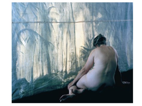
Brotherus is a Finnish artist, who works between Finland and France. She initially went to France on a residency but didn’t speak any French. She used a post-it sticker method, starting with basic words. Starting with very concrete words and took photos of them in situ. Gradually moved to less concrete words. Did a series of these images. ‘Starting point of my work’. They took me seriously. Then (2011) invited back to work within the schools. Went back to same place as the initial series to look at the beginning of her art – how would it feel? Eventually became a body of work – ‘a position statement’, a turning point, looking back, again using post-its, but talking in more detail. 12 years ago – then a series of statements about how she felt then and where she is now (when taking the images). The images show a picture with long texts, talking about her life – but more about her feelings ‘I can’t take the company of people my own age’. Made into an exhibition and into a book. Includes ‘all the themes that are important to me’, landscapes, fog, reflections, the human figure in a landscape. A return to autobiographical working. Previously was interested in work related to the history of art.
‘I don’t do things in a hurry, if you have the luxury of time use it’, leave things aside then come back to them.
When the work is personal it’s hard to have anyone else there – but when it’s a study of the human figure it can be anybody, it’s easier to position someone else – but when yourself you end up running back and forward. I like to be alone because there are less distractions and I am not worried about the other person.
I don’t want to hide the camera release – it shows that the person is also the artist – ‘it’s an invitation to a shared contemplation – that’s also why I like the back image’. It’s a different feel when she (the artist) is looking at us or looking away – ‘a frontal figure is a confrontation’. It’s easier as a spectator to enter in (when it’s the back of the artist) as we are together, but we are not disturbing each other.
The Annonciation– it’s a responsibility as an artist to lift the lid on things that are taboo – pictures can allow you a route into things, making something into a picture may allow you to distance yourself, to see myself as a human being and others have similar issues.
Work in a sincere way as its all your work, eventually it will all come together, you have your own way of discovering, work more rather than stay at home and think.’ I shoot a lot, then I leave it aside’. Think afterwards, edit and reflect. There is no one right answer, multiple solutions out of a body of work.
I have also looked at more of her work online (Brotherus, 2014). The series discussed above – 12 Ans Après (1999/ 2011 – 2013) shows a combination of her earliest work and the later images taken at the same place. As noted, there are a combination of landscapes and portraits. Interestingly she has mixed portrait and landscape formats for both types of images. All are colour. Most are melancholy. In several the emotions are overflowing. Some, but not all, of the images include the post-it notes, scattered all over the pictures. Unfortunately, I cannot read French – as I think they add another dimension to the work. One of my favourite images from the series is a very simple view of water and sky – La Saône 3.
The series Carpe Fucking Diem is a recent series in which she attempts to move beyond her perceived failure (not having children) looking at ‘the surprising and surreal undertones of the everyday life, not totally deprived of humour, because even an unhappy end is not The End’ (Brotherus, 2014b). While this series is not so overtly autobiographical as some of her other work it still is clearly based on her life and her feelings. Some of it was actually shot at the same time as the work for The Annonciation and the two series can /should be looked at in parallel.
I find Brotherus’s work fascinating. When I looked at it previously, I actually found it somewhat disturbing and hard to view. My feelings have changed over the last year and I now find it both sad and surprisingly beautiful. The combination of clear autobiography, both sad and funny, (at times uproariously so) with images of small details, a bowl of potatoes, a worm on the street, give an insight into the life of someone I wish I could meet.
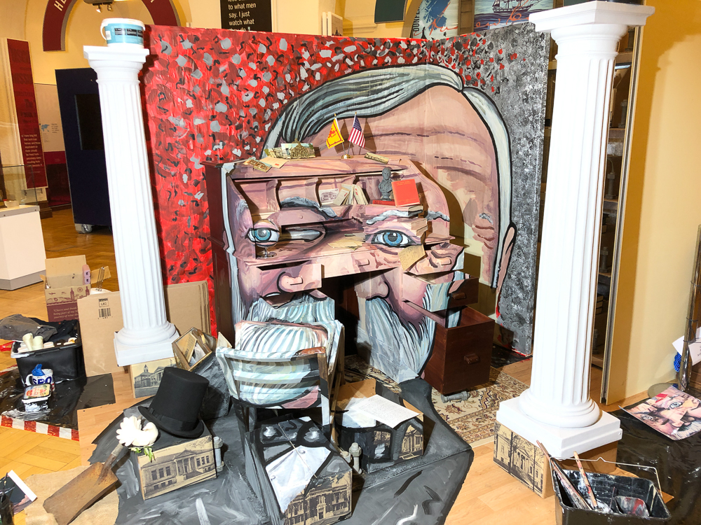
Dunfermline has strong links with Andrew Carnegie as it is where he was born, and it hosts his Birthplace Museum. At present the artist/photographer, Calum Colvin, is in the process of making a work of art that will become a photograph of Andrew Carnegie.
Calum Colvin is a Scottish artist (although when I asked him, he said he wasn’t sure if he was an artist or a photographer) who specialises in making three dimensional constructed pieces of work that when photographed become an image of the person. He has mainly (although not exclusively) worked with figures that have a relationship to Scotland or Celtic mythology. Recent work has included Burnsiana, which was an exhibition of work exhibited alongside poetry by Rab Wilson that was written in response to the artworks. He describes it as ‘‘Burnsiana’ is an exhibition and book born from an appreciation of the poetry, life and times of Scotland’s favourite son, Robert Burns. The works are a mixture of the mundane and the surreal, assemblages of everyday objects, which become a three-dimensional canvas for various painted scenarios’ (Colvin, 2019). The images can be seen on his website:
Other work also included a series looking at Scottish history and the symbolism of the Jacobite Risings and therefore the legacy this has had on Scottish identity. He collages items together to make the image. ‘His complex artistic manoeuvres and erudite references can be read as a metaphor for the construction, the ‘collaging’, of history itself, thereby asking us to be vigilant as to which version of history is presented to us, by whom and to whose gain.’ (Edinburgh Printmakers, 2009). The work is full of illusions, both visual and metaphorical and need more than a brief look to interpret.
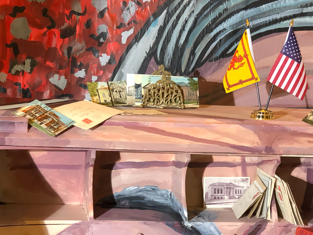
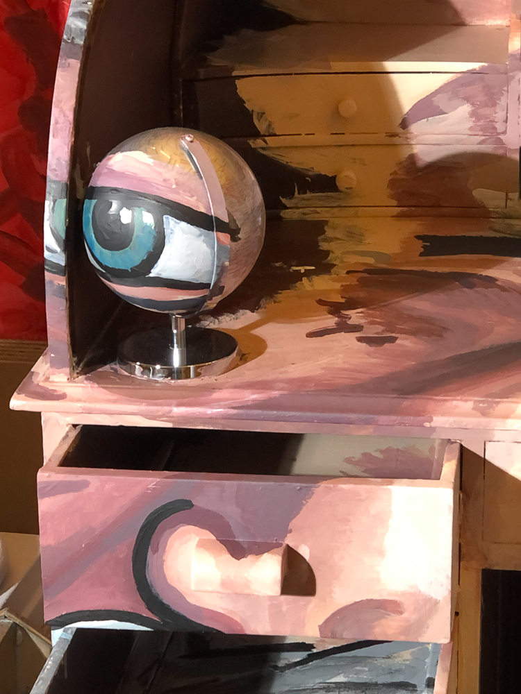
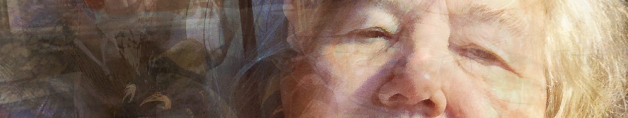
Colvin is in the process of working on another piece, a head of Andrew Carnegie and I was lucky enough see this work in its final stages and catch a very brief conversation with him. The process is that he builds a large construction that, in this case, included books, postcards, Carnegie memorabilia, a desk which he has overpainted and some purely constructed pieces (the eyes) and then places them in such a way that when photographed from directly in front they merge to produce a single image that shows the man. Looked at from any other angle they become a 3-D jigsaw puzzle. In this case the work is being made in the Carnegie Birthplace Museum and has been watched by the visitors and Colvin’s research has been influenced by the easy availability of relevant information. When I saw it he was just putting the final touches to the model, altering some lines in the painting to make it more realistic. Colvin takes regular images of the model to guide his work. The final model will then be photographed, printed large scale and displayed within the museum and the model itself will be destroyed, although I was told that some pieces of it will be retained and shown alongside the photograph.
Colvin kindly allowed me to take some pictures of both the model and him working with it.
")

")


")
-2")
-3")


-8")
-7")
-6")
-5")
-4")


")
")