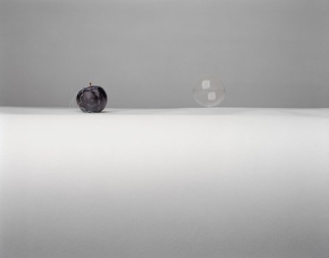
Sarah Lynch is a Scottish photographer who makes still life images by building up small sculptures, wire, fruit, pieces of paper and then photographing them and showing them at large scale. There is one that grabs my attention, a plum with some pieces of thread in a deep damson colour on a white surface with a bubble floating just above the same surface. It contrasts dark and light, solid and ethereal, permanent, and fleeting. Another shows a raspberry on a pile of torn white paper suspended by a string and wire. The images are delicate, appearing simple. Fragile but balanced. The fragments of colour stand out against a predominantly white and grey background.
In the interview in Photoparley (Boothroyd, 2012) she says her goal is to make ‘people stop and pause for a while’, to spend ‘a moment contemplating everyday objects as beautiful and fragile’ and to ‘put our small selves into perspective’. Not a bad goal to aspire to.
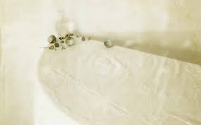
Laura Letinsky is a Canadian artist and photographer, who lives and works in Chicago. She is best known for her still life images, mainly using soft pastels colours. Initially she mainly used objects, fruit, china, tables, and napkins but more recently has added in photographs, magazine clippings and similar objects to her oeuvre. The pictures often show the end of things, the leftovers, the crumbs on the table. The images are surprisingly beautiful for all that they show the debris of life. In her interview with Brian Sholis (Sholis, 2013) (quoted in the OCA manual) she talks about her interest in still life as a genre that enables her to explore ‘the tension between the small and minute and larger social structures’. She describes how she uses images ‘already in the world’, including her own. She notes that ‘images are promiscuous……. they don’t care what we do with them’ and that ‘photography can help access the feelings that are intrinsic to being human’. In another interview she says, ‘Instead of inviting the viewer to partake in the traditional still life, I was interested in what remains. What gets left over, what you can’t get rid of, or what you try to hold onto’ and references Barthes’s comments about photography being always after the fact (Herrara, 2017).
In Ill Form and Void (Letinsky and Tillman, 2014) it is often difficult to be sure whether she has photographed real items, or pictures of real items or a mixture. The delicate colours of the images are set against white, cloths nd paper. Much is torn and broken. The colours are smudged. They talk about the small things, the left-over things, the left behind items. It is similar to the series Albeit – however in this case the colours are harsher and the use of torn pictures more obvious. One shows a bird on a branch with an ivory handed knife, the kind of knife I grew up with, and that are still in my mother’s drawers.
Time’s Assignation and Other Polaroids 1997 -2007 (Letinsky and Herschdorfer, 2017) is a series of Polaroids of still life’s. The surfaces are damaged, the colour is washed out. They are blotched and blurred. Some are barely visible. They are beautiful, show the small unimportant things in life. The images were made on Polaroid Type 55 film, now partly decomposed as part of her working process – but have become images in their own right, time worn.
I had only seen the occasional image by her previously but, having looked at it extensively I find myself wanting to acquire it, to hang it on my wall, to be able to stare at it when I am tired. To luxuriate in the colours. To bring back the past.
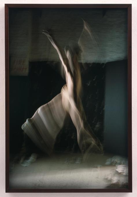
Sam Taylor-Wood (now Taylor-Johnson) works across photography and film both commercially and within the fine art world. She has directed Nowhere Boy (about John Lennon) and 50 Shades of Grey. Her website (Taylor-Johnson, s.d.) shows a mixture of short film clips and still images. All make use of time, time suspended or sped up. There is an arresting photograph of a dancer in mid leap, set against a languid looking female on a couch –After Van Halen. Another image shows a dancer – Speed – where a slow shutter speed has caught her clothes swirling around her and there is the well know Suspended Self Portrait series with her hanging upside down, seemingly in mid-air, no obvious supports.
She says in short video interview Brief Applause (Brief Applause: Artist Sam Taylor-Wood, 2008) ‘I have ideas and they wouldn’t go away…. they are very photographic, very strong. A lot of my photographs take a lot of organisation and set up. Suspended self portraits are images of me bound and hung from my studio …. there was a lot of pain and constriction …. Yet when you see them…. You sense more freedom than the constriction, …. (it is) frozen in time’.
Still Life (Still Life, 2001) is a short film of fruit in a bowl that shows the fruit decaying over time. It is set to music by Keith Kenniff in a piece called Preservation Devine. In 4 minutes, it shows a bowl of apples, pears and cherries gradually disintegrating. They first shimmer, become surrounded by a blue glow of fungal spores and then collapse. All to the accompaniment of soothing piano music. It is surprising beautiful and relaxing to watch. In another piece A Little Death (A Little Death, 2002) she shows the gradual collapse of a dead hare via the life of insects into the remains of bone and skin. All the while a peach sits alongside, remaining seemingly whole. This time it is set to a short piece of chamber music by Royksopp. This is equally mesmerising although more horrific – I suspect because of the awareness that this was once a living animal.
Both of these pieces are related to the painters frequently chosen objects for still life, fruit, game, death and decay, carefully posed and translated into film. In an interview with Wendt (Wendt, 2019) Taylor-Wood says ‘A still life is still a still life, even in the transformation from painting to film. I am interested in ideas connected to mortality and the passage of time, as were the Dutch master painters’ . The films make use of time passing and alteration in states of being to tell a very carefully composed story. They talk about life and death, now and then, time and standing still. The whole world in a compressed space.
In Chapter 4 from Charlotte Cottons book The Photograph as Contemporary Art (Cotton, 2014) she discusses the art of making images from the ordinary things in life – something and nothing.
Non-human things – often ordinary and every day – can, when photographed, become more important. This is particularly noted when colour is intensified, scale is changed, or the environment is changed. This can be used for almost any item you can imagine; they could be concrete items such as traditional still life or ephemeral things such as snow and light.
What do you make of these types of images is what you will/ can. The practitioner/photographer has has decided that the item is important simply by photographing it. The images may be unglamorous such as in the Quiet Afternoon series by Fischer and Weiss. They may question the status of art by picturing an activity demonstrated in Gabriel Orozco’s work Breath on a Piano. Photographs made from unusual found items can suggest stories to the viewer about what might be happening. The interpretation is up to your imagination. Nigel Shafran uses things found in daily life, such as his washing up, photographed in ambient light which tells us about the importance of the ordinary.
Images taken in series can make a commentary on culture. Architectural spaces may be used in a similar way and for this people often use deserted and partly destroyed buildings together with items that have been left behind by previous tenants. In James Welling’s work he repeatedly photographs items from slightly different angles or with slight changes implying that know something you need to look at it in multiple ways.
Still life, especially of items within the house or home, may demonstrate the considerable frailty of life. This was frequently a topic with the Dutch still life painters and they often used memento mori within their painting. It can be used to show how life changes, things falling apart, the end of eras.The idea of behind these possibilities is the use of an everyday, ordinary or unexpected object to make us think about what we are seeing and interpret it in a different way. It can be very useful if you are wanting to talk about things that are not traditionally easy to photograph or that might cause distress if handled too directly such as death, freedom, loss or change. Metaphors also have limitations in that they may not be understood without knowledge of the specific referents used or an explanatory text – which might then close down the possible interpretations. The viewers of the Dutch Old Masters were usually people who were visually literate and would have subconsciously understood the inclusion of a skull or a cross. Metaphors also are usually limited by culture. An extreme example of this might be some graffiti on a wall, which could be seen as vandalism by one person, a gang affiliation by a group of people or simply as ‘I was here’. Colour is another example of this. In Britain white is usually used to represent purity, virginity, clarity, and peace and is often used for wedding dresses, while in India, Hindu populations would traditionally use red as it indicates spirituality, protection and commitment while white is commonly worn to funerals as it symbolises purity, and it is used to show respect to the departed.
Summary:
Still life, in the broadest sense, can be used as a metaphor
Metaphors can be useful if you are describing a profound or troubling subject
Metaphors need to be used with care as not everyone will understand them, and text may need to be added
The use of unexpected conjugations of items especially with unexplained settings can make people think / invent their own stories.
Reference:
Cotton, C. (2014) The Photograph as Contemporary Art. (Third edition) New York, New York: Thames & Hudson.
Karen Bullock is a young documentary photographer from Alabama, USA. She has produced a body of work called Presence Obscured (George, 2020) which explores the changing nature of Christianity and faith in the south of America, and her own experiences within that setting. She says ‘Through these photographs, I share what I perceive as an ethereal sense of presence alongside themes of longing and loss. They are an open-ended offering to the viewer to ponder experiences of faith which sometimes arise in our lives, especially in the midst of trauma or crises such as the world is enduring now.’ Bullock made the images to after a severe personal difficulty and found that they helped her to cope.
The images show buildings, old churches (inside and out), abandoned statues, and religious icons. There are no people, just the traces left behind. It asks is faith still active, or has it long gone? Where is it now in people’s lives? The colours are vibrant even though the subject is occasionally sad. The lack of people is poignant. It asks another question – if she went back tomorrow would there be someone there – or not?
Bullock’s use of absence lends strength to the work. It talks about the forgotten things, the things that may, or may not, have lost importance. People would dilute the message. It tells me about a life that is strange to me – I live in the cold and austere north. The colours are different. The story is similar.
Elliott Wilcox is primarily a fashion and sports person portrait photographer, working for some of the big names, Converse, Nike, Urban Outfitters. In his website (Elliott Wilcox, s.d.) the first thing you see is people, people standing, people jumping, people in your face. Saturated colours. Moody glances. However, as you work down the page, past all the glitter and the glamour, you come across three very different pieces of work. More personal, although absent of people.
Courts is a series of images of sports courts. They are hyper saturated with colour, while remaining quiet and reflective. The walls show multiple marks were the ball (and bodies) have hit. The energy of the players has been transmuted into these tiny marks.
Walls shows climbing walls, or rather the close-up details that you would probably only usually see if you were close up and personal with them, hanging on. If you saw one of the images out of context mots people would not know what they were. They are abstract patterns, areas of light and shade. But with the minimal context given by the title they make sense. I can imagine (with terror) balancing on a point, clinging to the surface. The sheer strength required to do so.
There is a third piece Inhalers where he pictures the inhalers used to treat asthma, enlarged and isolated against a blue background, seemingly hanging in mid air. They show traces of life in the dirt and lipstick. They are lifesavers to many people.
The contrast between this work and his commercial work is startling. They use the same techniques, large format, highly coloured images. They tell about the person in their sheer absence of people.
Richard Wentworth was originally a sculptor who used the everyday world as his model and his photography uses the same source. He looks at the objects found in the environment – often incongruous- and makes them into a piece of work that describes the place and time.
In an interview with Ben Eastham (Eastham, 2011) he talks about observational intelligence. ‘that’s something of what an image is – it has to have a component which is unaccountable, which sweeps over you.’ He thinks (I think) that we are made up of instinct and curiosity – which sometimes work against each other. That we recognise the spatial environment and respond to it unconsciously, use things as we need them. That words (and their origins) are important. That things happen to him.
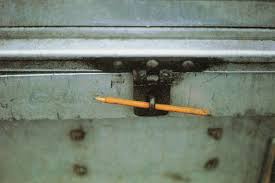
The work Making Do and Getting By (Wentworth, 2015) documents small found sculptures where an item has been used beyond its intended purpose (a boot as a door wedge), something that has been mended with a purely functional method (twine or gaffer tape to fix an open gate), a pencil to secure a lock. The images tell a story, not so much individually, but en masse, a story of the practicalities of everyday living. A story about the people who make and mend. A story of what you do to fix the small inconveniences. A quick walk around my local neighbour can produce similar images. As can my house. Flowers from the roadside in a plastic water bottle. The difference is that he sees them and records them.
Is the photographer a historian or a storyteller? Why can’t they be both? History is telling stories. Well, stories that are supposed to be factually based. But the facts are always picked by someone – famously the victor. And then the facts are made into a story. That story gets repeated over and over, changing slightly with each iteration until the people that were involved in the original event might well not recognise themselves. A storyteller uses facts to make up something different deliberately. But any good story, one that is worth reading holds a kernel of truth. It has come from something the writer sees to be true. It might even be a history, a story of a journey. The most important thing is being honest. You do not need to be explicit with the reader, but you should not tell lies. Is it history (a straight factual documentation of an event)? If so, it should be as accurate as possible – but even then, your own interpretation and views will colour it. Is it a straight factual piece, a half-way house, your feelings on something? That is fine – as long as you do not pretend otherwise. Is it a complete fiction? Also fine, fiction can tell as deep a truth about an event as fact.
Where do I sit? I think that straight factual telling of an event is easier. It, usually, takes less of a personal emotional toll on the photographer. When I look at photobooks the ones that grab my attention, the ones that I want to emulate have a fictional component. The images tell a story. Do not get me wrong – I like straight documentary too.
Can I make a story? You need the ideas first. Can I take some documentary images I have taken and use them to form the start of a story? Can I blend fact with fiction? My personal history with events in the world? I certainly do not just want to be a documentary photographer. Even with the subjects I know best and am most interested in. It is the storytelling aspect that holds me. The subtle changes that include the emotion. This is a topic I need to explore.
Where is this? What is happening? What does the storm portend? Whose house? There is not anyone there – but that leaves it open. What is next?
William Eggleston is said to have interpreted his surroundings by the objects they contained rather than by the people. His pictures are often thought of as being devoid of people – however a look at the website of his foundation shows that this is far from true. See: http://egglestonartfoundation.org/
His images are brightly coloured and are often about the small details. On the front page there are images of a car (and its advertisement), a deserted shop (possibly a diner), 3 light fittings (on varyingly coloured backgrounds), landscapes (including a beautiful image of either coloured leaves or blossom), road signs, a glass on an aeroplane table, stuff on (probably a kitchen) table , dolls, a bowl of fruit, as well as six pictures focusing on people and another car. This covers most of the possible subjects of photography. The difference is that he thought to take these varied images in colour at a time when the norm was black and white and mainly either street images or formal photography, carefully considered and correctly viewed. I am not suggesting that Eggleston did not carefully consider each of his images – just that his eye for what made an image was different. His images use the items to tell about the place. The image of the glass on the aeroplane table immediately makes me think of holidays, travel, excitement, and also fear – but it is a very simple image utilising the light coming in the window. Eggleston is said to have ‘legitimised’ the use of colour in art photography when, up to that point, it had mainly been used in commercial work. He used a dye-transfer printing process that gave vivid colour and makes things look hyper realistic. His images are often of the ‘ordinary world’, things left on the pavement, broken items, street signs. His composition includes skewed lines, odd perspectives, and unlikely items.
In the introductory essay to William Eggleston’s Guide (Eggleston and Szarkowski, 2014) by John Szarkowski which was initially published in 1976, Szarkowski is dismissive of the use of colour in most photography, for instance comparing it to paintings ‘ it is their unhappy fate to remind ups of something similar but better’ (p.9) and ‘Most color photography, in short, has been either formless or pretty’. But he goes on to say that the best of modern colour photography ‘derives its vigour’ from taking images of ‘commonplace objects’, the things found in life, the people and the ordinary places, ‘visual analogues for the quality of one life. This certainly describes Eggleston’s work. The book instantly takes you back, to mid last century America, neither rich or particularly poor. The life of the ordinary person. He does not make fun of it, it is a simple statement – this it what it is. The bikes and the cars, the barbecue, the rubbish in the streets. This is the way at it was.
Eggleston’s lifestyle was eccentric, he was rich, southern and did not need to work. He plays the piano, draws, paints and almost incidentally takes photographs. There is a fascinating extended interview answered life story by Sean O’Hagan (O’Hagan, 2017) which describes how people were originally offended by his work both because of the colour and the subject matter. The ordinary world. The world most people inhabit.
References:
Eggleston, W. and Szarkowski, J. (2014) William Eggleston’s guide. (2nd ed.,) New York: Museum of Modern Art.